Oscraps

April Challenge #4 - Creative Techniques

Honestly I am normally sucky pants at this kind of thing, but Ona, your tutorial was AWESOME.
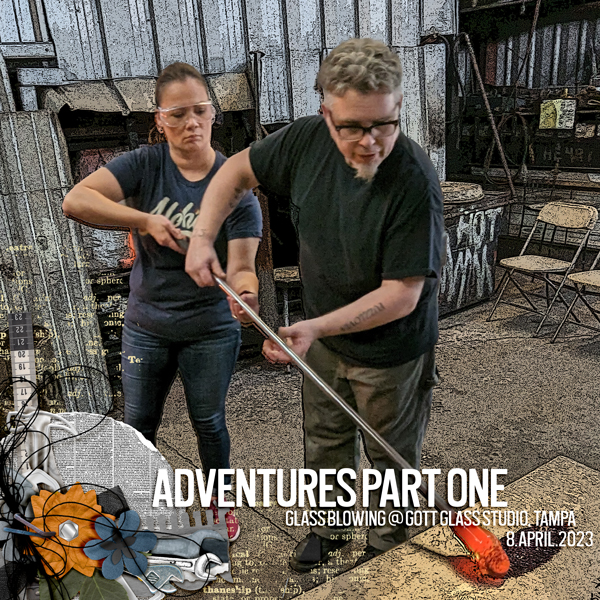
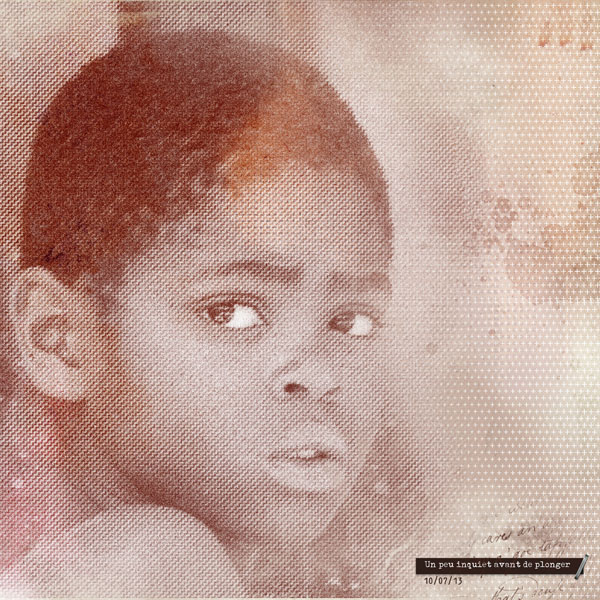
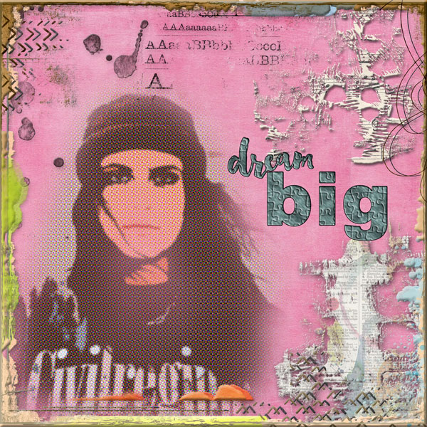
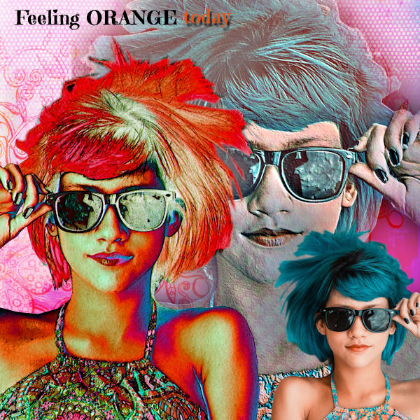
I used cutout, halftone and poster edges filters. I intensified the poster edges and reduced the opacity of the halftone.
I extracted Esther and our teacher Justin from the original photo and popped the extraction back into the filter-enhanced photo. I love the sharpness of them v the grunginess of the filtered photo.

 
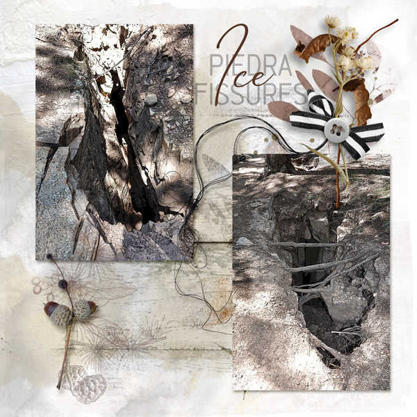
Ona, I followed your tutorial to the letter except I had to add an extra screen layer to get some colour in the water. I know it's an odd image to choose but I'd already started this page as a travel memory page and was stuck what to do with it . I masked it with an AnnaBlendz but it ended up in a photo frame and reduced in size so hard to see the effects produced. I added a photo from the same boat race above thought to show what it would have looked like without any filters. If I can find time I'll have another go with a different sort of image. Love all the inspiration pages above. They're all absolutely amazing.

View media item 377132
 
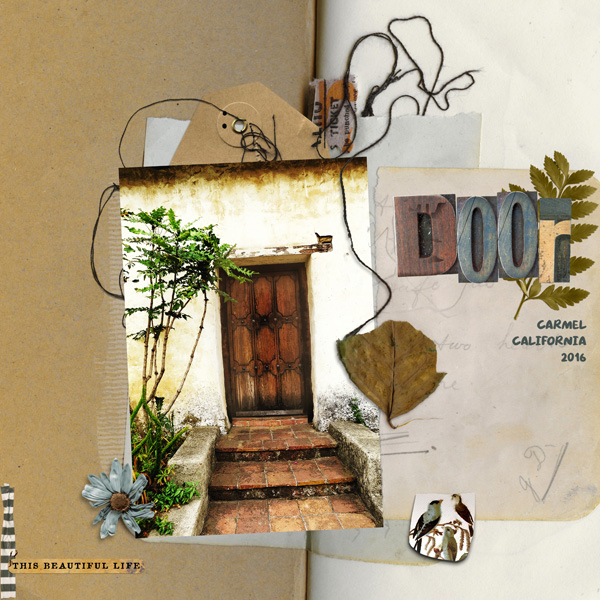
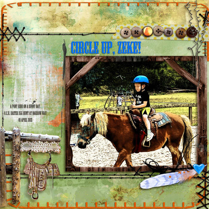
I had a lot of fun playing with the filters. Thanks so much, Ona, for the great tutorial and for giving us the incentive to play! I wound up using the filters you suggested and thought they suited the old door in my photo. Here's my finished page:
 
What I am feelin' like..........................

giphy.gif


So HAPPY with all the layouts that have been added and so happy that a lot of you had a go with it and learned something new!!! FABULOUS results ladies, absolutely stunning!!!!!!!!!!! :banana: :lovey3:
 
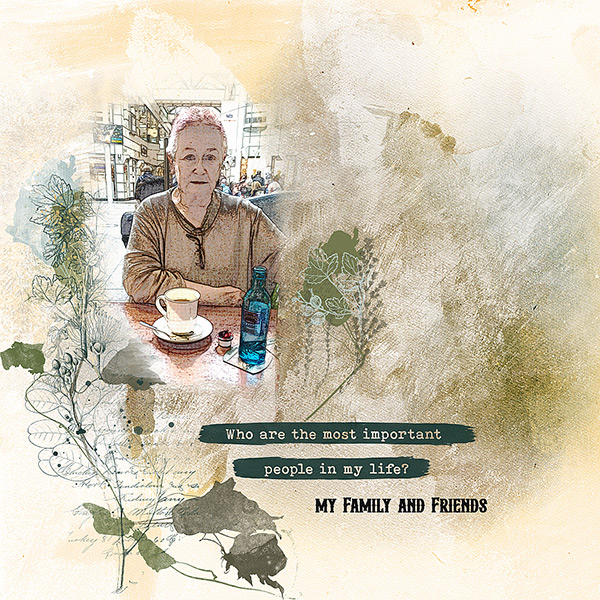
I love all these effects, but I don't know how the filters are named in my german version in my PSE or PSP
to follow the steps
can someone help me please
Hallo Anja, mir geht es genauso. Ich habe Ona angeschrieben. Sie sagte, es ist egal, welche Filter Du nutzt. Das half ton heißt im Corel PSP 21 unter Effekte Halftonemaster, das Cut out könnte bei uns die Aussparung sein. Versuche irgendetwas, was Dir gefällt. Ona ist bestimmt großzügig.
:)
 
Hallo Anja, mir geht es genauso. Ich habe Ona angeschrieben. Sie sagte, es ist egal, welche Filter Du nutzt. Das half ton heißt im Corel PSP 21 unter Effekte Halftonemaster, das Cut out könnte bei uns die Aussparung sein. Versuche irgendetwas, was Dir gefällt. Ona ist bestimmt großzügig.
:)
Hi Susanne, ich hab es in PSE und PSP versucht, bin mit PSE und Sylvias Hilfe weitergekommen, Danke
schau mal in post 33 mein Ergebnis
 
Hi Susanne, ich hab es in PSE und PSP versucht, bin mit PSE und Sylvias Hilfe weitergekommen, Danke
schau mal in post 33 mein Ergebnis
Ja, hatte ich erst hinterher gesehen. Gut geworden. Ich komme bei PSP nicht klar und werde diese Aufgabe schwänzen müssen.
 
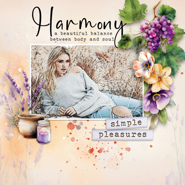
I used to play with filters a very long time ago... Somehow had gotten away from them, so thank you for the refresher course Ona... Not really knowing what I wanted to do , or how the filters would interact it was trial and error of course... I knew I wanted the half tone to show and hard lines... The first one I did was interesting, but I decided to try again... I think I prefer the 2nd one, using one of my all time favorite Anna templates... I am going to post both images because they are so very different , but both made using the same 3 filters that you demonstrated... How on earth did you get the half tone to be so obvious, in you final page... it is not showing in the tutorial. Basically I just wanted it to be obvious that I had used filters... Will be revisiting filters and playing more....

The 2nd one was the first one I did... my 2nd try and my favorite is shown first here.
Goodness, Liz, I love both or your layouts! as to getting the half tone more obvious in my layout, under the my final composite photo in post one there is a little note I added:

"The Halftone doesn't appear as prominent as in my layout on the photo above because it is smaller. I did however sharpen the photo in my layout using the High Pass which gave the Halftone and bit more prominence. "

So once you have your photo composite or completed layout, try adding a High Pass sharpen layer to intensify the Halftone, then add a layer mask to brush out the areas you want to subdue. Hope that helps. :)
Thanks Ona... I had read the note, but wasn't quite sure how it affected the final outcome... I'll give it a try...Liz
 
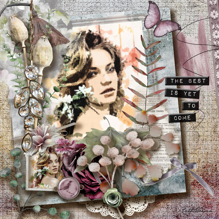
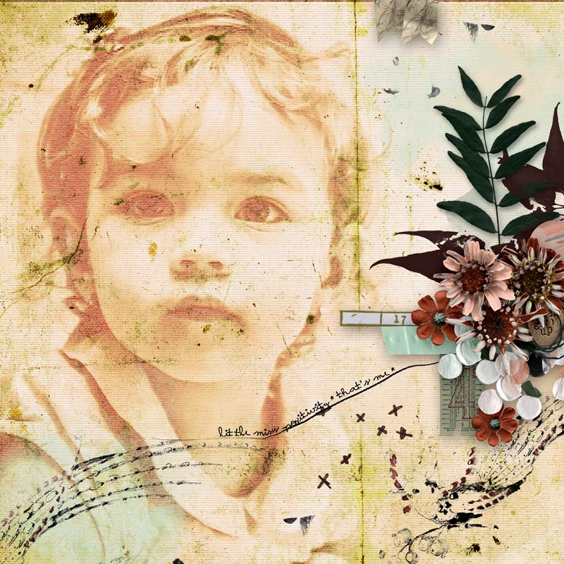
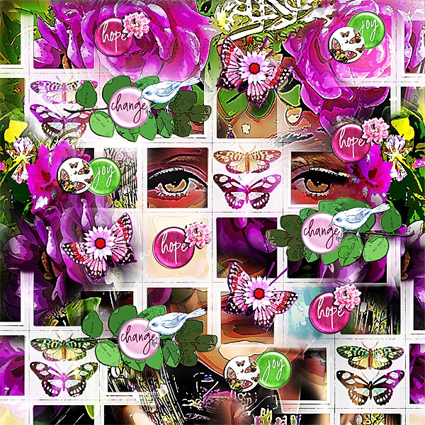
Hi Everyone...What a great! challenge Ona!...I use filters a lot...They are fun! once you get the hang of using them...It took me awhile to get the hang of them...but they are a great! way to change up the look of your photographs & elements...I have my large photo in the back of the QP Template that I used from the Simply Spring Oscraps Collab..I repeated it multiple times...using varying parts & blending them in according to how I wanted the pieces to go together...

For my photo...She's peeking out from behind the open parts of the template...I hope you can see clearly her eyes,forehead,mouth & chin...I used 3 filters on the photo...Poster Edges/Dry Brush/Watercolor...Poster Edges is my fav filter & next Dry Brush...They are both used here...

I also had much fun using varying combos of these filters on the flairs,the blue bird,butterflies,large green leaf & some flowers...Cutout/Sponge/Dry Brush/Poster Edges...filters...All of these elements...represent positivity & hope for the future...

My layout is all about Hope...Change...Joy...Fits what I'm going through right now...I'm hopeful for the future...I still have my not-so-good days...But I'm still moving forward in my recovery...I have to believe that the future will be brighter & better than all me & my amazing! husband have been through these last few months...So you can see her sad eyes but lurking behind them is...Hope...Change & impending Joy...Thanks for this Amazing! challenge Ona!...:heartpumpred: :beatingheart: :heartpumppink: :thankyouspin: ...

My : Hope : Change : Joy : Layout :

 
Last edited:
Thanks for the tutorial. I use Photoshop Elements and I am not sure about the different filters. They are also written in Swedish so it's a bit hard for me to know what they are in English. I used the filters: Poster edges, Dry brush and Find contours. I also used Blend Modes and lowered the opacity.

 
Always love your technique challenges and tuts. Thanks for hosting, Ona.
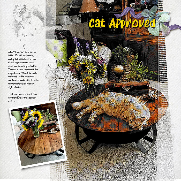
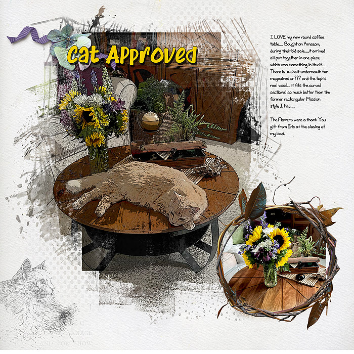
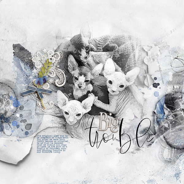
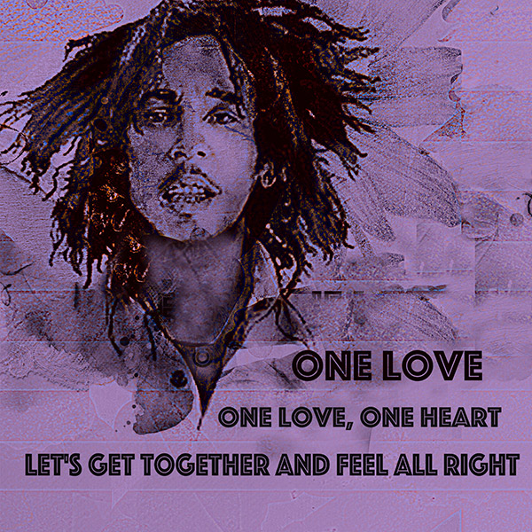
Used a bunch of filters. First used the colored pencil on the photo, then turned it into a black and white. Used a high pass filter to give it a gritty feel. Then finished off with a color transfer neural PS filter.

Used Anna Aspnes' APP Bountiful.
 
Back
Top