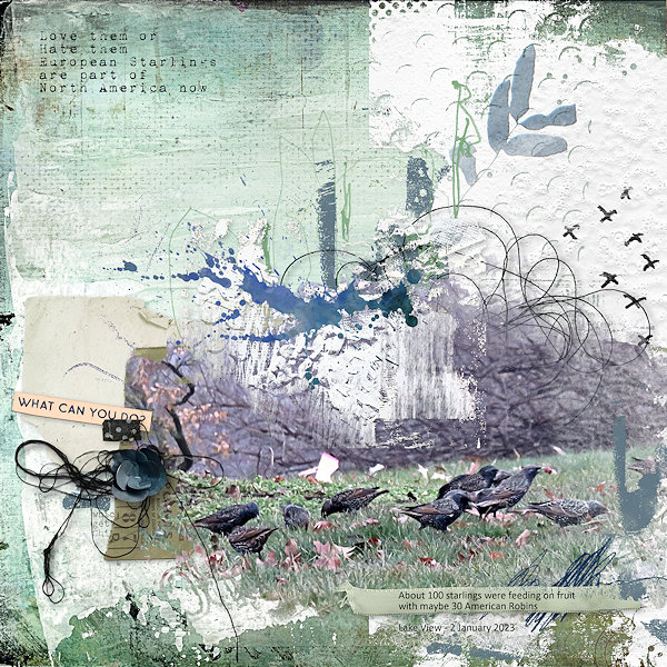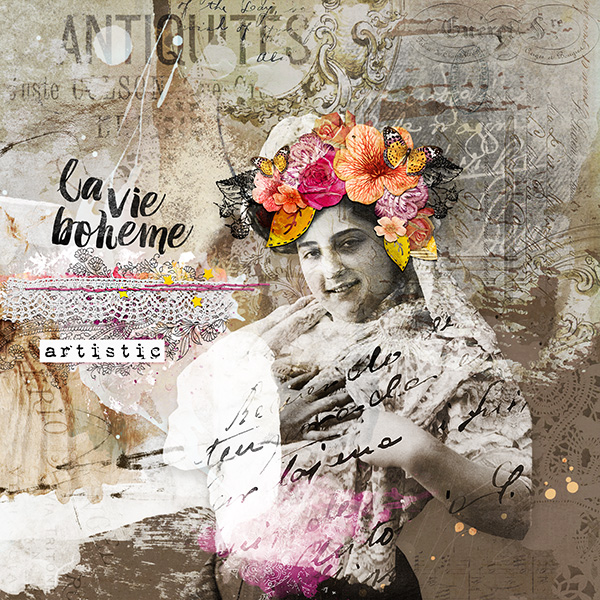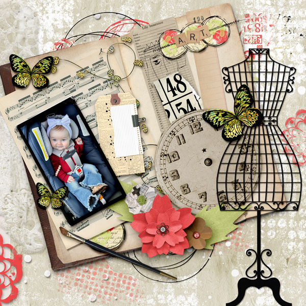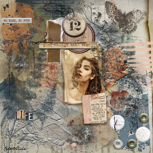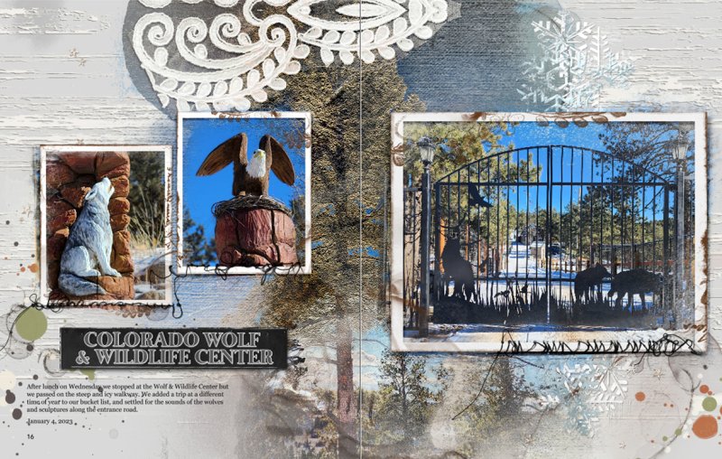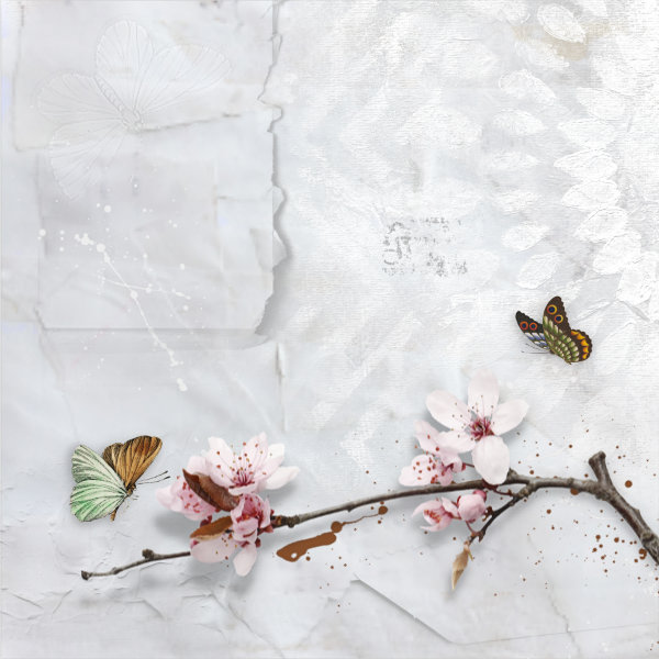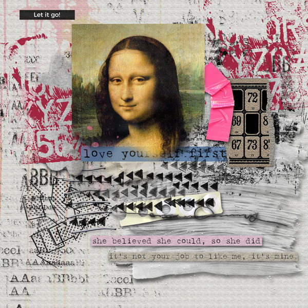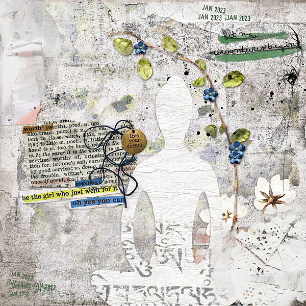
All members that participate, can everyone PLEASE ensure that you read all the rules
for this challenge so that you can claim your challenge points. Thank you!
Hello and welcome to the first Mixed Media challenge for January 2023! I hope you all have had a great Christmas and New Years' and are ready to dive back into creating some art!
As a general rule of thumb, a Mixed Media page is created with a variety of mixed mediums such as gesso, paint (splatters, strokes, blobs, splats), stamps, stencils etc. What makes this type of page stand out is also the use of texture. This is what we will explore in this challenge, how to create texture on a digital page.
In a physical hands-on mixed media project, texture can be created by using mediums like gesso, texture paste and/or gel mediums. You can apply these mediums with sponges, paint brushes, your fingers, or a palette knife to lay the medium down and then roughen it up even further by laying something coarse over the top of it, like a piece of corrugated cardboard, a thick piece of material or by using a stencil. These types of projects are wonderful to look at as they add so much interest and also, importantly, they make the piece tactile to touch, I just love running my fingers over these types of projects, to feel the contrast between the smooth and rough patches of the art piece.
But how do you translate that to digital, what can be done to give a digital piece that tactile feel? No doubt there are many ways but I tend to stay with shadowing and sharpening on some of the things I use. While this isn't a full-on Creative Technique tutorial/challenge, you will find some helpful tips on how I used these two techniques to give my digital page some depth and interest. Read on.

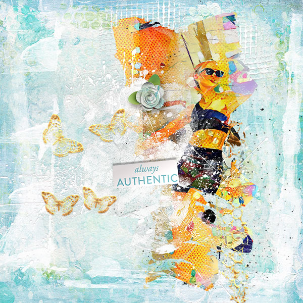
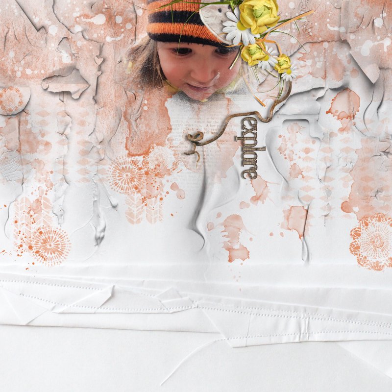
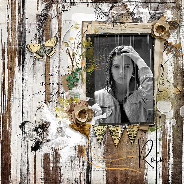
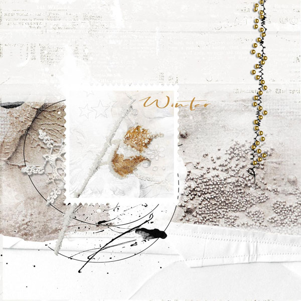
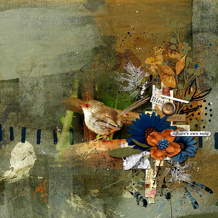
But first, here is my page:
Credits are in the gallery.
Notes about my page:
- Wherever I can, I always like to use the textured products that the designers have already created, like papers, paint splatters and gesso etc.
- Also, don't forget about textured overlays, these can be clipped to a solid paper to give it texture or clipped to an object, like paint splatters, to give it more texture.
- I have used two favorite techniques on this layout, adding a drop shadow to gesso and using the High Pass filter to sharpen the background paper here is are two screen shots of how I did this:
Using High Pass filter to sharpen:
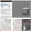
Using a drop shadow on gesso to give it more definition:
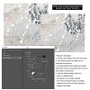
Important note to remember:
Use these techniques on some of your work, not on every paint splat or gesso blob you use on your page.
 Some paints IRL are applied thinly so they look flat, while others are applied thickly so they will create small drop shadows and be more textured.
When you look at a physical mixed media artwork, you will note that there are variations throughout it, some smooth areas and some textured areas, some textures are subtle while others are prominent so make sure to do the same thing on your own digital pages. Variations equate to creating interest, so try to vary the techniques you use.

There are other techniques like embossing that can also be used but I don't use it that often in my own work, so please share your techniques if you do!
Note: If you use a different application and don't have Photoshop's ability in regards to drop shadowing and sharpening techniques mentioned above, then please use what ever applications can be in your own program and tell me here in the thread when you add your layout.

-------------------------------------------------------------------------------------------------------------------------------
RULES:
- Create a mixed media page using some TEXTURE(s), and if you try out one of the techniques explained above then please let me know in this thread which one you used. For those that do not have Photoshop or Photoshop Elements, please read the red text above. You can scrap about anything you like, and you can use a photo or just go photo-less.
- Please use 80% Oscraps products that are currently in the store.
- Non-Oscraps products or retired O designer products can be used whether the designer is selling elsewhere or not.
- You need to credit all the products used on your layout.
- Your layout can not be used for more than one challenge.
- Your page must be posted in the Challenge 7 gallery by midnight PST January 31st 2023 and linked back to this thread (see below on how to add your linked layout).
- And do not forget to update the CURRENT MONTH'S TRACKING THREAD to be eligible for your coupon.
Adding a linked layout from the Gallery to a thread:
1. Upload your layout to the gallery first. In your forum post click the Gallery Embed icon (little camera).
2. This will open your gallery, simply click on the layout you require, then scroll down to the bottom of the screen and click the Continue button.
3. Your linked layout is now in your post, the image will appear once you have clicked the Post Reply button.
Last edited:
