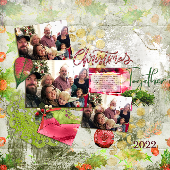
OMG!I have been playing with products from our new guest designer Sarapullka Scraps and just loving them! ♥
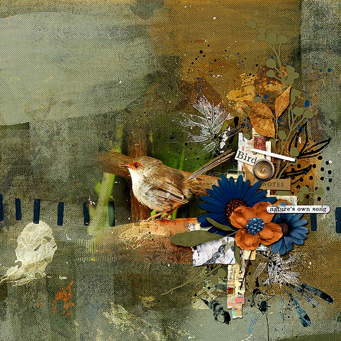
This is a page I did today using Larisa's Music of Earth: Rythyms of Nature Bundle and Rachel Jefferries's Music of the Earth: The Pace of Nature collection. Larisa and Rachel created their collections as a collaborations and they work beautifully together!
BIRD NOTES
Created with Oscraps products:
Music of Earth: Rythyms of Nature Bundle | Sarapullka Scraps...
Oscraps
- Home
- Forums
- Archive - Previous Challenges and Events
- Challenges Archive
- 2023 CHALLENGES ARCHIVE
- JANUARY 2023 CHALLENGES
You are using an out of date browser. It may not display this or other websites correctly.
You should upgrade or use an alternative browser.
You should upgrade or use an alternative browser.
January Challenge #7 - Artsy/Mixed Media
- Thread starter wombat146
- Start date
FroggyCelineT
Active Member
Thanks for the tips, Ona, on the shadows for the gesso. Here's a bit of process for my page:
Since I added gesso on top of the curled tag and filmstrip, I made 3 copies of the gesso and inserted them in between the tag and filmstrip, added one on top of the tag and one underneath the filmstrip. Then I clipped the top gesso to the tag. That allowed the shadow for the curled tag to remain. Then I clipped the middle gesso to the filmstrip, allowing that shadow to be seen. The bottom copy of the gesso is the one I added the slight drop shadow to. I did the same process with the gesso above right. I used the same process with the paint on the title paper strip. i did not add a texture or shadow to the paint. I did add texture throughout the page using Anna's spackle kit. The rest of the page is Rachel's.
Since I added gesso on top of the curled tag and filmstrip, I made 3 copies of the gesso and inserted them in between the tag and filmstrip, added one on top of the tag and one underneath the filmstrip. Then I clipped the top gesso to the tag. That allowed the shadow for the curled tag to remain. Then I clipped the middle gesso to the filmstrip, allowing that shadow to be seen. The bottom copy of the gesso is the one I added the slight drop shadow to. I did the same process with the gesso above right. I used the same process with the paint on the title paper strip. i did not add a texture or shadow to the paint. I did add texture throughout the page using Anna's spackle kit. The rest of the page is Rachel's.
*gina*
Well-Known Member
Thank you so much for the challenge and for inspiration
I used High Pass on the background and the overlay, a Drop Shadow on the stamp
I used High Pass on the background and the overlay, a Drop Shadow on the stamp
zlemon
Christy
Super challenge. Thanks for hosting, Ona.
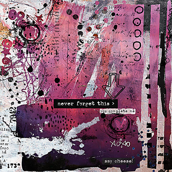
I used a high pass filter on the entire page, then masked out the purple-pink color—made the background seem edgier. Such a talent group of artist's here.
Used Rachel Jefferies goodies: This is Now kit, Sinopia bits&bobs & papers, Epic cosmic stuff, and true&free bitsandbobs.
I used a high pass filter on the entire page, then masked out the purple-pink color—made the background seem edgier. Such a talent group of artist's here.
Used Rachel Jefferies goodies: This is Now kit, Sinopia bits&bobs & papers, Epic cosmic stuff, and true&free bitsandbobs.
#7: you-complete-me.jpg
- zlemon
- 9
Always love a mixed media challenge. This is an edgy valentine that I may or may not give to my...
Last edited:
Pia/Pippin
Well-Known Member
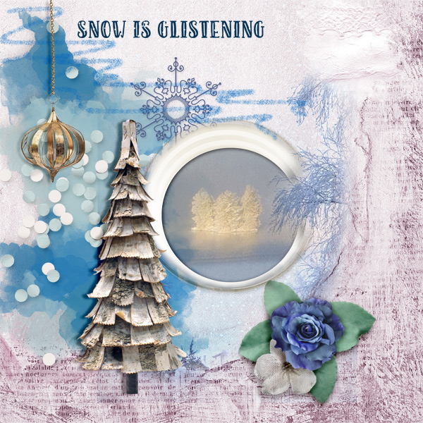
Fun challenge! Here is my page.
Snow-is-glistening.jpg
Created with [URL='https://www.oscraps.com/shop/Snow-Maiden.html']Snow Maiden kit[/URL] by ViVa...
LazyDaisy
Well-Known Member
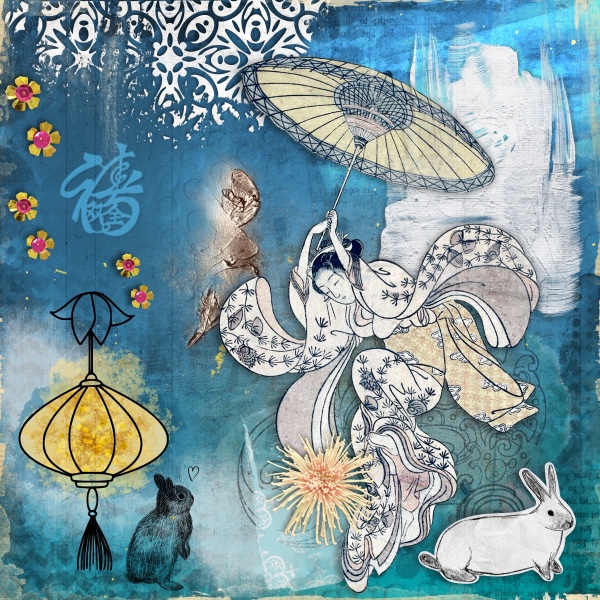
Thank you for the challenge. I added 2 gesso element, I had to add more texture to them to emphasise more & I created shadows for them. I tried to emboss the Chinese character but I lost resolution when I resized, I will have to experiment with the technique. I used an overlay over the background to give a look of debossing. I used splatters & more textured elements as well. I would never thought about embossing so thank you again.
January Challenge #7 - Artsy/Mixed Media
January Challenge #7 - Artsy/Mixed Media
I use Procreate so to create for the challenge.
I...
I use Procreate so to create for the challenge.
I...
Amandajk
Holy Nomad
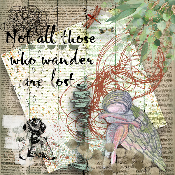
I USED LINEAR ON THE PAPER, GIRL AND THREAD
I USED A HEAVY DROP SHADOW ON THE GREEN PAINT
LOST IN MY MIND BY CRAFTY BUTTON DESIGNS
I USED A HEAVY DROP SHADOW ON THE GREEN PAINT
LOST IN MY MIND BY CRAFTY BUTTON DESIGNS
LOST---ARTSY--JAN-23-WED.jpg
[URL='https://www.oscraps.com/shop/Lost-in-My-Mind-Kit.html']LOST IN MY MIND BY CRAFTY BUTTON...
ViVre
Well-Known Member
Hi Ona, just in time ........ !!
ArtJournal pages are very difficult to me, and that's why i heart your challenge! Out of my comfort zone!
There are many many beautiful layouts in this thread.
Here's mine:
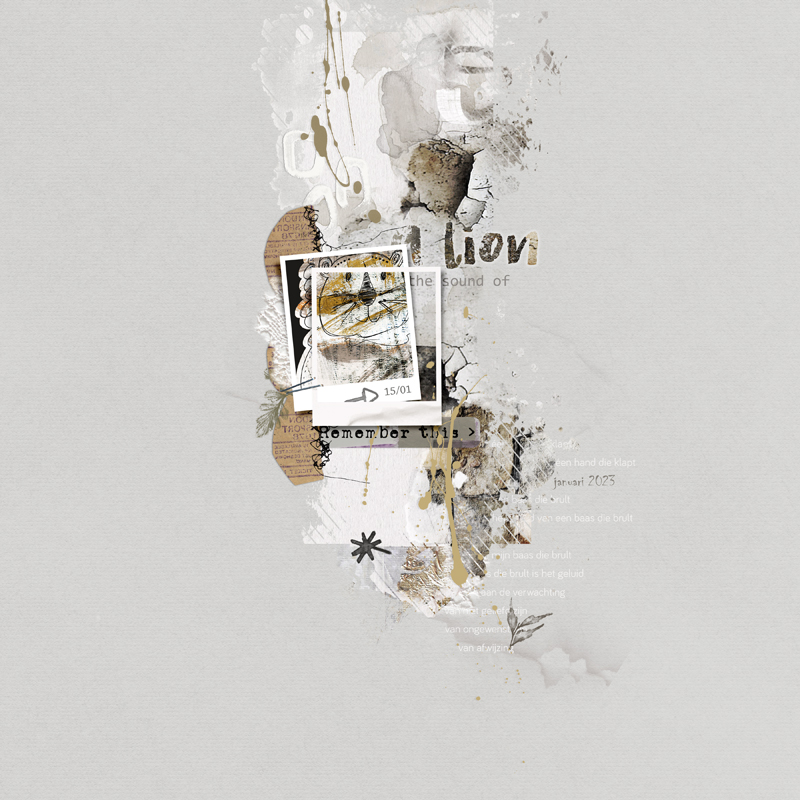
On the left-side of the lion you see a lace: there i used that filter you've explained.
And above the frames are three small circles: their shadow is due to this challenge
xx ViVre
ArtJournal pages are very difficult to me, and that's why i heart your challenge! Out of my comfort zone!
There are many many beautiful layouts in this thread.
Here's mine:

On the left-side of the lion you see a lace: there i used that filter you've explained.
And above the frames are three small circles: their shadow is due to this challenge

xx ViVre
