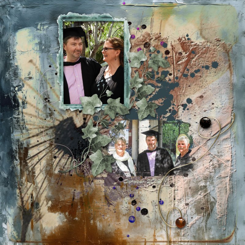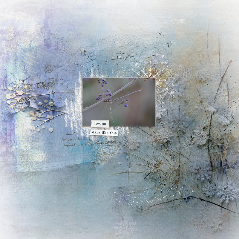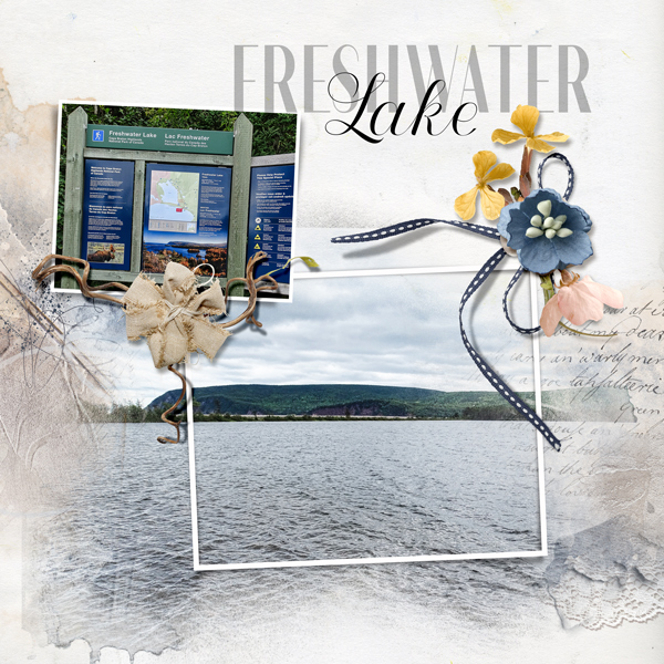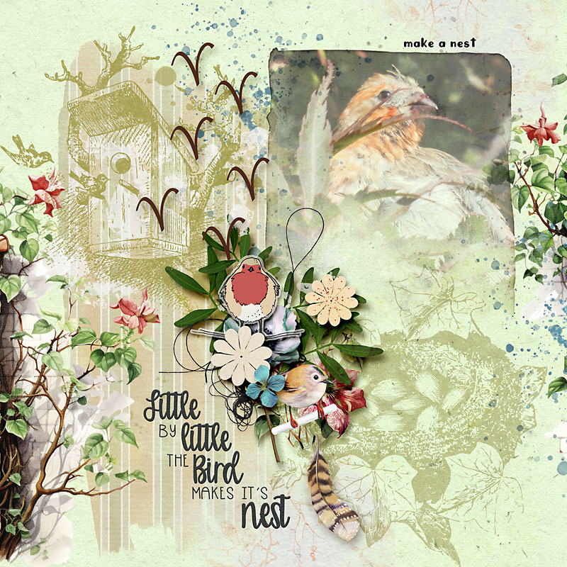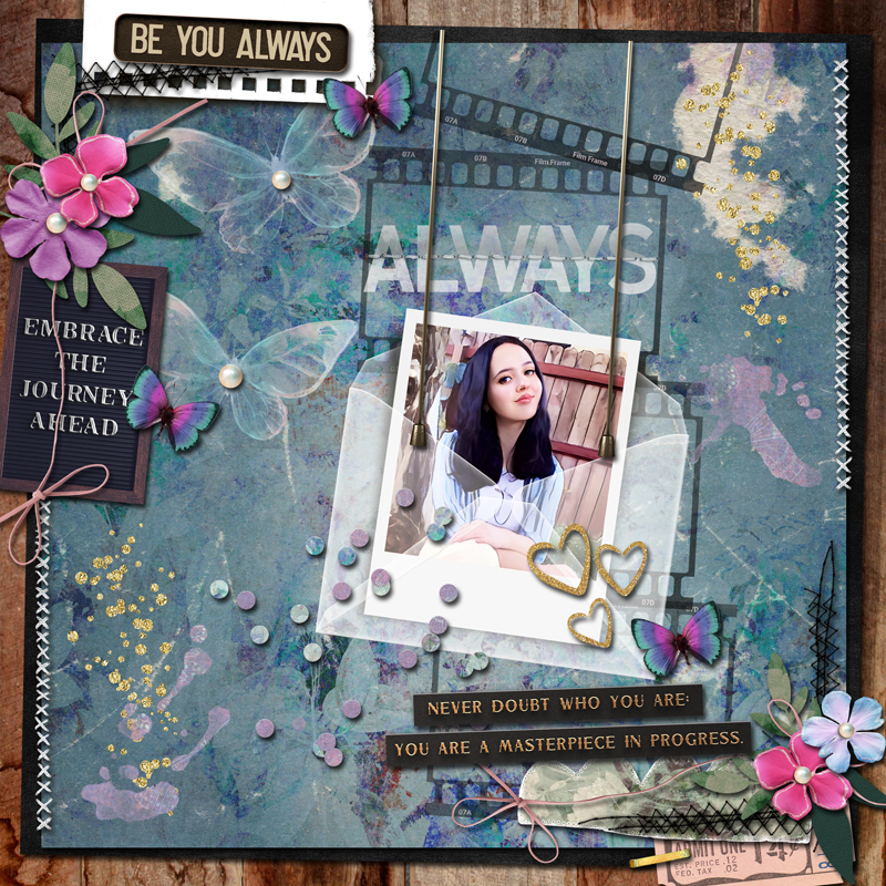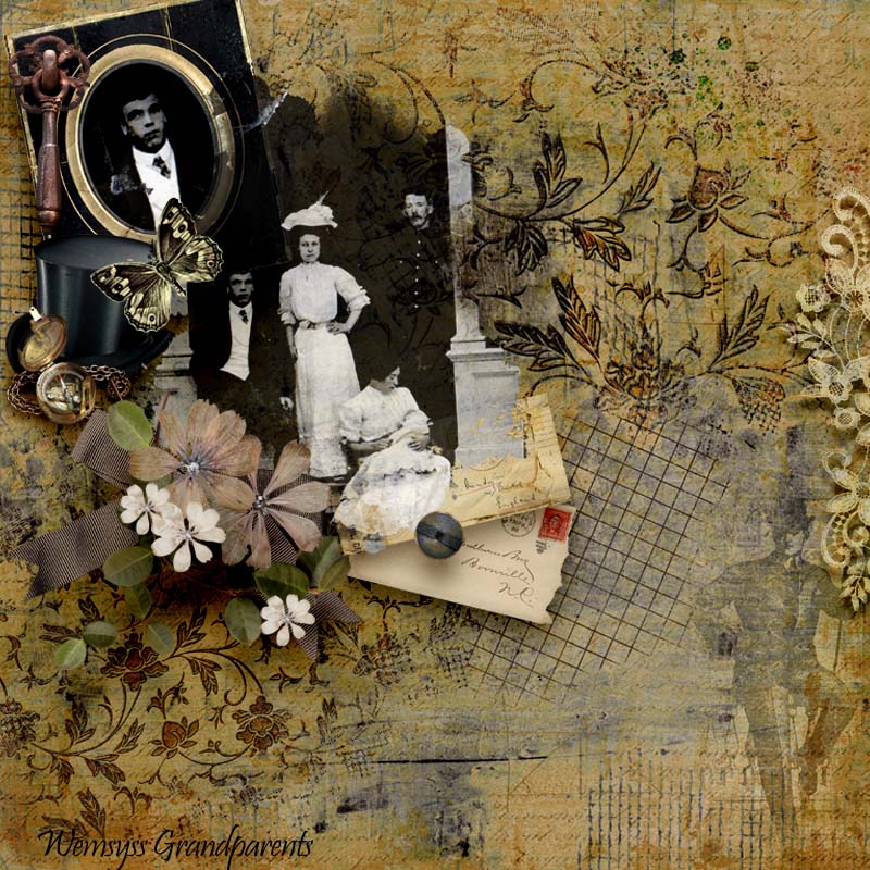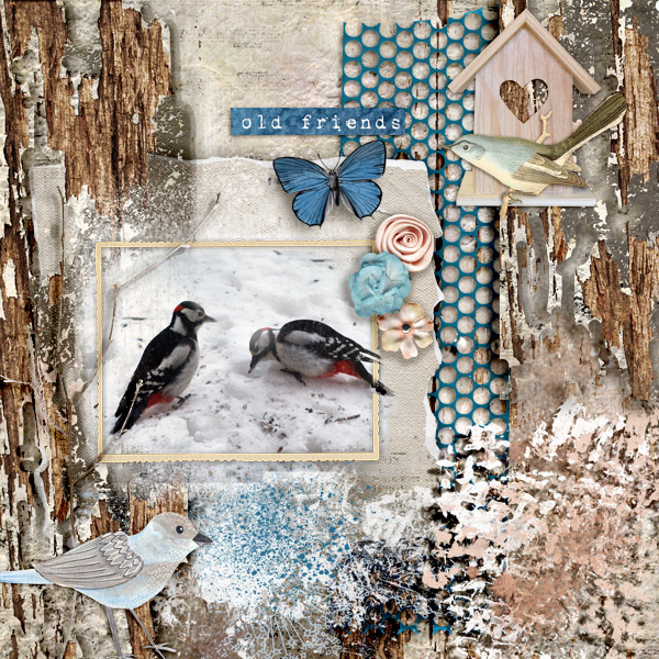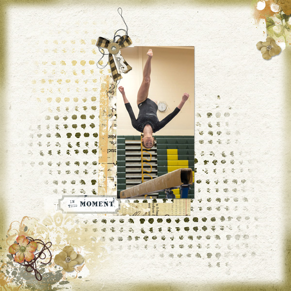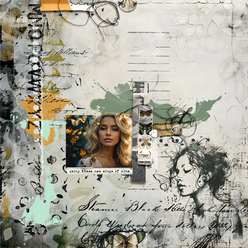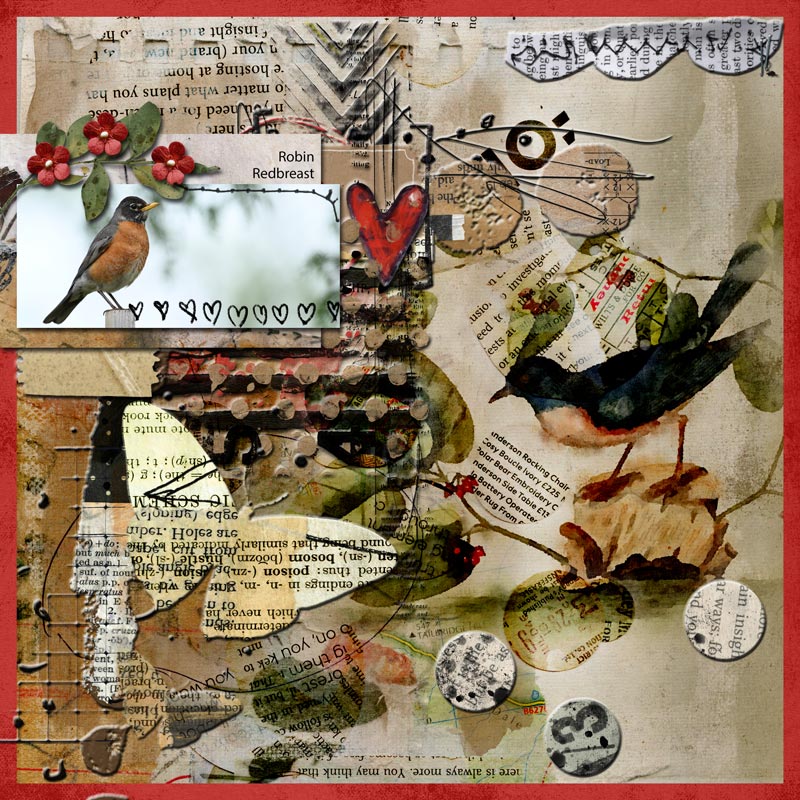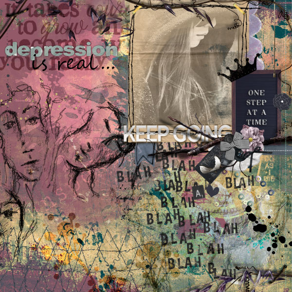
All members that participate, can everyone PLEASE ensure that you read all the rules for this challenge
so that you can claim your challenge points. Thank you!

Hi everyone and welcome to the first Artsy/Mixed Media challenge for 2024! I sincerely hope that the new year brings you all lots of joy, happiness, peace and good health! xx

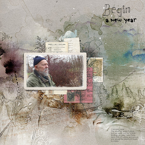
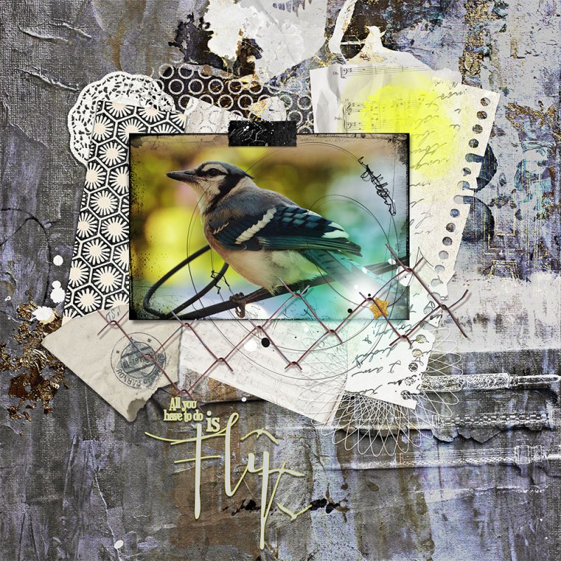
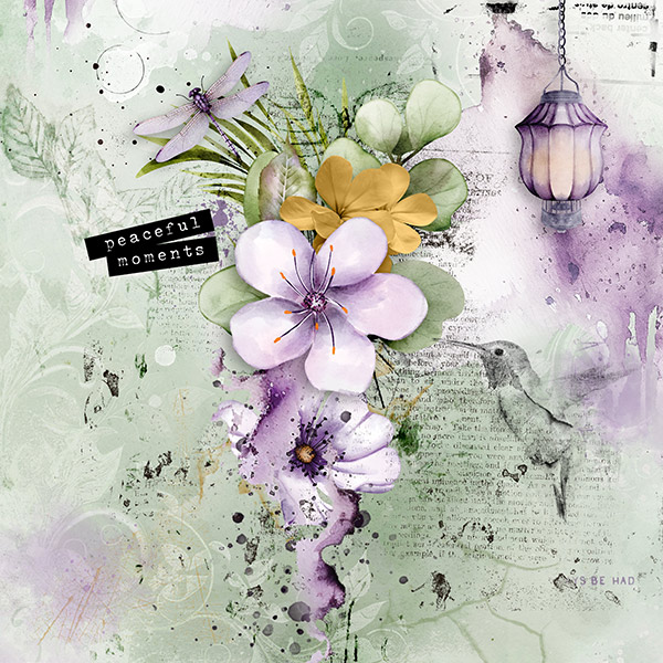
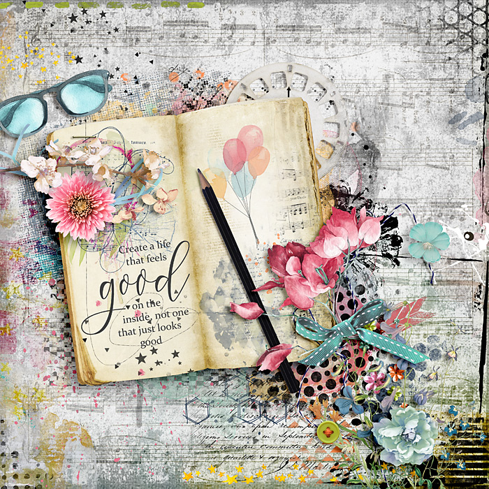
The most basic requirement for this challenge is to create an artsy/mixed media layout. This means I would like to see LOTS of paint, stamping, brushwork and grunge on your page! This is the time to get MESSY!! So I want to see lots of textures, because that is what mixed media means, using a range of different media and in digital form this means using textures that stand out, using colours that contrast (whether they be bold or pastel) and using brushwork or png stamps to add depth your layout.
I find it easier to actually start off with a mixed media paper, most of the hard work has already been done for you!
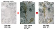
 You can even blend some papers together to create your very own version if you want to. For instance, here are two yummy textured papers created by Rachel Jefferies from The Mixed Media Signature Kits: Oxley that I blended together. The one of left has that fabulous netting/fabric texture but I wanted some colour added so I chose the one on the right, with it's wonderful stamping of foliage on it.
I used a Color Burn blend on it and then brought back the Fill mode to 86%. (In Photoshop the Fill mode is similar to Opacity but I will be covering the difference in an upcoming Creative Techniques challenge soon.
 )
)Of course I didn't stop there!
 I wanted to accentuate the texture of the netting/fabric a bit more so I used my most favorite sharpening technique, the High Pass filter in Photoshop. I tend to use this technique a lot as it gives such great results.
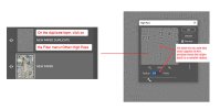
- Create a duplicate of the layer you want to sharpen, in this instance, for me, it is the new paper I created above.
- Now click on the Filter menu and then click Other>High Pass.
- Use the slider to increase the sharpening by moving it to the right and to lessen it by moving it back to the left.
- The moment you see some color starting to creep into the preview window, slide back to the left.
When you click OK to exit the High Pass dialogue box you will see just see grey, but don't worry, now we need to change the blend mode to Linear Light or Soft Light, depending on just how 'strong' you want the sharpening effect to be. Below you will see a close up of the High Pass effect that I applied above; on the left duplicate/sharpen layer has a Blend mode of Linear Light at 100% Opacity; the middle example uses a Linear Light but the Opacity has been lowered to 57% and the example on the right is what it looks like when a Soft Light blend has been applied at a full Opacity of 100%.
As you can see each is quite different and it just depends on what type of effect you are after. For mixed media layouts like this I tend to stay with Linear Light at different opacities, and for completed standard layouts I sometimes will apply a High Pass filter using the Soft Light blend, the opacity is dependent on what type of layout it is. Sharpening is quite subjective so all you can do is go with what YOU like.

Here is my finished page:
RULES:
- Create an artsy/mixed media layout using any theme, your page needs to have a variety of mixed media like paints, paper piecies, fabric, stamping, brushwork etc etc. I want to see LOTS of textures, not just a paint splatter behind a photo!
 You can use photos or not, your choice.
- Please use 80% Oscraps products that are currently in the store.
- Non-Oscraps products or retired O designer products can be used whether the designer is selling elsewhere or not.
- You need to credit all the products used on your layout.
- Your layout can not be used for more than one challenge.
- Your page must be posted in the Challenge 5 gallery by midnight PST January 31 2024 and linked back to this thread (see below on how to add your linked layout).
- And do not forget to update the CURRENT MONTH'S TRACKING THREAD to be eligible for your coupon.
Adding a linked layout from the Gallery to a thread:
1. Upload your layout to the gallery first. In your forum post click the Gallery Embed icon (little camera).
2. This will open your gallery, simply click on the layout you require, then scroll down to the bottom of the screen and click the Continue button.
3. Your linked layout is now in your post, the image will appear once you have clicked the Post Reply button.
Last edited:


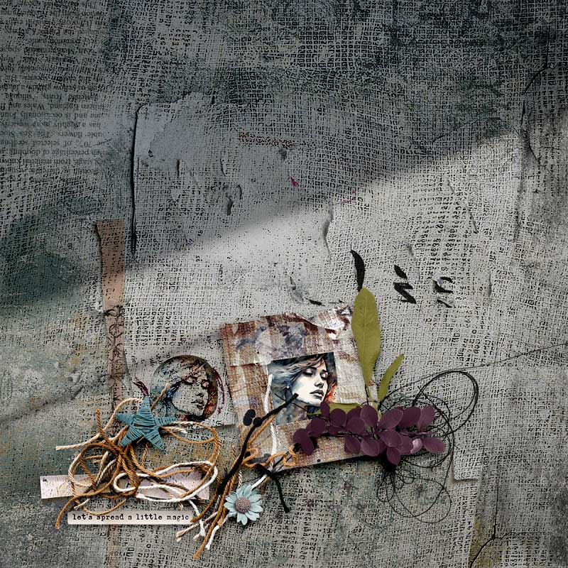
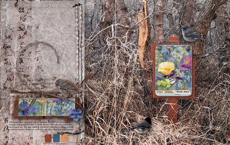
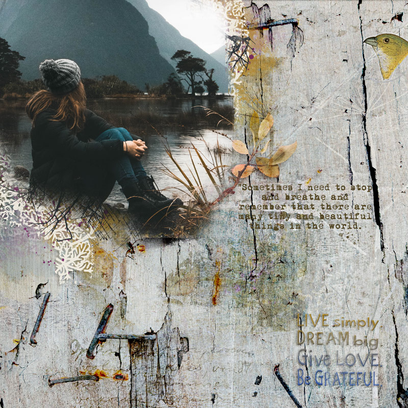
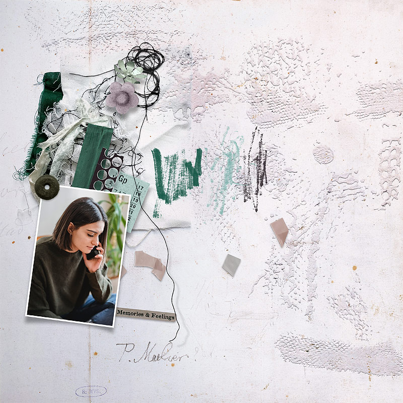
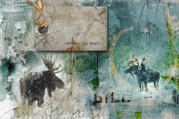


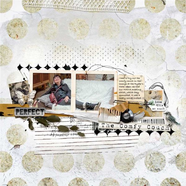
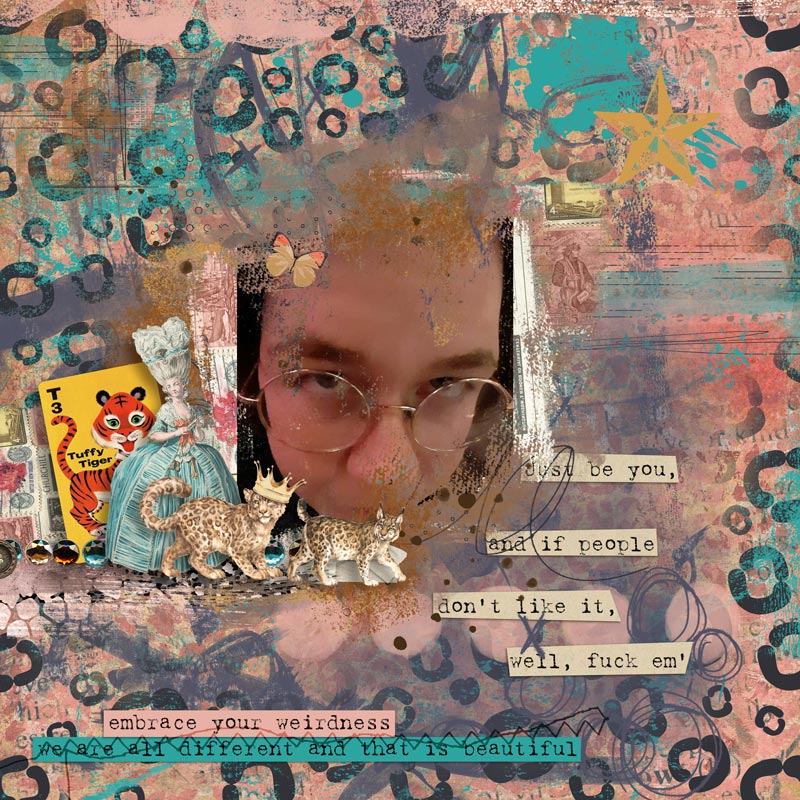
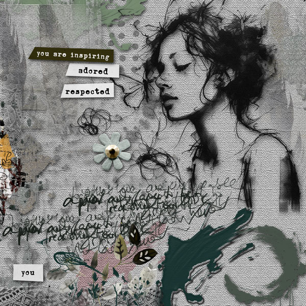
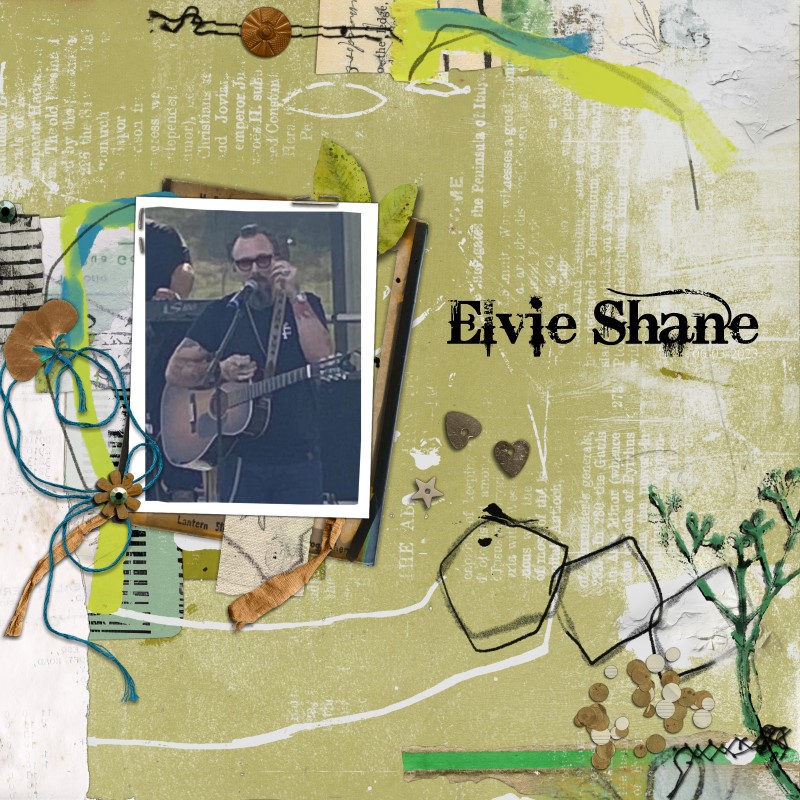
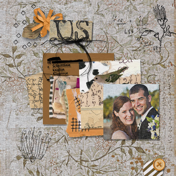
 look at all of the gorgeous layouts that have been added!! fabulous work guys!!!
