margje
The O is awesOme

All members that participate, can everyone PLEASE ensure that you read all the rules for this challenge
so that you can claim your challenge points. Thank you!
")
Welcome to the Creative Techniques Challenge!
This month it is all about the post processing of your layout!
After you did all the hard work on your beautiful page there are still some steps you could take!
After the finishing of a design it could make your page so much more interesting when you go through some final steps.
Let me give you some examples of my workflow and how I most of the time finish my layout!
After the merging on my full sized JPEG I
- Do a Dodge and Burn layer ( You can do this multiple ways in Photoshop or PSE and I think several other graphic programs) You can use the Dodge and Burn tools of your program on a duplicated layer, but my preference is to make a new layer on top and fill it with 50% Gray. Set this layer to Overlay. You can now paint with Black to darken, and with White to lighten. Use a soft brush with not all 100 % the opacity so you can build things up! Ad light and shadow this way! You can use lighter or darker colors for this too !
- Look at the colors of the layout and enhance them with the 50% Gray layer set to Overlay. You can make your colors softer or more intense with a deeper or softer color on your brush! You have full controle when you paint on your layer above your layout! Remember you can always lower the opacity of this layer.
-Look at the subject and what you want to focus on the page! Maybe you can use a bit of Gaussian or even Motion Blur on a duplicate layer of your page. I often use a black layermask to paint in some effects back with a white brush! Motion or radial blur looks awesome when you want to create some motion.
-Give the page a warm or cool Photo filter ( you can find that in your Adjustment Filters) It can also be done when opening a Paper from a kit on the top layer and blend that in, or make a solid color layer yourself, or even a gradient layer will do a wonderful job! Use a blending mode on that layer and play with the opacity. All on a new layer above your page!
-Play with the depth of field of the layout. Make it more 3D with all kinds of stuff! Use some texture brushes on a new layer or play with (set to Black and White) papers with some texture that you can paint in. Or use some bokeh. Make some larger shadows with elements you used from a kit ( like I did in my sample page) You can add floral shadows for example. Fill the element with a color and give it some blur and play with the opacity! Layer it over your page! You can also paint it in with a layermask! It will give your page so much more interest.
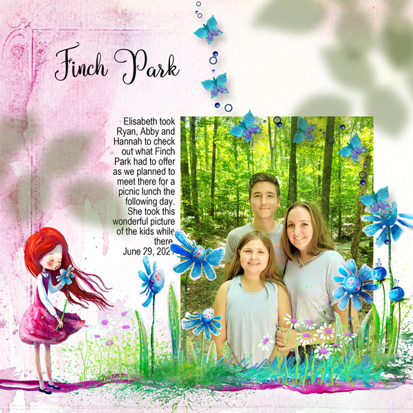
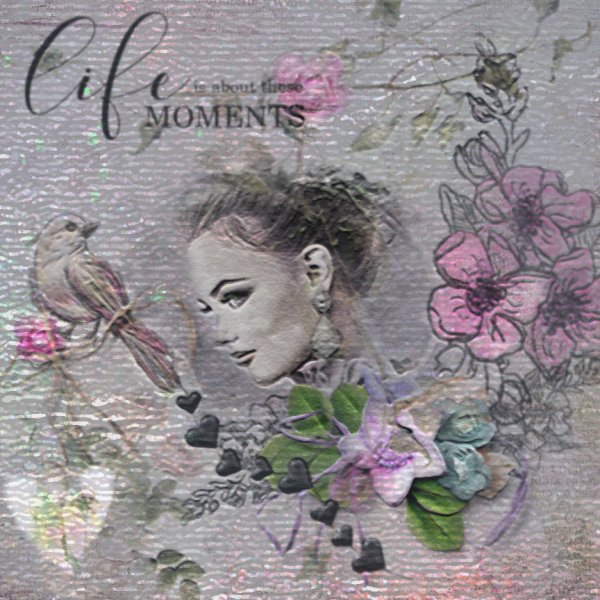
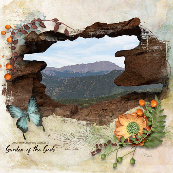
Here is a page (that was already in the gallery) where I used some floral elements from the APP Veranda over the layout! I gave them a green color and a lot of Gaussian Blur and I played with the opacity! Can you see the depth that it added? On this page I did the 50% gray layer in Overlay Blending mode technique with the Dodge and Burning and the Coloring too!
The easy way to make this 50% gray layer in Photoshop is to go to New Layer and then on that new layer to Edit- Fill- 50% Gray- uncheck Preserve Transparancy and hit OK! Color is # 282828 if you want to just dial it in on a new layer. Don't forget to set this layer in Overlay Blend mode. Don't forget to change the settings later on because Photoshop will stay in this setting when you use the Color Fill tool the next time
Here are some screenshots:


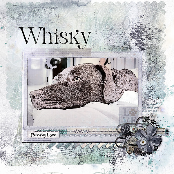
Here is the layout I made for this Challenge:

Maya Bundle by Aftermidnight Designs
I used all of the above techniques!
I hope that everything is clear! If not just ask away!
Have fun!
RULES:I hope that everything is clear! If not just ask away!
Have fun!
- I challenge you to do some post processing of/on your layout! Use at least 2 of the steps that are listed above, you are very welcome to do more! If you use a photo editing program other than Photoshop or PSE you can do similar things in the program you use! Please write in the forum what you did and let us know about the steps you added to complete your page!
- Please use 80% Oscraps products that are currently in the store.
- Non-Oscraps products or retired O designer products can be used whether the designer is selling elsewhere or not.
- You need to credit all the products used on your layout.
- Your layout can not be used for more than one challenge.
- Your page must be posted in the Challenge 1 gallery by midnight PST July 31 2021 and linked back to this thread (see below on how to add your linked layout).
- And do not forget to update the CURRENT MONTH'S TRACKING THREAD to be eligible for your coupon.
Adding a linked layout from the Gallery to a thread:
1. Upload your layout to the gallery first. In your forum post click the Gallery Embed icon (little camera).
2. This will open your gallery, simply click on the layout you require, then scroll down to the bottom of the screen and click the Continue button.
3. Your linked layout is now in your post, the image will appear once you have clicked the Post Reply button.
Last edited: