Oscraps

***CLOSED*** August Challenge #5 - Sketch

Status
Not open for further replies.

*sylvia*

♥→o←♥
CHEERY O
2021-PAGE-SKETCH-WEB.jpg


All members that participate, can everyone
PLEASE ensure that you read all the rules for this challenge
so that you can claim your challenge points. Thank you!

Hi everyone, Sylvia here welcoming you to the SKETCH challenge for August.

I hope you’ll all enjoy scrapping along with me.

♥ ♥ ♥

For this challenge, I was searching around the www and found this artsy one by scrapfriends.
Use this as inspiration for your layout.
Your layout doesn't have to look exactly like this sketch, but I should be able to see how the sketch influenced your layout.

And my twist for you.
Your photos have to be black/white.

sketch_44.jpg


my layout

Sketch.jpg

I used

rjefferies-somewhereinbetween-collection-800.jpg


Have fun!

Can't wait to see how this challenge inspires you!​

........................................................................................................................................................................................................................................................................

RULES:
  1. Use the provided sketch as a starting point for your layout.
  2. Your photos have to be black/white.
  3. Please use 80% Oscraps products that are currently in the store.
  4. Non-Oscraps products or retired O designer products can be used whether the designer is selling elsewhere or not.
  5. You need to credit all the products used on your layout.
  6. Your page must be posted in the CHALLENGE 5 GALLERY by midnight PST 31 August 2023 and linked back to this thread (see below on how to add your linked layout).
  7. And do not forget to update the CURRENT MONTH'S TRACKING THREAD to be eligible for your coupon.

Adding a linked layout from the gallery to a thread:
  1. Upload your layout to the gallery first. In your forum post click the gallery embed icon (little camera).
  2. This will open your gallery, simply click on the layout you require, then scroll down to the bottom of the screen and click the continue button.
  3. Your linked layout is now in your post, the image will appear once you have clicked the post reply button.


Last edited:

*sylvia*

♥→o←♥
CHEERY O
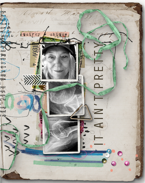
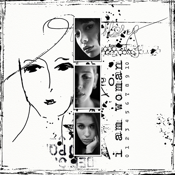
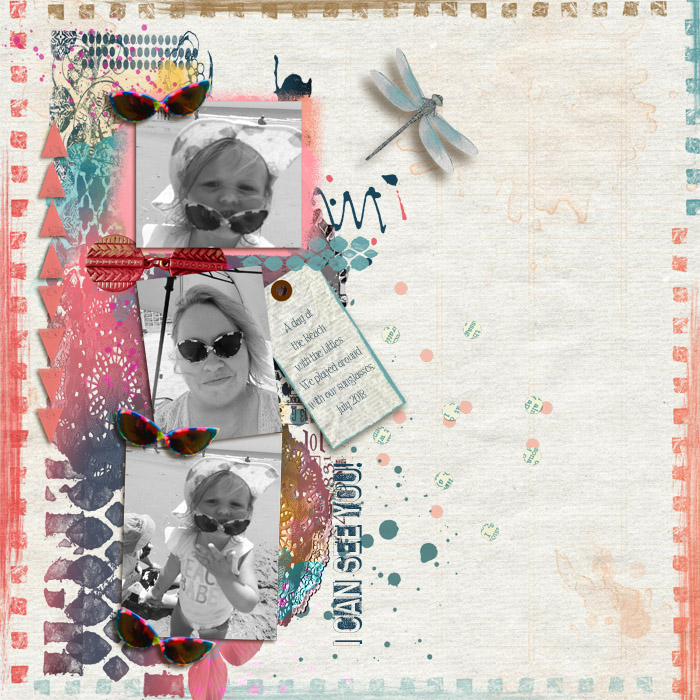
Thanks for the challenge! This turned out to get me well on my way into the month's challenges right away. When I see a challenge and it's really hard, I start on it right away. :D


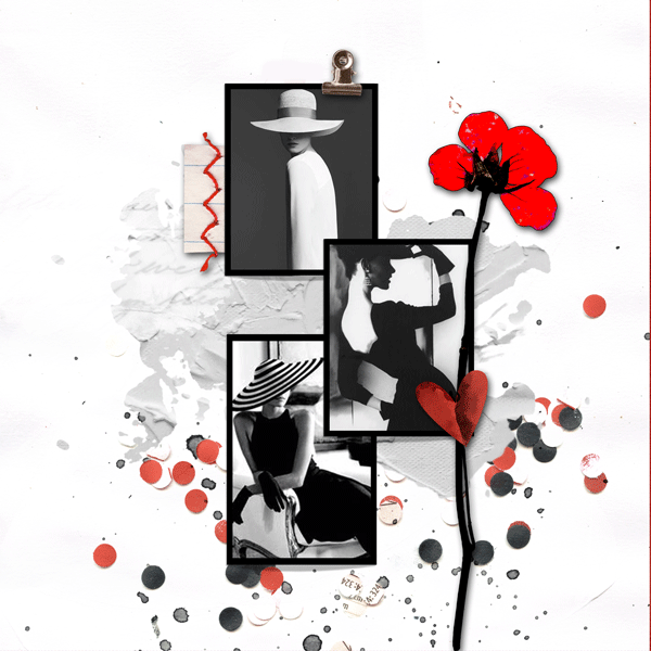
Amazing layout. I really like the use of the sketchbook. It fits so well. And the scattered elements add the finishing touch to your page. Your photos look dramatic and remind me of my broken ankle that needed surgery.
Thanks for joining the Sketch Challenge this month.
 

*sylvia*

♥→o←♥
CHEERY O
Love your challenge Sylvia!
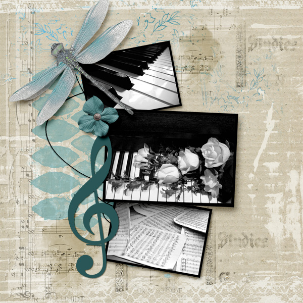
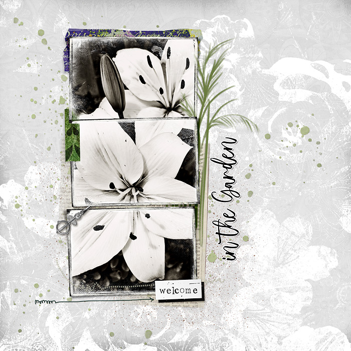
Es hat mir viel Spaß gemacht ein Layout zu erstellen und hier ist meine Version:


Das ist eine fabelhafte Umsetzung der Vorlage. Sehr kreativ und perfekt auf den Punkt gebracht. Die zarten Farben und gewählten Akzente machen dein Layout zu einem "Hingucker". Danke für deine Teilnahme.
 

*sylvia*

♥→o←♥
CHEERY O
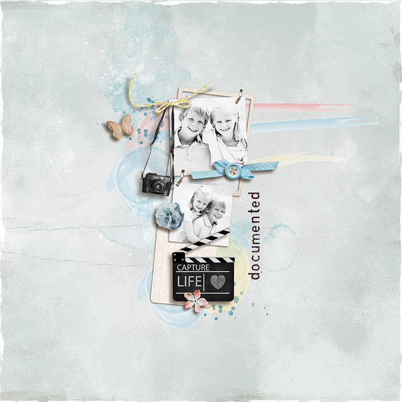
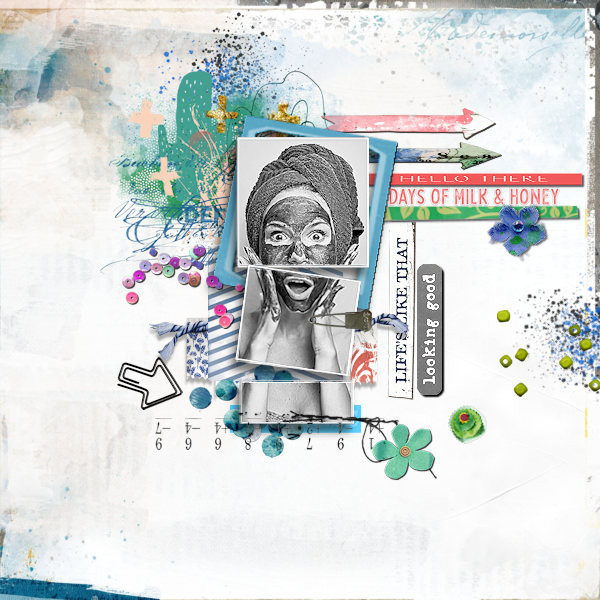
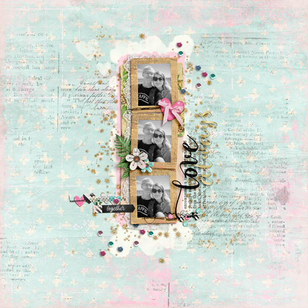
Thank you, Sylvia for this challenge. It took me a while, but now it's done.


Das ist genial, Susanne. Das Design und die Kombination der unterschiedlichen Produkte ist einfach perfekt. Dazu das Foto und wie du es geteilt hast - SUPER!
Danke für deine Teilnahme.
 

*sylvia*

♥→o←♥
CHEERY O

*sylvia*

♥→o←♥
CHEERY O
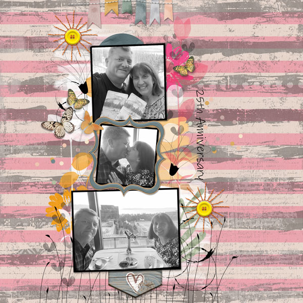
Hi Sylvia! Here´s my take on the fun sketch:

Such an amazing layout with the elegant design and all the tiny accents. I LOVE everything in it and your photos are the highlight.
Thanks for joining the Sketch Challenge this month.
 

*sylvia*

♥→o←♥
CHEERY O
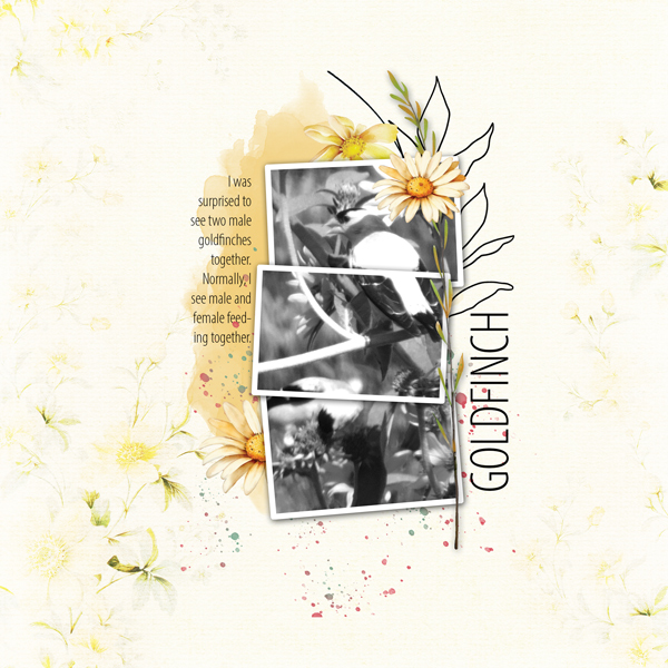
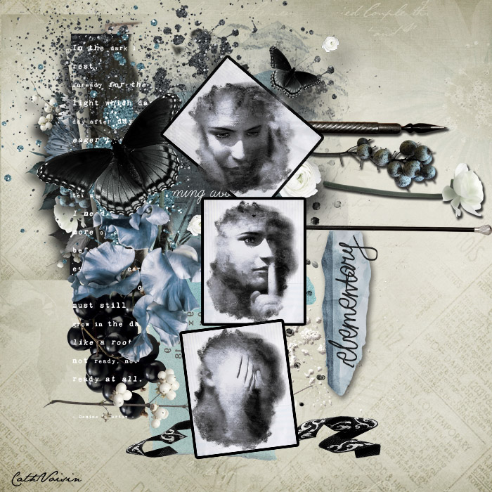
Thank you for this challenge Sylvia !
Hear nothing, say nothing, see nothing.
First of all, I LOVE the message of your page and the artistic interpretation of the sketch. The photo effect effect is simply stunning also the color combination you chose.
Thanks for joining the Sketch Challenge this month.
 

*sylvia*

♥→o←♥
CHEERY O

The framing is as cool and creative as the "Gina-typical" OOB. The color scheme makes the layout look very sober and stylish. And even the few accents are carefully selected and placed. Awesome layout.
Thanks for joining the Sketch Challenge this month.
 

*gina*

Well-Known Member
The framing is as cool and creative as the "Gina-typical" OOB. The color scheme makes the layout look very sober and stylish. And even the few accents are carefully selected and placed. Awesome layout.
Thanks for joining the Sketch Challenge this month.
thank you so much, Sylvia
 
Status
Not open for further replies.
Top