Oscraps

*CLOSED* - May Challenge #6 - White Space / Clean

Status
Not open for further replies.

*gina*

Well-Known Member
1681898172481.png

All members that participate, can everyone PLEASE ensure that you read all the rules for this challenge
so that you can claim your challenge points. Thank you!


Hi everyone - my name is Gina and I welcome you to the May White Space / Clean Challenge.

White space means a lot of free space on your layout and very few elements.

Your challenge is to create a layout using:
3 different photos, 3 different papers and 3 different elements.
You think that's not possible? Be sure - it works.

But I want to challenge you a little bit more.
The arrangement must be either vertical or horizontal.

You can add a title, but this is optional.

For my example I used Sweet Dreams Galaxy Kit and
Sweet Dreams Galaxy Extra Papers by Connection Keeping.

mystar.jpg

Have fun!
RULES:
- Create a white space layout by using 3 different photos, 3 different papers and 3 different elements. The arrangement must be vertical or horizontal.
- Please use 80% Oscraps products that are currently in the store.
- Non-Oscraps products or retired O designer products can be used whether the designer is selling elsewhere or not.
- You need to credit all the products used on your layout.
- Your page must be posted in the Challenge 6 gallery by midnight PST May 31 2023 and linked back to this thread (see below on how to add your linked layout).
- And do not forget to update the CURRENT MONTH'S TRACKING THREAD to be eligible for your coupon.


Adding a linked layout from the Gallery to a thread:
1. Upload your layout to the gallery first. In your forum post click the Gallery Embed icon (little camera).
2. This will open your gallery, simply click on the layout you require, then scroll down to the bottom of the screen and click the Continue button.
3. Your linked layout is now in your post, the image will appear once you have clicked the Post Reply button.
 
Last edited:

*gina*

Well-Known Member
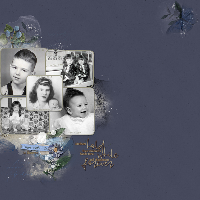
White space is so hard for me! I always want to fill in the whole page. :D But I had a lot of fun minimizing. Thanks for the challenge!

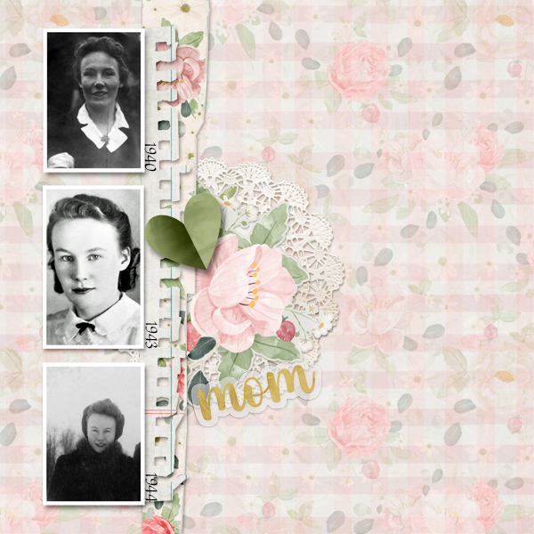
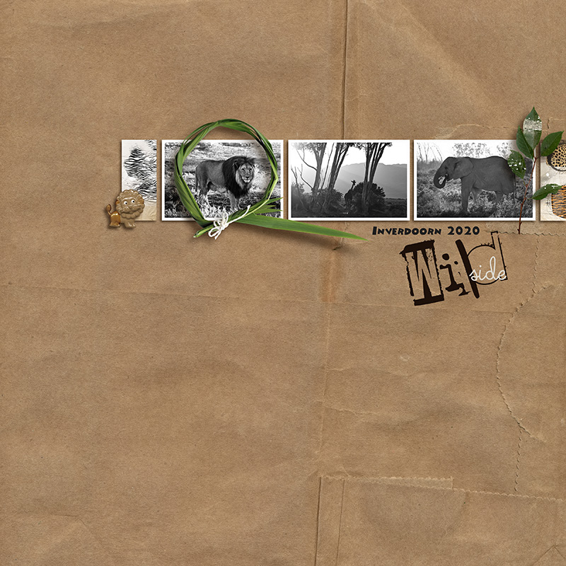
What a gorgeous layout, Diane - you did a great job with your page. I like the beautiful b/w photos, the added elements and your paper choice. The red paper is the icing on the cake.
Thank you so much for taking part in the challenge.
 

*gina*

Well-Known Member
Love this challenge, Gina, thanks so much
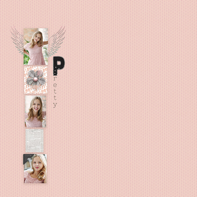
What a gorgeous page, Karen - I love the vertical flow and the soft colors. The wings as a continuation of the photo is a cool idea, also the photo corner. I like the subtle choice of paper and the wonderful photos.
Thank you so much for taking part in the challenge.
 

*gina*

Well-Known Member

*gina*

Well-Known Member
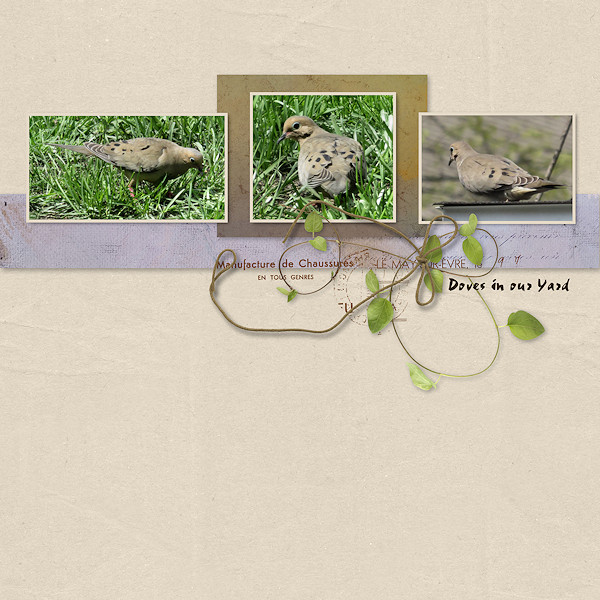
Like others here, I find white space a real challenge but this was even more interesting to do.

And you did it great - I love the beautiful photos of the doves and the arrangement of the papers and elements.
Thank you so much for taking part in the challenge.
 

*gina*

Well-Known Member
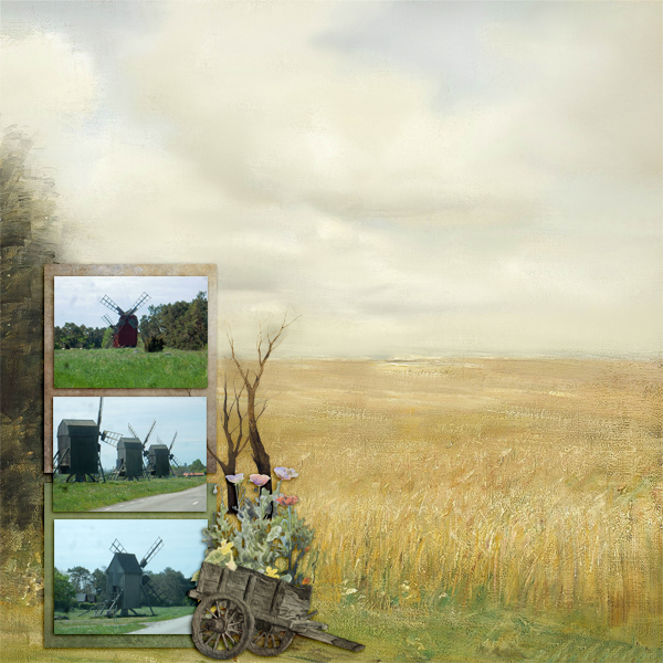
Here is my page! I hope it's okey to use a patterned background. My three elements are the wagon, the flowers and the bare trees.

Fantastic page, Pia - although it is a scene paper, the focus is on the beautiful photos with the windmills and the added elements. Very clever the arrangement of the other papers.
Thank you so much for taking part in the challenge.
 

*gina*

Well-Known Member

*gina*

Well-Known Member
Thank you Gina for this challenge!

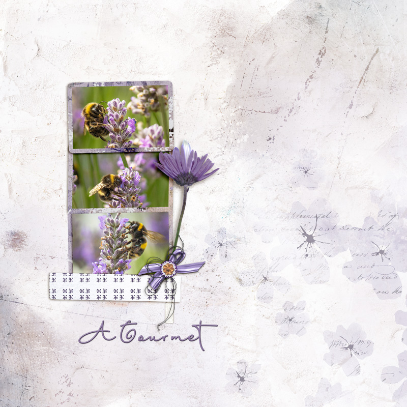
What a gorgeous page, Geraldine - I like the color scheme and the beautiful photos of the lavender with the bee. Very clever to use one paper for creating the frames. The elements and the title are a perfect addition.
Thank you so much for taking part in the challenge.
 
Status
Not open for further replies.
Top