Oscraps

April - Challenge #2 - Double Scraplift

bcgal00

Well-Known Member
CHEERY O
2018-double-scraplift-blog.jpg


All members that participate,
can everyone PLEASE ensure that you read all the rules for this challenge

so that you can claim your challenge points. Thank you! :)

Hi, I'm Rae (bcgal00) and I'm hosting Challenge #2 which is a double scraplift challenge.

I love to scraplift and what makes it even more fun, is that there are 2 layouts to provide inspiration for your page design. Please create your layout following these rules:

1. Take inspiration from BOTH layouts to create your page.
2. Tell me what inspired you from each layout.


Here are the two layouts you will scraplift.

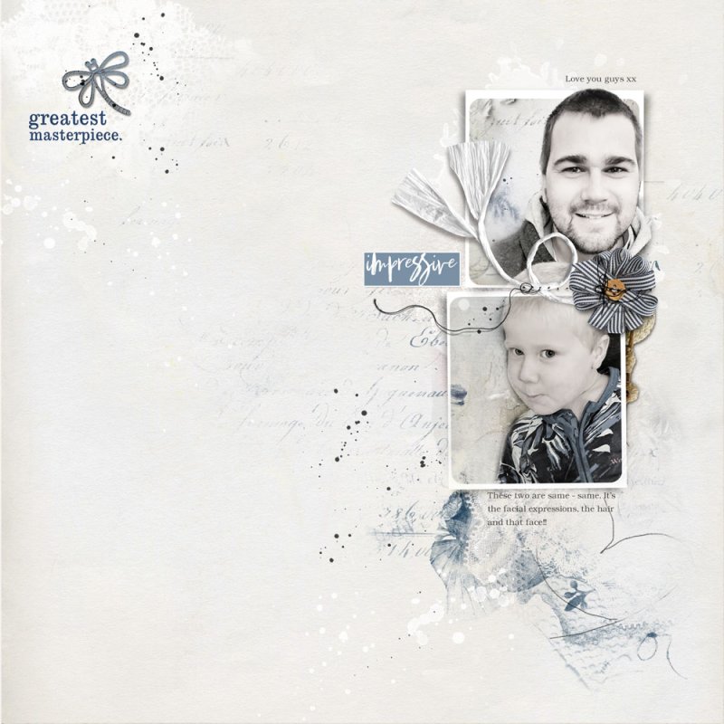
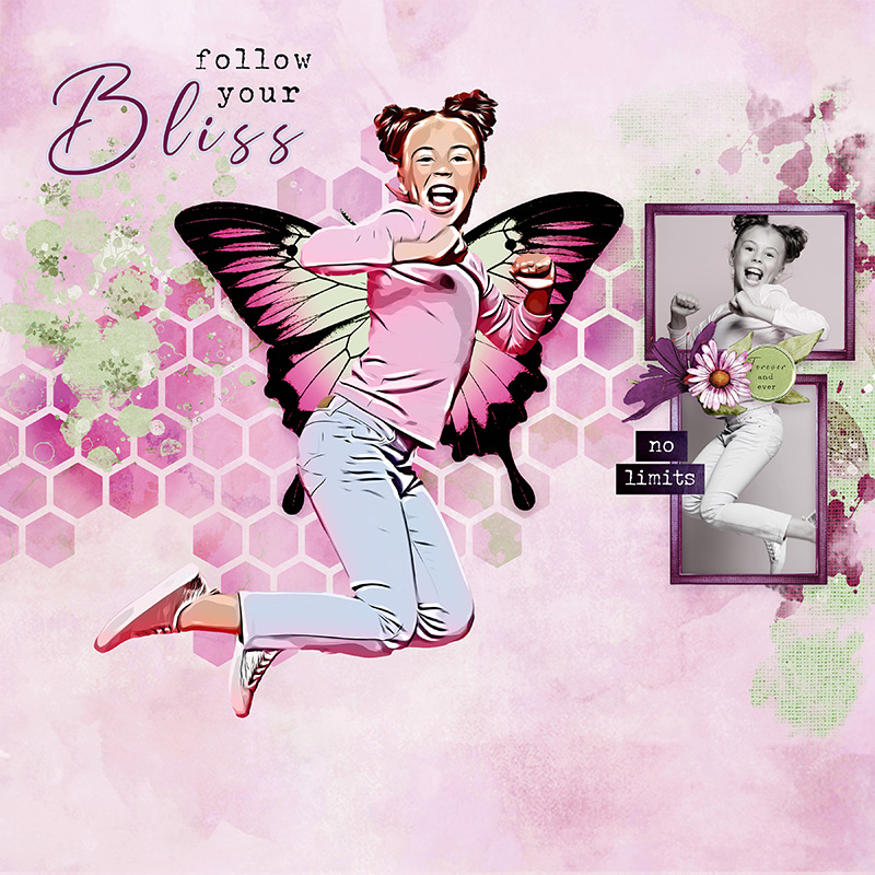
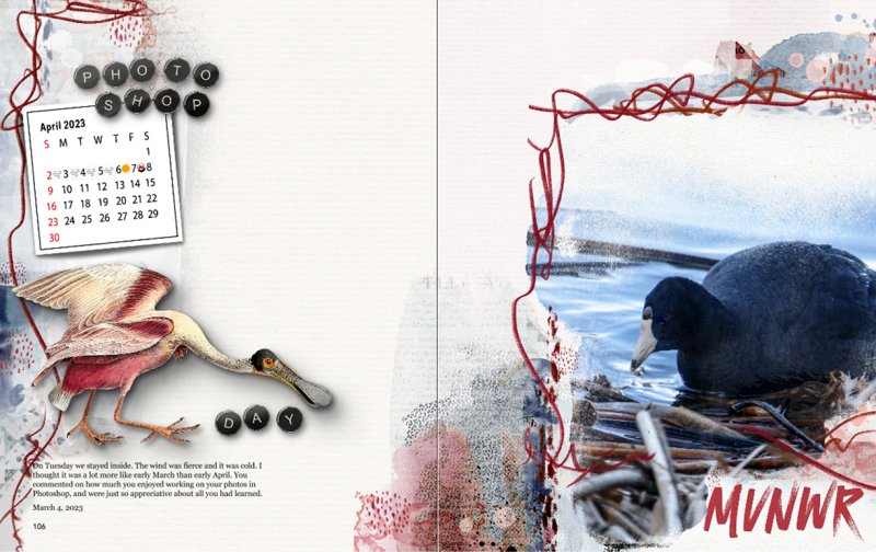
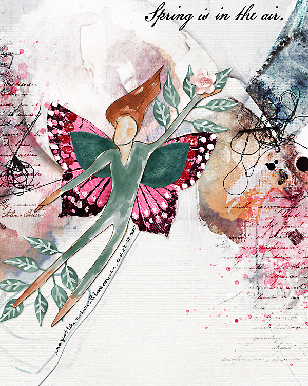
The first is a beautiful artsy page by Madi.

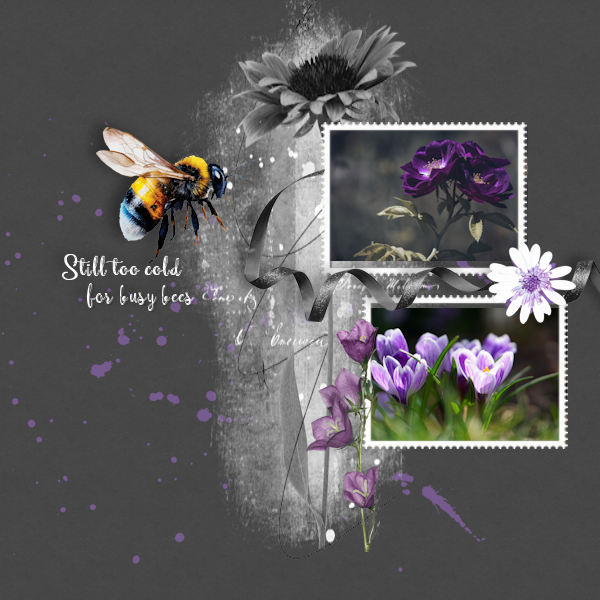
This gorgeous page by pmjames is the second scraplift layout.

From sample page #1 I was inspired by:
handwritten text
text stamp
left and right sided stamps/paint over neutral background paper
the sense of movement/energy
pops of pink color

From sample page #2 I was inspired by:
word art in upper left corner
white paint
double framed photos
swirl
blue paint


flysohigh-L.jpg


RULES:
- Your layout must take inspiration from both sample layouts and you must tell me what your inspiration is.
- Please use 80% Oscraps products that are currently in the store.
- Non-Oscraps products or retired O designer products can be used whether the designer is selling elsewhere or not.
- You need to credit all the products used on your layout.
- Your layout can not be used for more than one challenge.
- Your page must be posted in the Challenge 2 gallery by midnight PST April 30, 2023 and linked back to this thread (see below on how to add your linked layout).
- And do not forget to update the CURRENT MONTH'S TRACKING THREAD to be eligible for your coupon.


Adding a linked layout from the Gallery to a thread:
1. Upload your layout to the gallery first. In your forum post click the Gallery Embed icon (little camera).
2. This will open your gallery, simply click on the layout you require, then scroll down to the bottom of the screen and click the Continue button.
3. Your linked layout is now in your post, the image will appear once you have clicked the Post Reply button.


Last edited:
sandra-9663

Well-Known Member
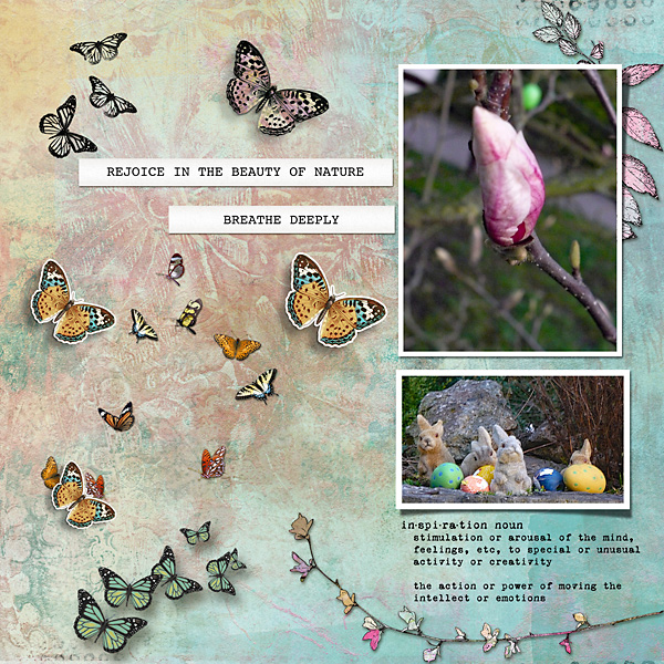
Thanks for the Challenge!!

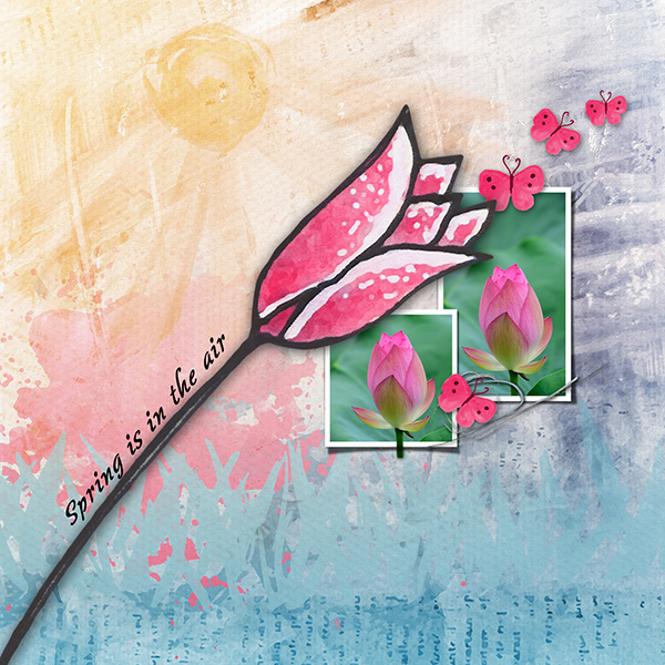
My inspiration from Madi's page:
to use the Simply Spring Oscraps Collaboration
the multi-colored background paper
the diagonal line on the page
the "Spring is in the air" text

My inspiration from pmjames' page:
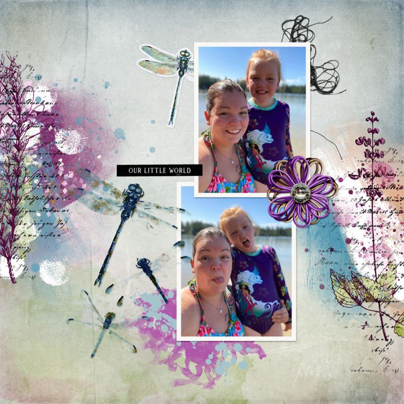
to have two photos
to have an out-of-frame (the stem of the flower)
the string used to anchor the photos
the dragonfly (I used butterflies)


EvelynD2

Well-Known Member
CHEERY O
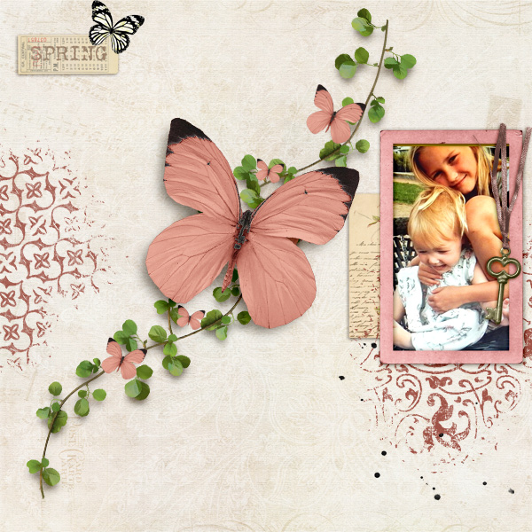
Kit: Summer Solstice by NLD Designs
Inspirations:
Layout 1:
Butterfly, greenery, black font, script title, title in top right corner, white paint
Layout 2:
Photos on right side of layout, staggered photos, photos stacked vertically, fiber on corner of photos, small flower on corner of photos, splatter
 

Adryane

aA Creative Team Member
Thanks for the challenge!

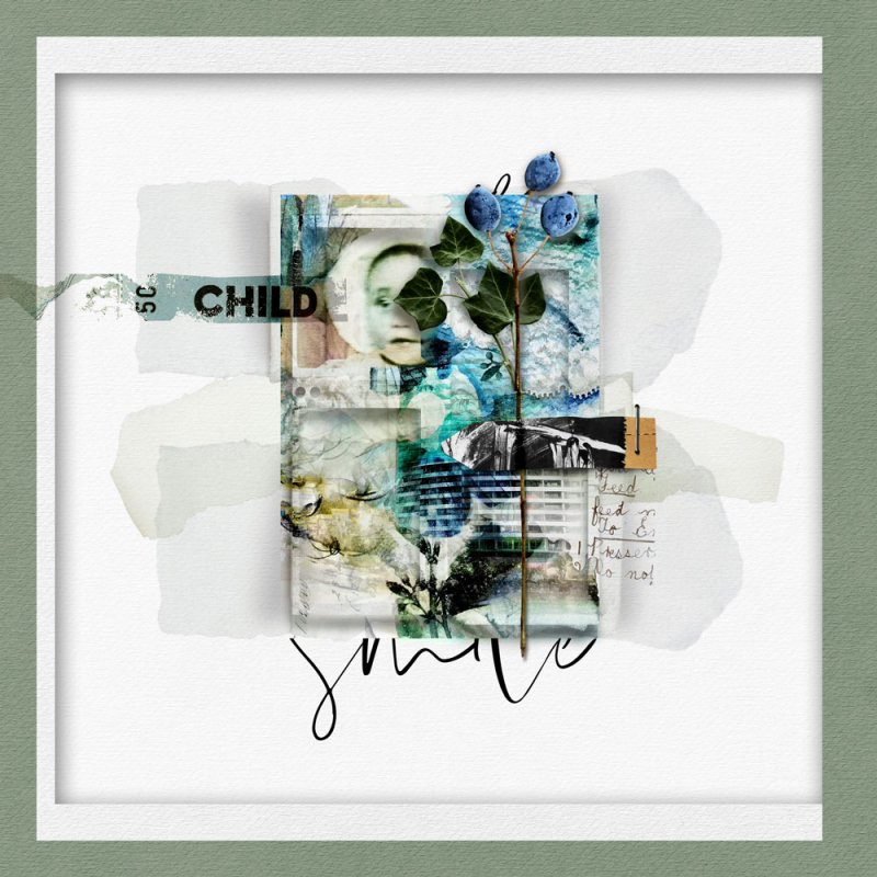
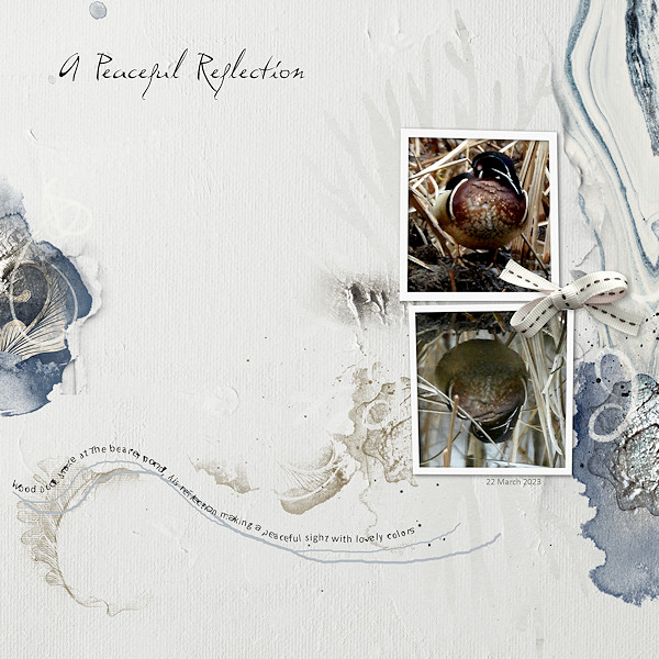
I took the collage feel, cursive font, and artsy-ness of Diane's page and combined it with the more structured feel, framing, and word strip found in Michelle's page.

 
Last edited:

scrap-genie

Well-Known Member
From the 1st, title at the top, journaling on a line, designs on the sides & feeling of movement
from the 2nd, quiet colors, 2 photos (in this case two frames on one photo) & large bow


Cath VP

A dust in this great universe
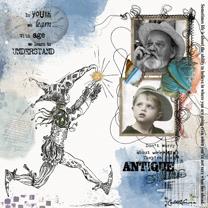
I really liked the layout of the second page with the photos which give an essential notion of the passage of time. I don't want my realization to be sad, but natural. I liked the dynamic brought by the character of Chrisrine Martin in the first page and the splashes of colors. And I wanted to give a rather positive idea of the age which is not important in itself but marks our faces!
Time is the same for each of us.
Thank you Rae for this challenge !
 

ElectraF

Happy 17th Oscraps!!!
I chose the script and colour from both edges, messy thread & the flying motion from the first
and the two photos and flower from the second.
 

mary-lynne

Well-Known Member
Thanks for the challenge!
I uses the side transfers and Title placement from the first layout; and the photo cluster and the little top cluster from the second layout.
 

zlemon

Christy
Loved this challenge. Thanks for hosting Rae.
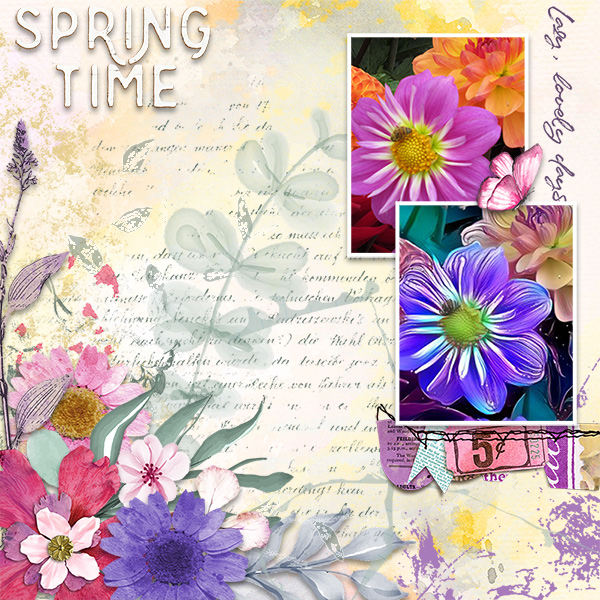
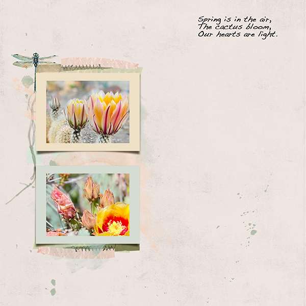
Went with a minimalist approach, so I could use my gorgeous cactus bloom photos.

Used the words "Spring is in the air" from the first layout and I used the two photo template from the second layout.

Used Rachel Jefferies Anisopetra template and Sanguine kit.
 
Top