Oscraps

August 2022 Challenge # 3 - Creative Photo Editing

margje

The O is awesOme
1658761052683.png
All members that participate, can everyone PLEASE ensure that you read all the rules for this challenge
so that you can claim your challenge points. Thank you!

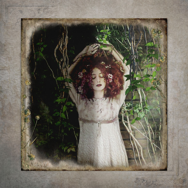
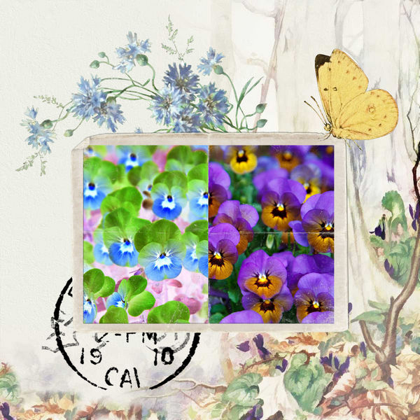
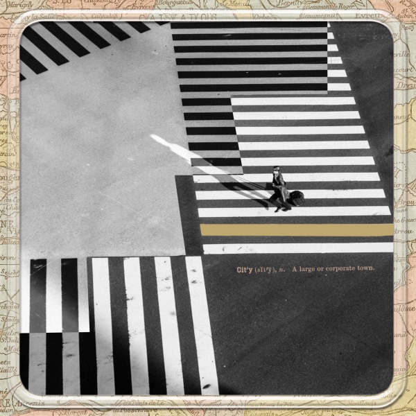
Welcome to the Creative Photo Treatments Challenge.
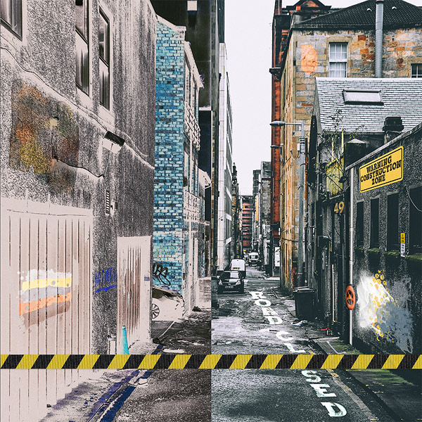
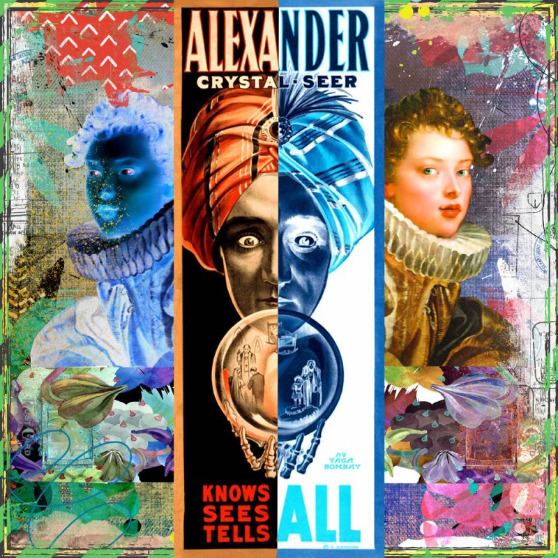
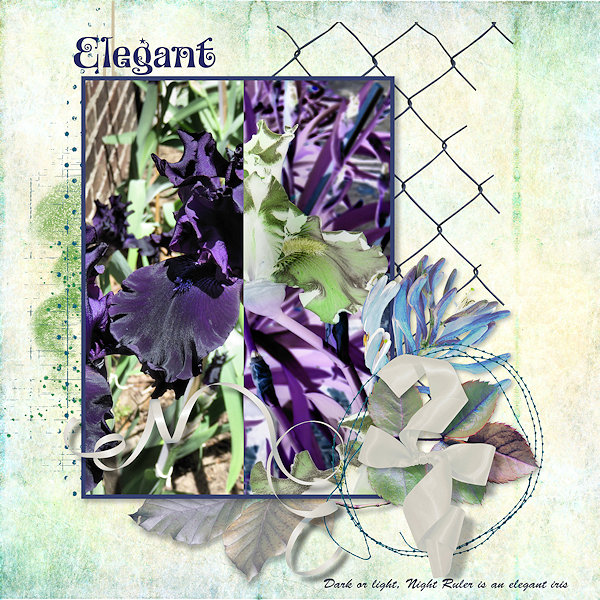
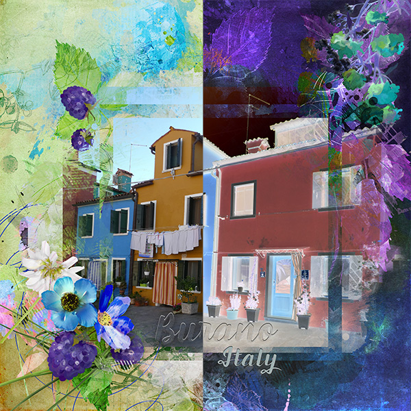
Do you ever use the invert function with your photos and elements? It can give interesting results. Especially when you work with subjects like opposites such as light and dark, good and bad, summer and winter, joy and sorrow!
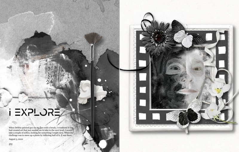
I challenge you to use the invert function on half of your photo, so that we can see the result in your layout!
In Photoshop you can find the invert function using: Command + I (Mac) or Control + I (PC) to invert the selection.
In other editing programs this function will be there too!

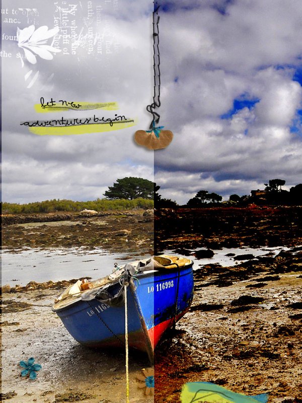
I made an example page for you:
Font: Britannic Bold​


RULES:
-Use the invert function on half of your photo in the layout!
- Please use 80% Oscraps products that are currently in the store.
- Non-Oscraps products or retired O designer products can be used whether the designer is selling elsewhere or not.
- You need to credit all the products used on your layout.
- Your layout can not be used for more than one challenge.
- Your page must be posted in the Challenge 3 gallery by midnight PST August 31 2022 and linked back to this thread (see below on how to add your linked layout).
- And do not forget to update the CURRENT MONTH'S TRACKING THREAD to be eligible for your coupon.
Have fun creating!

Adding a linked layout from the Gallery to a thread:
1. Upload your layout to the gallery first. In your forum post click the Gallery Embed icon (little camera).
2. This will open your gallery, simply click on the layout you require, then scroll down to the bottom of the screen and click the Continue button.
3. Your linked layout is now in your post, the image will appear once you have clicked the Post Reply button.
 
Last edited:

Jam-on-toast

Well-Known Member
CHEERY O
Thank you for this interesting challenge. Here's my take, I hope I did it right. In the original photo the building on the left is dark and gloomy and negates the very reason why I took the photo in the first place - quaint and awesome windy street in a cute little town in the middle of nowhere where time stands still and not much changes ever... so inverting the left half of the image created a wonderful effect...

original.JPG


margje

The O is awesOme
Awesome result on your photo and page! Great job! It's very beautiful! It gave you perfect the effect you were after!
 

Amandajk

Well-Known Member
I took this in a different direction regarding half; I selected the girl, colored her pink, duplicated the layer then inverted my selection of the girl, then added comic filter on top layer. Inverted again to delete the girl. Then merged the layers.The bottom layer has the girl in pink.
 

Amandajk

Well-Known Member
Thank you for this interesting challenge. Here's my take, I hope I did it right. In the original photo the building on the left is dark and gloomy and negates the very reason why I took the photo in the first place - quaint and awesome windy street in a cute little town in the middle of nowhere where time stands still and not much changes ever... so inverting the left half of the image created a wonderful effect...

View attachment 377177

I like the contrast of the older buildings and the modern car!
 

margje

The O is awesOme
I took this in a different direction regarding half; I selected the girl, colored her pink, duplicated the layer then inverted my selection of the girl, then added comic filter on top layer. Inverted again to delete the girl. Then merged the layers.The bottom layer has the girl in pink.
Beautiful result on your photo! Awesome design and layering on the layout! Great job!
 

Kythe

Well-Known Member
CHEERY O
I really had to work at this one. I wanted the light/dark effect. As there is no 'invert' in PSE, I worked around it. I duplicated the image, linked them so they wouldn't slip then used the marque tool to section off half the image. From there I played with the opacity on each side until I got one side dark and the other lighter. It helped to have a background paper as some of the opacity's look quite different with different backgrounds. It isn't a dramatic difference but the idea is there.:)
 

margje

The O is awesOme
I really had to work at this one. I wanted the light/dark effect. As there is no 'invert' in PSE, I worked around it. I duplicated the image, linked them so they wouldn't slip then used the marque tool to section off half the image. From there I played with the opacity on each side until I got one side dark and the other lighter. It helped to have a background paper as some of the opacity's look quite different with different backgrounds. It isn't a dramatic difference but the idea is there.:)
What a beautiful page! Awesome you found a way to make this work! Fantastic job!
 

*gina*

Well-Known Member
CHEERY O

margje

The O is awesOme
Thank you so much for this gorgeous challenge, Margje
I found this photo - actually quite unspectacular, but well suited for this challenge. I also added some elements directly to the photo, which you might not see so well at the first view.
View attachment 377447

Love the effect on this photo! Beautiful page! Well done!
 
Top