Oscraps
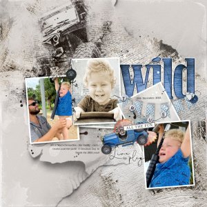
True - All the Fun
- pmjames
-
- Tags
- #cheeryofave boy child
- Credits list
- Artplay Palette Jouer
ArtsyTransfer Jouer
ArtsyKardz Jouer MultiPack
Watercolor Template Album No.9
Automobiles No.1
Play WordART Mix No.2
Axiom WordART Mix No.1 (BeadedThreadz)
PaperTextures No.15
MultiMedia Frames No.7
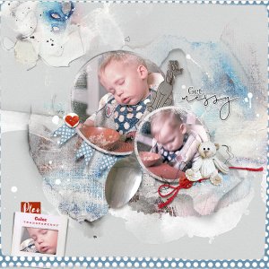
Process Page 1 of the WaterColor Template Album No.9 was opened up and a Solid Paper was placed on top of the background layer. One of the frame sets were duplicated and placed in the gap in the template. Some layers of the Template were turned off and others were moved or filled with colour to better suit my layout. Images and ArtsyKardz were clipped to the frame layers of the template. One of the images were extracted and desaturated to a light sepia colour. Paper Textures, Transfers desaturated, WordTransfers, and Edge Overlays were placed below the frame layers before a Brush from Automobiles No.1 was placed on top of the transfers, duplicated with a Luminosity Blending Mode applied to the second layer at 72% opacity. WordART from Play WordART Mix No.2 was placed on top of the layout, with the colour adjusted via Image>Adjustment>Hue and Saturation to a blue colour, duplicated with a Hard Light Blending Mode applied to the second layer. Dimension elements were placed on top of the layout. Journaling completed the page.
- Designer(s) Used:

