Oscraps

How do you start your white page layouts?

Jam-on-toast

Well-Known Member
CHEERY O
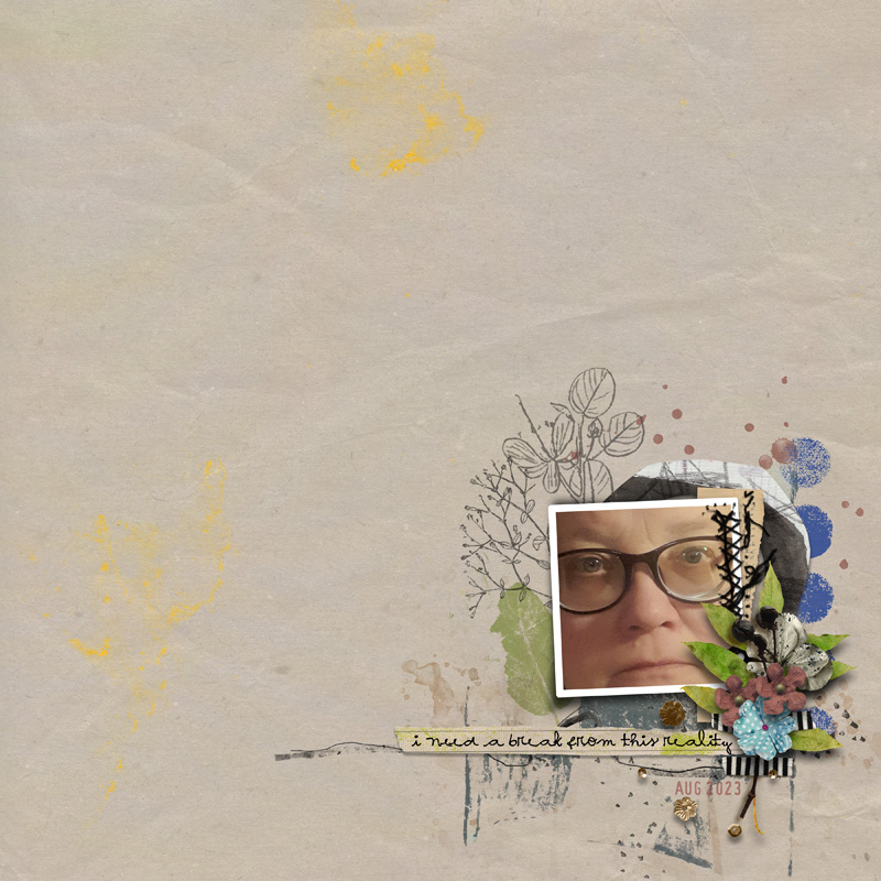
I have just spent more than two hours agonizing over how to place a photo and seven elements onto a page. Yes, just seven elements... As you migh have guessed, I am talking about this month's challenge #1 - white space/clean. When I look at the pages other scrappers create, it all seems so straightforward: a photo, a transfer, a word art and a tiny flower or two. Can't be that hard, can it?

Yet, I never know where to start. One line running through my mind on repeat is... Why would you make your photo small and why would you fill you page with nothing??? And this is the showstopper for me. I am a storyteller. I tell stories and I don't know how to do that with an empty page. Don't get me wrong - I LOVE looking at white space layouts - they are gorgeous and creative and I would love nothing more than to be able to create them too. I just don't know how to. For me, every page starts with the photos I have. Even if I want to work with a specific kit/template, I still would start by selecting my photos and build my layout around them.

So, here's the question... how do you start your white page layouts??? What is the first thing you decide on? Is it the kit? The photo? The emotion you want to express? How is a white space page born?
 

faerywings

The Loopy-O
CHEERY O
Olga, I struggle with white-space pages too. I have a hard time starting and an even harder time stopping. If there aren't a million layers and a ton of paint, my pages look incomplete. The only tiny bit of advice is to look at other white space pages in the Gallery and scraplift them.
 

LSlycord

Well-Known Member
I love white space layouts. And I love telling stories. And those are really the only kinds of layouts that I enjoy doing. (And I just realized it as I was thinking about this question.) What I generally do is look at some white space layouts before starting. Then I have something in mind.

Another thought that I just had and have never tried...I think that I will try making two pages on the same subject. Choosing one of my favorite photos from a story I want to tell and use that for a white space layout, then use corresponding photos for my story page next to it! I'm going to try that this week and see how it goes.
 

marijke

I love the O!
CHEERY O
For a white space challenge I start with a photo and then I choose the paper and elements ... and I love white space pages ...
 

anke55

Well-Known Member
CHEERY O
I usually start with my photo or photos and next would be the paper. I prefer clean backgrounds. You can still use lots of stuff on your page, just not all over the place lol. Maybe just think of it as creating a smaller page on your page. Have it take up no more than a third of the whole page. Add layers behind your photo and some splatters and maybe a twist/doodle. White space can be fun :)
 

BrightEyes

Kay
CHEERY O
Yet, I never know where to start. One line running through my mind on repeat is... Why would you make your photo small and why would you fill you page with nothing??? And this is the showstopper for me. I am a storyteller. I tell stories and I don't know how to do that with an empty page. Don't get me wrong - I LOVE looking at white space layouts - they are gorgeous and creative and I would love nothing more than to be able to create them too. I just don't know how to. For me, every page starts with the photos I have. Even if I want to work with a specific kit/template, I still would start by selecting my photos and build my layout around them.
Olga, I have the same thought... I have a hard time doing a white space page. I admire them but they are not my LO of choice.
 

Kythe

Well-Known Member
Hmm I really like the bold clean look of a white space LO. But they don't have to be that style. White space just means to keep at least most of the page clear. (I actually envy those who can write stories)
Often if doing a memory page, I will start with a photo that isn't in the best shape, faded or ripped etc. It looks good small but not so great when enlarged. From there, If allowed in the challenge, I will used a mask on the photo or paint behind it. Add a string or ribbon and a single element. A little bit of text to mark the date or event.1954 Siblings and Dad 02.jpg
 

tanteva

Mistress of Mayhem
I pick a photo that sort of tell a story by itself. Then I pick a wordstrip, a small wordart or just type a single sentenser to go with the feeling of the photo. I chose a paper that has some kind of texture or slight pattern, but still is sort of one color/plain. Add some paint or stamps under the photo, letting it show a little. Add some elements and make a small cluster. Once it's done, I mark all layers and move it all around on the background, to find "the balance", I.e. the perfect spot. Final step (that I do on basically every layout I make) I open up a couple papers from the kit, and test if any of them look better as a background. Most of the time, I actually end up with a different background that the one I started with.

An example:
 

sucali

Well-Known Member
CHEERY O
I LOVE white space layouts :lovey3: and the minimalistic look BUT I also like fuller layouts with a big picture.
And I understand what you mean Olga...sometimes it takes more time to create such a minimalistic layout, to choose the perfect elements for it, to "play" with the shadows...
As most of my layouts are for creative teams/designers I start with the kit and search for the perfect photo to be appropriate.
 

svanderhaegen

Well-Known Member
CHEERY O
I first pick my paper and the photo I want to use. Mostly I resize the picture to a relatively small size. Then I put some sort of paint or stamp underneath it and build a little cluster. That.s it. Easy peasy! I adore white space layouts :heartpumpred::heartpumpred::heartpumpred:
 

Jam-on-toast

Well-Known Member
CHEERY O
I first pick my paper and the photo I want to use. Mostly I resize the picture to a relatively small size. Then I put some sort of paint or stamp underneath it and build a little cluster. That.s it. Easy peasy! I adore white space layouts :heartpumpred::heartpumpred::heartpumpred:

Sonja, you make it sound like a 20-min thing... I love lookiong at white space pages too... I wish they were this easy for me...
 

Jam-on-toast

Well-Known Member
CHEERY O
I LOVE white space layouts :lovey3: and the minimalistic look BUT I also like fuller layouts with a big picture.
And I understand what you mean Olga...sometimes it takes more time to create such a minimalistic layout, to choose the perfect elements for it, to "play" with the shadows...
As most of my layouts are for creative teams/designers I start with the kit and search for the perfect photo to be appropriate.

YOUR pages are such an inspiration for those of us who struggle with white space... and yes, you are right, finding that ONE right element is much harder than just adding seven...
 

Jam-on-toast

Well-Known Member
CHEERY O
I pick a photo that sort of tell a story by itself. Then I pick a wordstrip, a small wordart or just type a single sentenser to go with the feeling of the photo. I chose a paper that has some kind of texture or slight pattern, but still is sort of one color/plain. Add some paint or stamps under the photo, letting it show a little. Add some elements and make a small cluster. Once it's done, I mark all layers and move it all around on the background, to find "the balance", I.e. the perfect spot. Final step (that I do on basically every layout I make) I open up a couple papers from the kit, and test if any of them look better as a background. Most of the time, I actually end up with a different background that the one I started with.

An example:

I like the idea of grouping it all and moving around to get the balance right... I need to try that!
 

Jam-on-toast

Well-Known Member
CHEERY O
Hmm I really like the bold clean look of a white space LO. But they don't have to be that style. White space just means to keep at least most of the page clear. (I actually envy those who can write stories)
Often if doing a memory page, I will start with a photo that isn't in the best shape, faded or ripped etc. It looks good small but not so great when enlarged. From there, If allowed in the challenge, I will used a mask on the photo or paint behind it. Add a string or ribbon and a single element. A little bit of text to mark the date or event.View attachment 401457

Oh my gosh... how have I not thought of that... of course, older photos that are not great quality... I would still want to scrap them becuase they are precious but I can't make them big... yet wouldn't want them to get lost in all that's happenening in a busier layout... thank you for the idea!!!!
 

Jam-on-toast

Well-Known Member
CHEERY O
I usually start with my photo or photos and next would be the paper. I prefer clean backgrounds. You can still use lots of stuff on your page, just not all over the place lol. Maybe just think of it as creating a smaller page on your page. Have it take up no more than a third of the whole page. Add layers behind your photo and some splatters and maybe a twist/doodle. White space can be fun :)

I have studied your white layouts extensively... and drawn inspiration from them... and will definitely continue doing so... I love your pages!
 

EvelynD2

Well-Known Member
CHEERY O
I usually pick the paper I want to use and then pick my photo. I then put a leaf or branch under the bottom of my photo and then build my cluster. I also like to include some small title.
 

timounette

Well-Known Member
CHEERY O
I love white space page and minimalist design.
Sometimes I start with a photo and sometimes with a paper or a frame.
But I need around 2 hours to do such a page !
 
Top