Oscraps

CC needed for this page, plllllleeeeeaaaassssseeeee!!

faerywings

The Loopy-O
CHEERY O
I have been doing way to many heritage pages for my mom's album because now I am starting to HATE them all!! Not the people thankfully, but all of the pages. :Cry:

I have 3 more to do, including this one but I must have tried about 100 times to work on this photo. And this is the best that I came up with.


It is such a formal photo to me and I just have a hard time with clean lines I guess.....

what would you change?
 

janedee

Well-Known Member
What about adding a frame to the photo - Anna has Laced Frames, Charlize Creations Let's Count kit has a lovely white wood frame and Maya De GRoot has a soft grey frame her Aero Toni kit.
 

LaurieW

lOve the O!
do you know the year the photo was taken or why- or are you leaving that for your mom to fill in.
 

petey111

Well-Known Member
I was going to suggest a frame or mask too to soften the edges...there's a good one in the 52 Inspirations that I use a lot from Sue.
 

taxed4ever

Administrator Crazy about the "O"
CHEERY O
I would suggest a mask too! But Chris don't forget the journaling, a good heritage page has to have journaling on it so everyone will know the story behind the photo!!
 

faerywings

The Loopy-O
CHEERY O
do you know the year the photo was taken or why- or are you leaving that for your mom to fill in.
I am leaving a page at the back of the book to fill in what I dopn't know -- and I only know my mom and uncle, plus my grandma and granpda, and my great grandparents. Everyone else-- no clue!

I'll try some frames and see what I can do.

Thanks ladies- I think I needed some "fresh eyes" on it!
 

clarabear

always chatty at the O!!
I like this photo...it doesn't have a general feeling to it. Some people are all serious...some are happy and then the little boy scratching his head in front is great. I don't think it is formal at all. I like the ideas to soften it up a bit.
 

wombat146

ONA - Administrator
CHEERY O
what a sensational photo Chris!!! love it!! and truly I love your page as it is...........just a thin white border is all that I would add....I love it!
 

VickiStegall

Administrator
Designer
CHEERY O
oh Clara - thank you for describing the picture - it completely changed the whole thing for me! I love it!

Chris, I'd soften it up a bit like everyone else said :)
 

Heather Prins

aA Creative Team Member
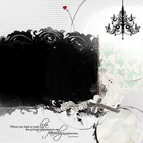
here's an idea

forChris.jpg


Anna aspnes
Artplay Palette Classico-bow, flower
Hipster Plume FotoBlendz 5
Artplay Palette Achieve-BG paper
Artplay palette Family-word overlay/word art
Artplay palette Why Not-heart
Metal mix Revised-fastener
Artplay palette Shabby Christmas-doily /transfer
Artplay Palette Sweet pea-lace strip
Chandelier 1
Stitched By Anna Tan

based on the photo though I flip the layout around so the photo is on the right, like yours is
 
Last edited by a moderator:

faerywings

The Loopy-O
CHEERY O
ahhhhhhhrrrrrggggggg! I started to re-work this when I got the Blue Screen of Death. Now my psd file is totally corrupted and i have to start back at SQUARE ONE!!!!!!!!!!!!!!!!!

:faint:
 

faerywings

The Loopy-O
CHEERY O
So I took all of your advice when I had to redo this page from scratch. (Again. heh. :twitch:)
But now I can't show it to you because I had to put it away for a December Challenge!

But watch this space and you can see it on December 1 :D
 

faerywings

The Loopy-O
CHEERY O
thank you again for your advice! I took it all to heart and came up with a new-ish page. And it also worked out for a new Oscraps challenge!

And now... for the reveal....... :D


Dumpty

back hOme and loving it
oh wow ! I'm too late to help, but not too late to admire the remake !
gorgeous !
 
Top