Oscraps
- Credits list
- Artplay Palette Strom
BONUS ArtPlay Strom Collection (Available when you purchase the full Collection)
WaterColor Template Album No.10
MultiMedia Documents No.10
Strom WordART Mix No.1
Patriarch WordART Mix No.1 (Beaded Threadz _He)
Rainbow WordART Mix No.1 (bead letter R)
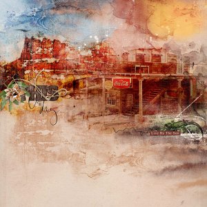
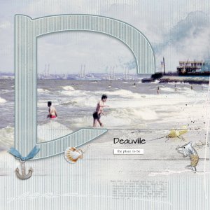
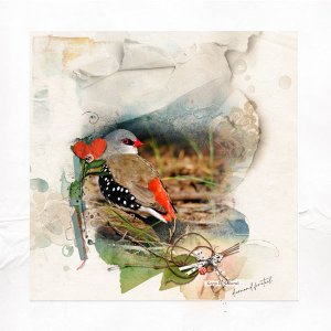
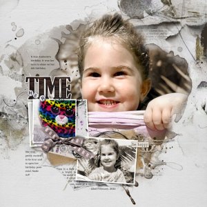
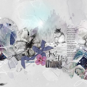
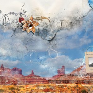
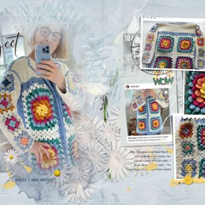
Process An Artsy Paper from the Bonus files and page 15 of the WaterColor Template Album No.10 formed the foundation for this Layout. Some Layers of the template were turned off and others were filled with colour or moved to suit my images. Two copies of my focal image (one was desaturated to a light sepia colour) were clipped to the FotoBlendz layer. The black area of the colour photo was blended out to allow the sepia colour to show through. Artsy Papers and supporting images were clipped to the frame layers. WordTransfers and MultiMedia layers were added below the image and dimensional elements and WordART were placed on top. Some journaling completed the layout.
- Designer(s) Used:

