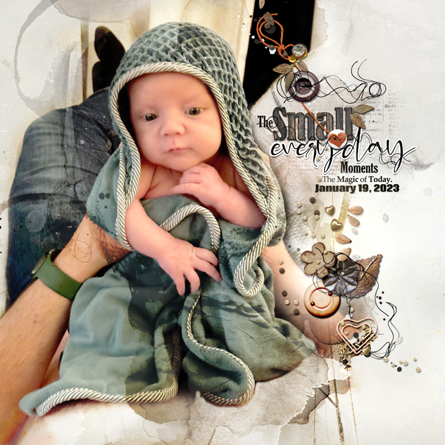
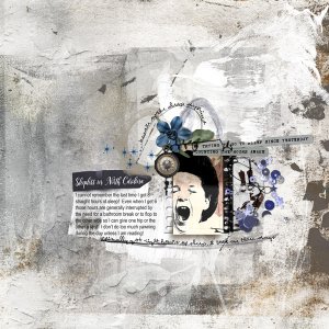
In this layout I used everything from the new Sayonara collection except the template--I was going for a textured-ish look for my photo, but changed gears about the texture on the skin after I saw it. I compromised by laying down an artsy paper, blending in the photo using color burn mode, adding a solid light paper underneath the artsy paper, and masking away certain artsy areas to restore the baby's skin tones. I corrected any leftover color-burn effect by duplicating the photo on normal blend mode and masking around that so only the normal skin tones remained. Because the eyes got greenish somewhere along the way, I wound up repeating this move to restore a closer eye color. I'm sure there's an easier way to do this, but I work on an old version of Photoshop Elements so there's that. I placed two multimedia Magicsprinklez clusters around the word cluster to reinforce the vertical nature of the layout. To finish, I applied Artsy Paper No 1 as an overlay, on multiply blend mode at reduced opacity, again masking out wherever the paper overlay texturized the baby.

