Art Journaling ~ Let’s Talk About Value
So far, we have talked about lines, shapes, color, and the design principle of C.R.A.P. – or Contrast, Repetition, Alignment, and Proximity. We are now going to dive deeper into color principles, and more specifically the concept of Value. Simply put, value describes the lightness or the darkness of a color. Even if you only use one color, value can be used to create depth and contrast. These choices are called “monochromatic”, mono meaning one, and chroma for color.
Here is an example of a monochromatic logo – something many of us would recognize:
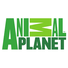
Notice how it is all one color, but it uses different versions of that color. In order to make those different colors, the base color must be modified. That’s where these next four terms come into play: Tint, Shade, hue, and tone.
Hue: A hue is either a primary color (red, yellow, blue) or a secondary color (orange, green, and purple). This is the “base color” you start with.
Tint is when you add white to a hue. This would be the sideways M in the logo above.
Shade is when you add black to a hue. Adding black will create a more intense color. This would be the word “Planet” in the logo above.
Tone is when a neutral grey is added to a hue. Toned colors are often considered to be less brilliant, but also more sophisticated and visually pleasing.
So, how does this all fit together with what we have learned so far? These concepts are used in a project to create contrast, depth, and emotion as well. When one chooses a color, sometimes it is chosen simply out of the emotion that it represents. Like last week when we talked about black – black immediately has a connotation of dark, maybe even foreboding feelings, or more “negative” emotions like sadness or depression. Red may represent passion or rage. Yellow evokes feelings of warm sunny days, etc…
I’ve mentioned that a monochromatic color scheme can create depth by varying the tint, shade, or tone of the color chosen. Here’s an example of a logo that uses one color, but uses shade and tint to create dimension and depth. Notice how the base color is blue, but they tinted it near the bottom, toned it in the middle, and shaded it at the top.
When creating our pages, color is an integral part of what we do. When we buy a kit, we like that it’s cohesive with the color choices, and the color palette is pleasing to our eyes. I know I always like it when I can “kit bash” or mix and match kits that use the same color values.
I could talk about color all day, but let’s get to the art journaling challenge and what’s up over at the O challenge forum!
Thinking back to all the design principles we’ve worked with so far, see if you can identify some of them in these pages I’m sharing.
This month’s theme is “Gratitude”, and our host Sonja added these prompts for this week:
Favorite outdoor activity
Favorite thing to do on the weekend
Your favorite time of the day
Your favorite beverage
A guilty pleasure
5 small things you enjoy
Favorite part about nature
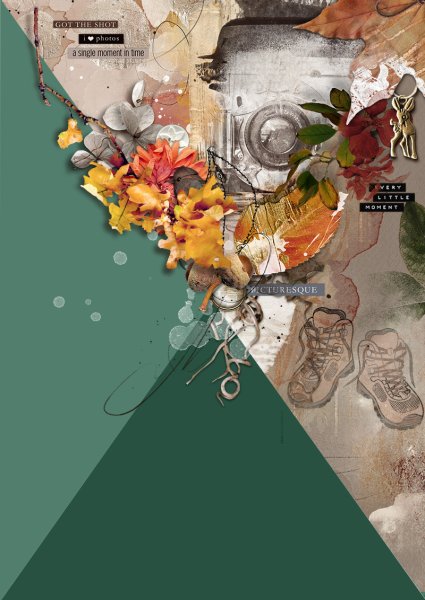
Her example page is here. She is using the diagonal A4 Template.
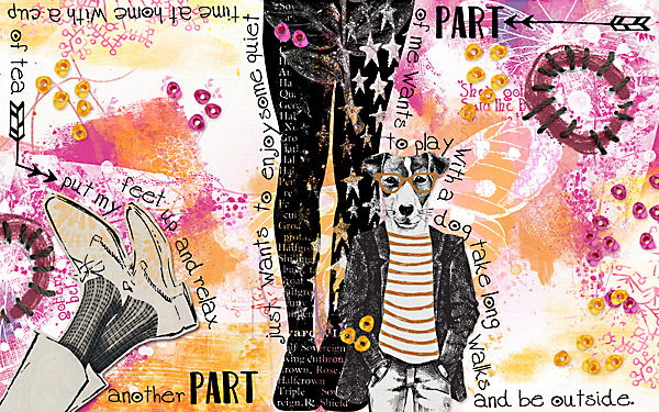
Madi is doing the block template:
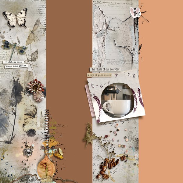
And Marijke is using the vertical rectangle template.
We don’t have any layouts yet that aren’t using the template. I absolutely love how these are turning out!
Make sure to join me next week for our next installment, which is Form.