Art Journaling ~ Color Me Please!
Hello my friends! Welcome back to Art Journaling Tuesdays where we feature the art journaling challenges over at oScraps, and we are also doing a 7 part series on design elements. This is week 3, and week 3 is all about how we use color in our designs. If you missed the first two, go back and read them at your leisure. They are Lines, and Shapes.
We can’t really talk about color without at least addressing these 4 design principles. I learned them many years ago from Robin Williams (the artist/writer not the actor). She taught me that in Graphic Design, paying attention to these 4 principles will make a cohesive and powerful piece. They are Contrast, Repetition, Alignment, and Proximity.
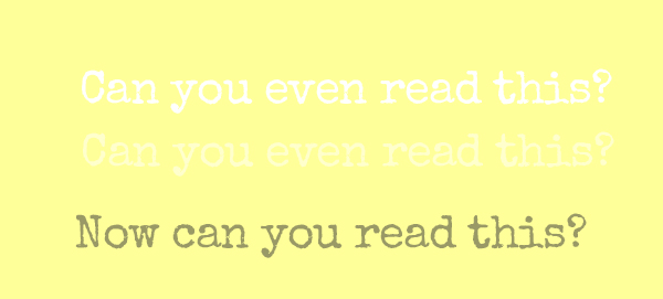
Contrast is very important. With Art journaling, we are speaking with our art – and if you can’t see it, some of the message is lost. Color is a part of contrast. For instance, what do you think would happen to our message if you had a creamy yellow background and white lettering? Or worse, off white lettering. You wouldn’t be able to read it! Now simply punch up the contrast a bit and pick a darker color. I picked a sagey/olive green. Now can you read it? Depending on the color you pick, you will have contrast, or you will create something that no one can really read or understand.
Conversely, if you want to have some kind of hidden message or journaling, you can use contrast and color to HIDE things that you want to put in, but you want them to be unnoticeable or part of the texture of the background. I have done a lot of hidden journaling and items that mean something to me, but are too personal to actually show in public.
Color is affected by repetition because of the “pops of color” that we choose in our layouts. It brings attention to itself and creates visual interest and a place for our eye to rest and enjoy.
Alignment and Proximity will come in later. They really don’t have much to do with how we use color.
So, back to color. We can go on for days on color theory, and what is a complementary color, an analogous color, and the color wheel, but that’s for a deeper dive than we are equipped to do here. For our purposes, color choices are used to create contrast, draw attention to something, or to evoke a feeling. Here’s a perfect example since Halloween just passed! See how the color black evokes a feeling? You wouldn’t just look at this page and think, “Oh what a happy page!!”. Jeannette made this fabulous page and used color very boldly! the orange and the white just pop!

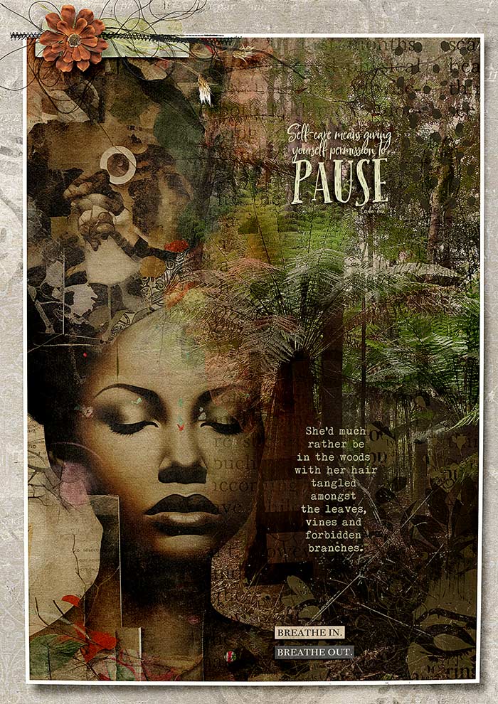
And this page … what part does the color play in evoking emotions? Ona did a fabulous job on this page. See the orange/red splashes of color that show visual interest? See how her journaling is done in a contrasting color so that it’s easily read?
So that’s a very shallow dive into color. Next week will be a part of color as well, and we will focus on VALUE.
Now, onto the November Art Journaling Challenges at the O! We are concentrating on “Gratefulness” for the entire month, and each week we will give you 5-7 prompts to scrap about.
Here are the journaling prompts for week one.
- Pets
- Something that makes you smile
- Favorite food
- An important person in your life
- A talent you have
- Favorite thing about the place you live
- A favorite hobby
This month, you can choose to make one page each week or create one page that encompasses all four of your journaling prompts. Ona has created templates that you can use to easily divide your page in to four parts. If you want to use the templates, the link is in the challenge. I chose to do the 4 pages in 1 with 4 triangles template. I can’t wait to see everyone’s pages!
Post them all here in the Art Journaling Gallery
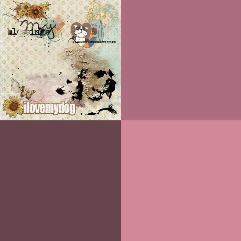
Here is Cindy’s page. She is doing the squares template:
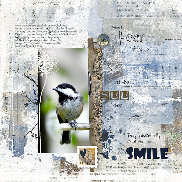
And here is ScrapGenie, who isn’t using the template:
And Ona who is doing the triangle template like I am:

Thank you as always, for coming to the blog and going on this journey with me. Art journaling is such a wonderful way to scrap and to make meaningful pages. I hope that I am helpful in that journey for you!