Oscraps

WINNER Announced: 22-02 Tips & Tricks Challenge with Karen Schulz, February 2022

Karen Schulz Designs

Designer
Designer
what-are-blend-modes-Header-2jpg.jpg
Welcome to the Tips & Tricks Challenge of 2022! My name is Karen (Karen Schulz Designs), and I am your Hostess for this challenge.
  • Each month I will be presenting you with a Tips and Tricks Tutorial.
  • Your challenge will be to take what you learn and put it into practice.
THIS MONTH'S TUTORIAL:

Whether you’re new to digital scrapbooking or a seasoned scrapper, understanding how Blend Modes work will give you more options to enhance your page. Let’s learn the basics, and then take a look at some practical examples.

Learn the Basics of the What, Where, How, and Why of Blend Modes in Photoshop. Download a PDF of this month's tutorial: Blend Modes Explained.

WHAT YOU NEED TO KNOW:

What You Need to Know:


1. Putting the Tutorial into Practice: For this month's tutorial, you may work with any products that you like; papers, blendables, text, paint, etc. It's your choice.

2. Sharing Your Work:
  • Tell us what products/images you are working with; tell us what Blend Mode you used to get your final result. Were there other Blend Modes that worked well for your images too? Just share your experience. :)
  • Post your Preview in Oscraps Gallery and add the following tags: tips & tricks challenge and also #karen schulz
  • Link your image in this thread for a chance to win a $5.00 Gift Certificate to my store. (Linking instructions below).
3. Challenge ends February 28th , 2022, at midnight, PST.

4. Please credit all products in your project.

If you don't have any overlays to experiment with, please feel free to download and use the Watercolor Overlays 06 Gift in my shop.
 
Last edited:
scrappysue49

New Member
Just been playing with your freebie and was really impressed. Then tried the blending mode with a distressed paper (Xuper) and one of your wonderful "Artsy Textures" and OMG, that was SUPER impressive. Then I picked another one of your textures (you can guess I love textures) and it was even MORE impressive although not something I can probably ever use still so pretty! Hope to actually get to enter this challenge!
 

Karen Schulz Designs

Designer
Designer
Just been playing with your freebie and was really impressed. Then tried the blending mode with a distressed paper (Xuper) and one of your wonderful "Artsy Textures" and OMG, that was SUPER impressive. Then I picked another one of your textures (you can guess I love textures) and it was even MORE impressive although not something I can probably ever use still so pretty! Hope to actually get to enter this challenge!
Oh, yes, PLEASE enter the challenge. I really want to see what you've done. And I agree with you. Texture and Blend Modes... one of my favorite products and techniques! I'm so glad you shared.
 
  • Like
Reactions: KFM

TrishD

TrishD
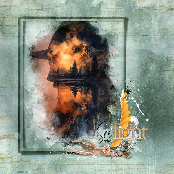
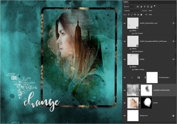
Here is how I did this
Hue/Saturation Adjustment clipped to Watercolor Overlay with SUBTRACT Blend Mode
Used two images from unsplash and Pixabay for the Double Exposure Image
AASPN_ChangeWordARTMix1_WWChange
AASPN_H2OWordMix1_Cool
Frame with Pattern Overlay
 

Karen Schulz Designs

Designer
Designer
Watercolor Overlay with Gradient in Saturation blend mode
Oh Boy, thanks Karen this is really addictive
Beautiful, Trish! LOL... It IS addicting, isn't it? Because you can get sooooo many variations with the same supplies! Thanks for participating in the challenge!
 

Karen Schulz Designs

Designer
Designer
Here is how I did this
Hue/Saturation Adjustment clipped to Watercolor Overlay with SUBTRACT Blend Mode
Used two images from unsplash and Pixabay for the Double Exposure Image
AASPN_ChangeWordARTMix1_WWChange
AASPN_H2OWordMix1_Cool
Frame with Pattern Overlay
Wow. Beautiful work! - and to think that overlay is the same one you used in your 2nd page... but it looks so totally different. :) Magic!
 

faerywings

The Loopy-O
CHEERY O
Wow, this tutorial is awesome. I have been using blend modes on papers and elements forever But I have never used new Adjustment or Fill layers for blending. I used a plain grey paper of yours with some light speckling (Love My Dog Papers) and have been using color fill layers and gradient layers with all sorts of blending modes and opacities. I am getting so many different results. I am going to have to do some more playing around and make a page!
 

Karen Schulz Designs

Designer
Designer
Wow, this tutorial is awesome. I have been using blend modes on papers and elements forever But I have never used new Adjustment or Fill layers for blending. I used a plain grey paper of yours with some light speckling (Love My Dog Papers) and have been using color fill layers and gradient layers with all sorts of blending modes and opacities. I am getting so many different results. I am going to have to do some more playing around and make a page!
I am sooo glad that you are inspired by this technique! I'm looking forward to seeing your results.
 

faerywings

The Loopy-O
CHEERY O
Well, I goofed up.
I made my page, had a blast trying all of the different techniques in the tutorial. I must have gotten distracted because I flattened the PSD and saved it. When I opened it today, imagine my surprise that all of my beautifully blended layers are gone. :eek:
I used all of the different techniques in the tutorial and loved it!


Karen Schulz Designs

Designer
Designer
Well, I goofed up.
I made my page, had a blast trying all of the different techniques in the tutorial. I must have gotten distracted because I flattened the PSD and saved it. When I opened it today, imagine my surprise that all of my beautifully blended layers are gone. :eek:
I used all of the different techniques in the tutorial and loved it!

Oh, I've done that before too. Ugh! This is lovely! I'm so glad you had fun experimenting and are happy with your results! Thanks for participating and sharing!
 
  • Like
Reactions: KFM

scrappysue49

New Member
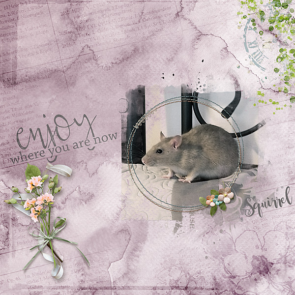
I was wondering about that but decided it might not be polite to ask!!! Whatever you did, the steps you took, all your hard work has really paid off in this wonderful page. It's both very pretty AND cute! So is "Squirrel"!!!
 

terryspear

Well-Known Member

Karen Schulz Designs

Designer
Designer

Karen Schulz Designs

Designer
Designer
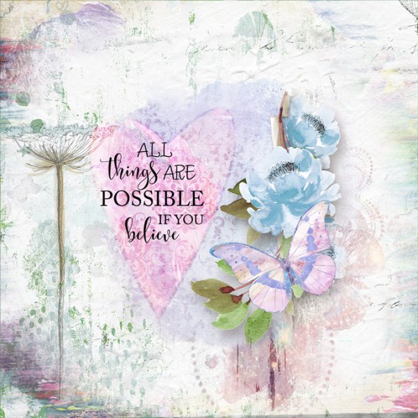
I blended the heart in Overlay, which worked well beneath the Word Art. I loved seeing your examples of what can look so much more blended or I would have used Vivid otherwise!
I agree, Terry. Using the Overlay Blend Mode on your heart gave it a really nice soft look and was a perfect background for the word art.
 

tanteva

Mistress of Mayhem
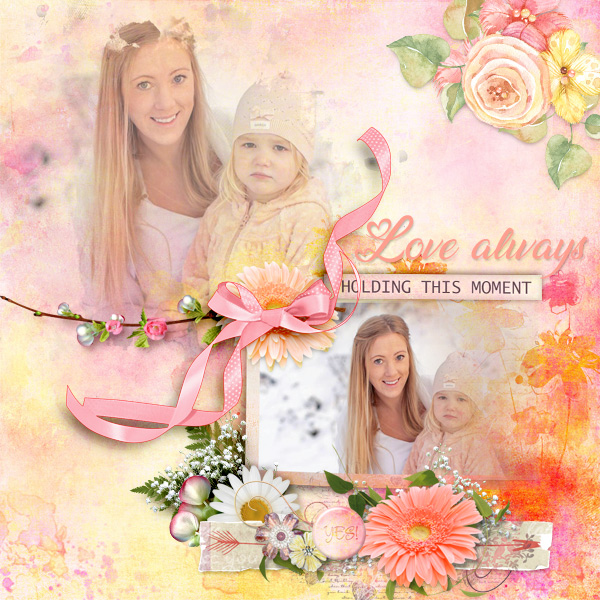
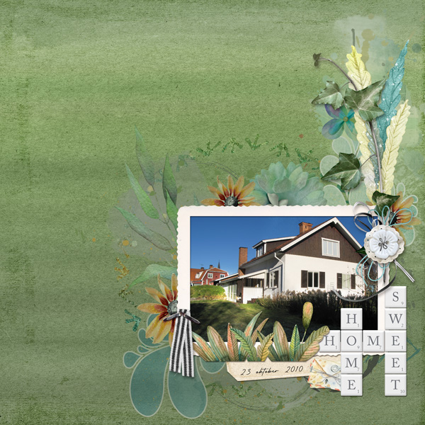
Thank you for the tutorial! Had lots of fun ... here's my layout:


Full credits in the gallery.

Steps:
The photo was a bit dark in the foreground. I duplicated it, changed the blend mode on the top layer to Linear Dodge, and then erased the sky and houses part of that layer so that only the grass area got lighter. For the background I used a solid colored paper from the kit and one of the water color overlays. Used the solid paper as background, added a new layer on top of that, where I used the gradient fill tool and made a stripey green gradient. Then added the water color overlay on top of that and changed the color to a dark green. Changed the blend mode on the gradient layer to Hard Light and lowered the opacity to 30%. Changed the blend mode on the overlay to Multiply and lowered the opacity to 70%. Finally for the background I added the Messy Edge, changed the blend mode to Color Burn and lowered the opacity to 82%. Then I added the photo and the elements, tucking some of the painted layers under the blended layers of the background.
 

Karen Schulz Designs

Designer
Designer
Thanks for giving us the detailed steps on how you created your page, Eva. I love that you used Blend Modes to get your photo exactly how you wanted it. Great job! And so easy, right? I appreciate how you experimented with different products, tools, and Blend Modes until you got exactly what you wanted on your background. Sometimes that's exactly how things fall into place! Thanks for participating in the challenge!
 
Thank for this fun tutorial! I tried different gradients, textures, and blend modes before I selected this one.

Gradient fill was used to blend with the texture using Overlay.
Mask and accent are from the Possibilities Collection, https://www.oscraps.com/shop/digital-scrapbooking-collection-possibilities-karen-schulz-designs.html.
Background texture is from Vintage Book Textures 02: https://www.oscraps.com/shop/Vintage-Book-Textures-02.html.
Photo is mine. The dark portion on each end is from the poles on my porch.


Karen Schulz Designs

Designer
Designer
Thank for this fun tutorial! I tried different gradients, textures, and blend modes before I selected this one.

Gradient fill was used to blend with the texture using Overlay.
Mask and accent are from the Possibilities Collection, https://www.oscraps.com/shop/digital-scrapbooking-collection-possibilities-karen-schulz-designs.html.
Background texture is from Vintage Book Textures 02: https://www.oscraps.com/shop/Vintage-Book-Textures-02.html.
Photo is mine. The dark portion on each end is from the poles on my porch.


Beautifully done, Tawnya! Gorgeous photo - and I love that the background paper you chose with the gradient replicates the colors in a rainbow. Thanks for sharing!
 
Top