Oscraps

March Challenge # 1 - Web Inspiration

Kythe

Well-Known Member
1677520491188.png
All members that participate, everyone PLEASE ensure that you read all the rules for this challenge so that you can claim your challenge points. Thank you!

Welcome to Challenge #1 Web Inspirations
hosted by Kythe

The Web Inspirations Challenge is to use the image found on the web to create a unique layout of your own.
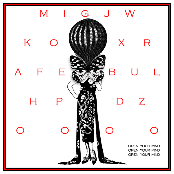
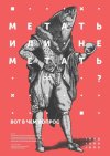
I found this delightful poster on Pinterest posted by Christaine Nagel and thought it would be fun to create a creature and layout around it!

Pixabay.jpg

The challenge is to use the figure from the image above to create a unique fantastical figure of your own. You may freely use any ideas from the image as a starting point for your own work. (You may not copy and paste any part of the image due to copyright issues.)

The main focus of your layout is to be the fantastical figure. Let your imagination reign. All else can come from any part of the image. You may like a pencil drawing rather than photo, the colour combination, the overlay of letters, the poster size, the simple background or anything you find interesting within the poster. Change it up as you like as long as the figure is the focus of the page.

In my example, I used the following as my inspiration:
  • mix of human body animal head
  • era for the clothing of the human
  • the lettering and text
What I changed:
  • background colour
  • subject colour
  • painting rather than sketch
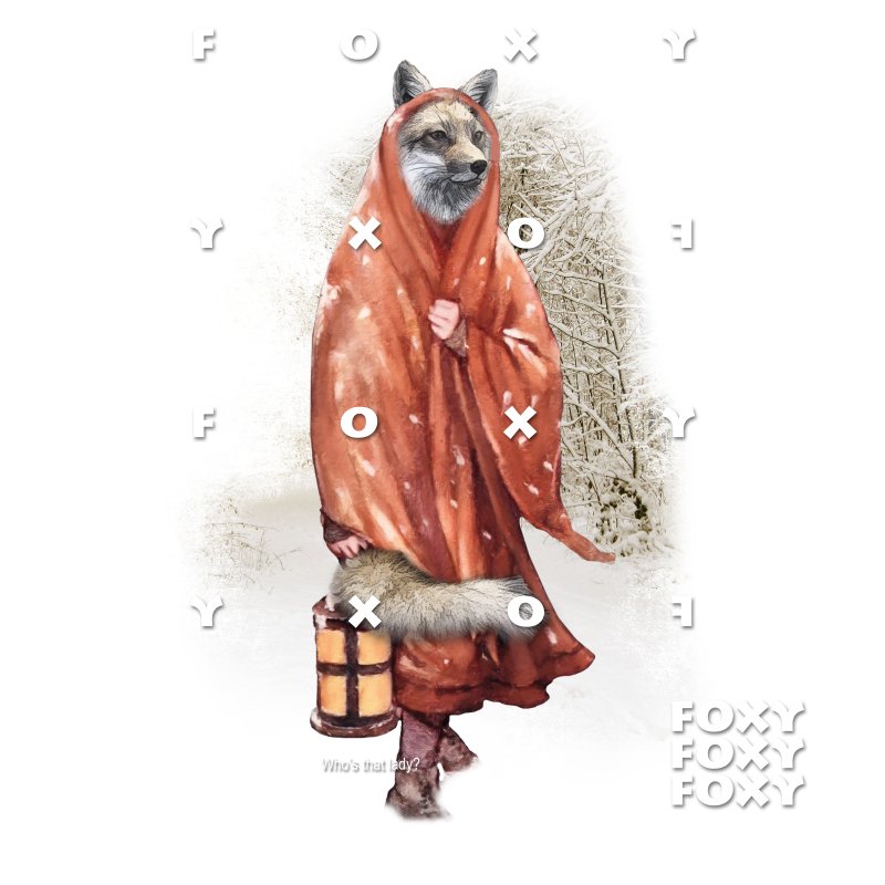
  • zebra head extracted from a photo
  • frame
  • size of the layout
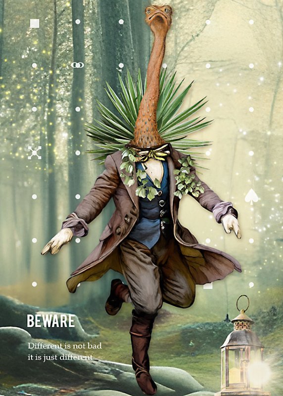
M y sample using:
Foxeysquirrel Imagine and a Zebra photo from Pixabay
Web Inspiration.jpg

RULES:
- create your own unique figure and layout using inspiration from the poster above. (You may not actually copy any part of the poster.)
- In the forum thread, list what inspired your layout

- Please use 80% Oscraps products that are currently in the store.
- Non-Oscraps products or retired O designer products can be used whether the designer is selling elsewhere or not.
- You need to credit all the products used on your layout.
- Your layout can not be used for more than one challenge.
- Your page must be posted in the Challenge 1 gallery by midnight PST March 31 2023 and linked back to this thread (see below on how to add your linked layout).
- And do not forget to update the March TRACKING THREAD to be eligible for your coupon.


Adding a linked layout from the Gallery to a thread:
1. Upload your layout to the gallery first. In your forum post click the Gallery Embed icon (little camera).
2. This will open your gallery, simply click on the layout you require, then scroll down to the bottom of the screen and click the Continue button.
3. Your linked layout is now in your post, the image will appear once you have clicked the Post Reply button.
 
Last edited:
Madi

Diane
CHEERY O
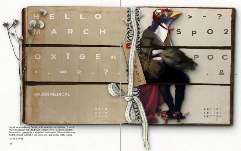
I created an ATC using Lynn Anzelc products,
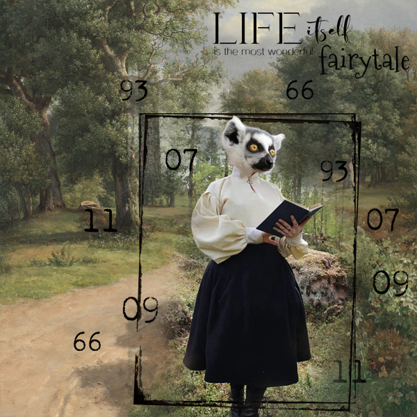
I also was inspired by the dotted/letters/numbers pattern and the overal layout.


For this ATC the unique figure is created from 2 animals from the kit.
I already made a whole set of ATC's and then I read the challenge again, that it needed to be unique, so made one more!
 

Kythe

Well-Known Member
Thanks for the Challenge!! - - That was fun!!

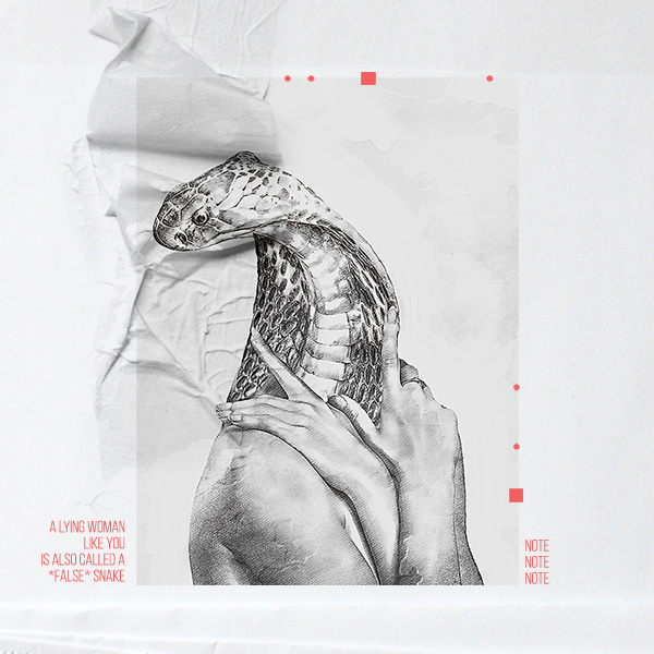
My Inspiration:
pencil drawing
human body with head replaced
random letters
three lines of text

The very clear and concise composition is an eye-catcher! A perfect example of an effective minimalist layout. Excellent.
 

Kythe

Well-Known Member
My gosh! The challenge hasn't been up long and already the entries are blowing me away!
 
  • Like
Reactions: AZK

vickyday

Love my O Family!
CHEERY O
Well, I can see I did my first page incorrectly, LOL! What's that note mean by being sure to "read ALL of the instructions!" DUH! Anyway, I still like the page I did, it just doesn't qualify for the challenge. I'll go and do another one. However, Araya is a "unique" character.....but I didn't create her, LOL!
 

Kythe

Well-Known Member
Well, I can see I did my first page incorrectly, LOL! What's that note mean by being sure to "read ALL of the instructions!" DUH! Anyway, I still like the page I did, it just doesn't qualify for the challenge. I'll go and do another one. However, Araya is a "unique" character.....but I didn't create her, LOL!
No harm done and I must say your layout is really good. I am sure Araya is a unique character
 

BrightEyes

Kay
CHEERY O
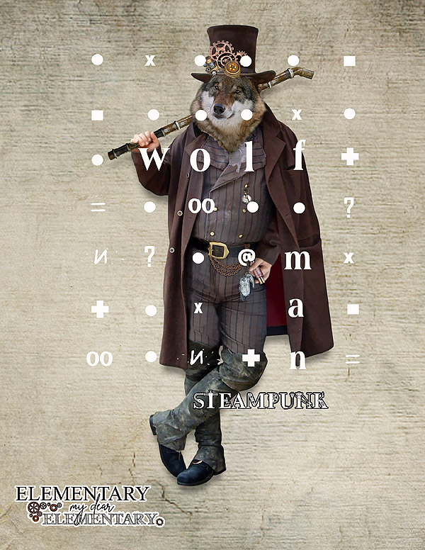
What a fun and unique challenge.

Inspirations
I used the following as my inspiration:
  • mix of human body animal head
  • steampunk for the clothing of the human
  • the lettering
What I changed:
  • use background paper - different color
  • subject in full color
  • extracted photo than sketch
  • wolf head extracted from a photo
  • 2 word arts in place of text
 

Kythe

Well-Known Member
What a great challenge!! I used the two species idea, and the color of the card.

@Kythe- your example, swoooooon!!! And @*sylvia* - hate snakes but that is riveting!!!!
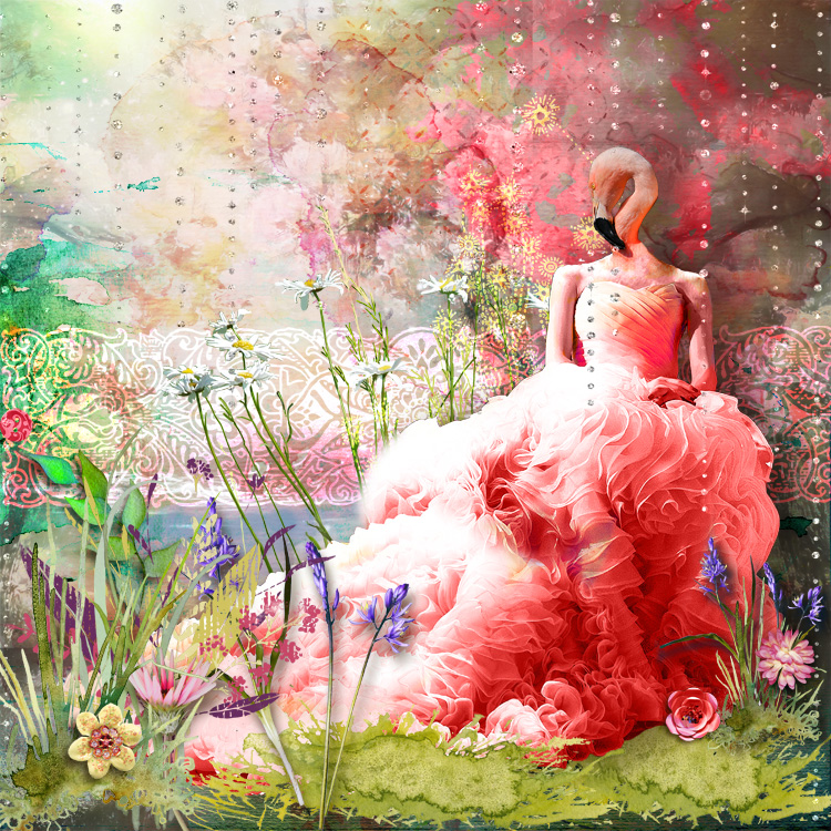
Oh I like the detail of the figure and the pink frothy dress to match the flamingo feathers. The fantasy garden is perfect for a romantic interlude. Excellent interpretation. Don't forget to tuck your LO in the challenge #1 gallery!
 

Kythe

Well-Known Member
What a fun and unique challenge.

Inspirations
I used the following as my inspiration:
  • mix of human body animal head
  • steampunk for the clothing of the human
  • the lettering
What I changed:
  • use background paper - different color
  • subject in full color
  • extracted photo than sketch
  • wolf head extracted from a photo
  • 2 word arts in place of text
He is so suave and debonair just as you would expect from a wolf! Love that you made him steampunk and referenced that charming Sherlock we all know. This is nothing short of inspired.
 

Kythe

Well-Known Member
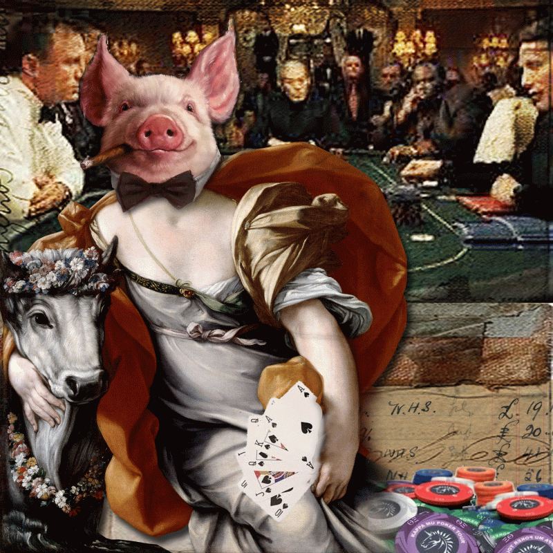
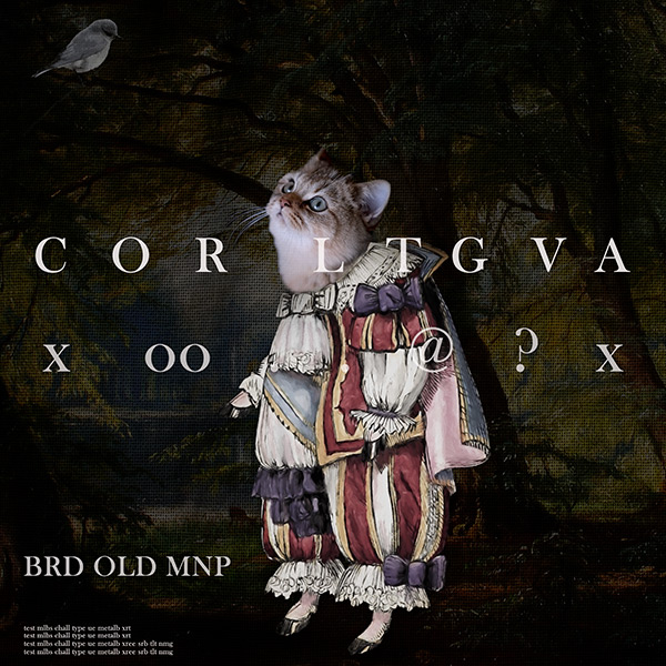
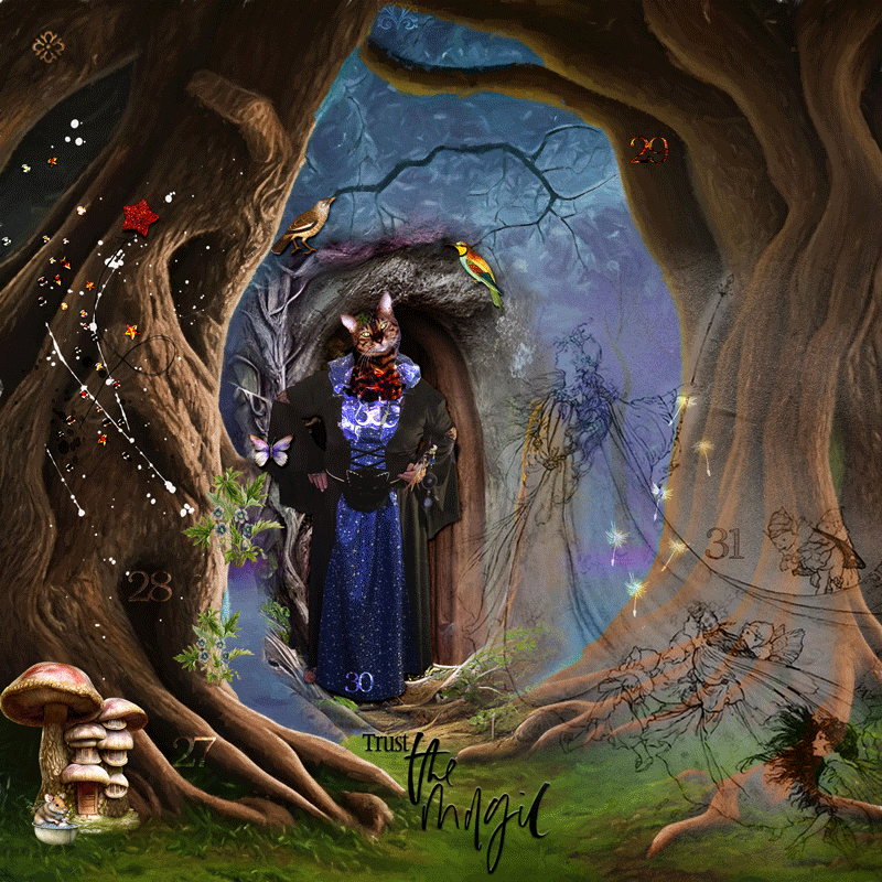
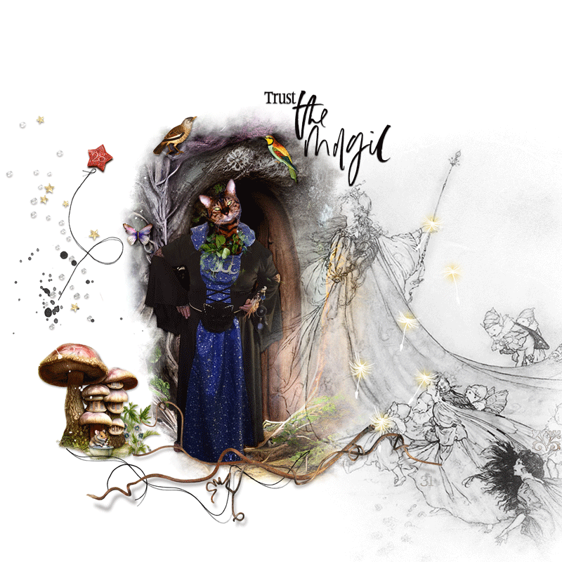
Oh my 2! I can't decide which I like better. They are both so good! I wonder what 'Miss Kitty' is up to?
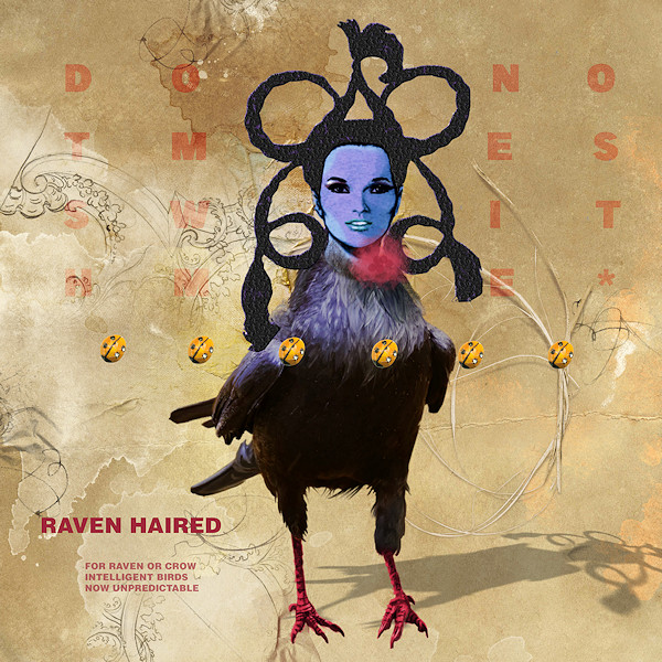
I hope it counts that I reversed the body/head switch. I also used a letter pattern, the shadow and basic arrangement.

Absolutely it is okay to switch. I wondered if any one would. I love this take.
 
Top