Oscraps

July Challenge #7 - Tic Tac Toe

BrightEyes

Kay
CHEERY O
2021-tic-tac-toe-web-jpg.409557

All members that participate,
can everyone PLEASE ensure that you read all the rules for this challenge
so that you can claim your challenge points. Thank you!

Welcome to July's Tic Tac Toe Challenge
My name is Bright Eyes aka Kay and I am your hostess for this challenge.

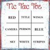
Below is the July Tic Tac Toe board
You need to pick 3 items in a row... across, down or diagonal...
and place them in your Layout.
You must list which row, column or diagonal and the items you used

(example: across middle row - camera, person, blue; down left column - red, camera, sky;
diagonal lower left to upper right -sky, person, wings)
Use whatever theme you wish
#Tic-Tac-Toe-July-2024-OS.jpg

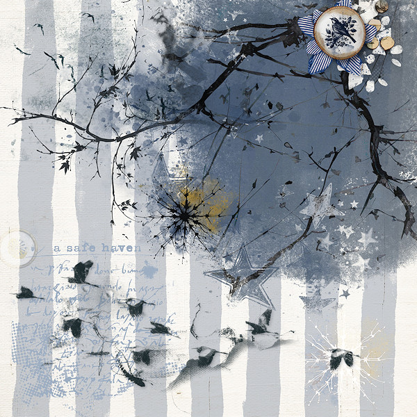
This is my Layout
I used right column down: Wings, Blue and Stripes
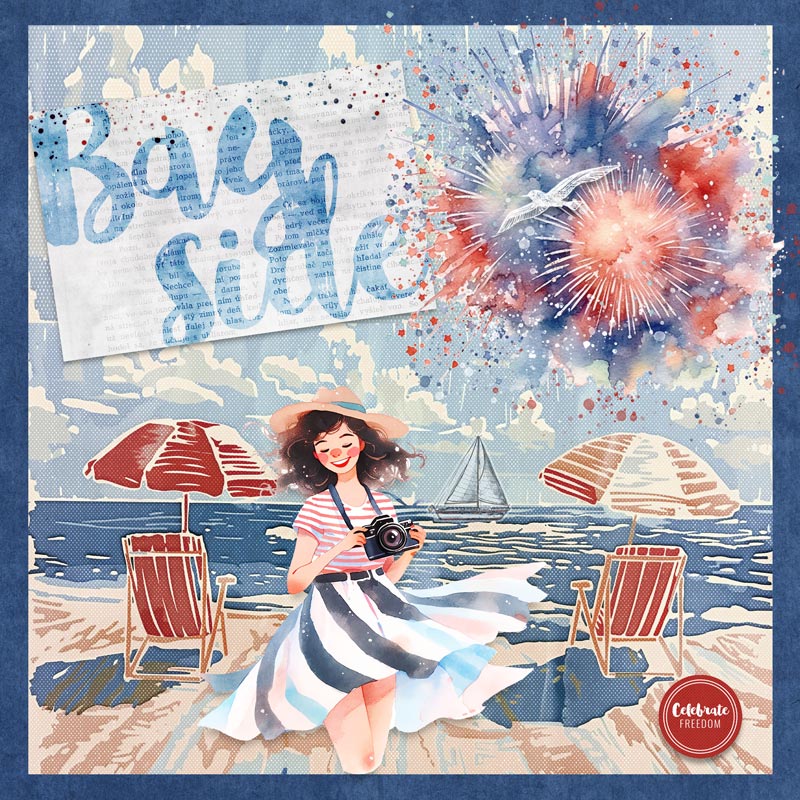


I used June Color Play - Bayside collection by Mixed Media by Erin
ewright-Bayside-Collection-PVW-1000.jpg

I am looking forward to seeing your layouts and what themes you used.


RULES:

- pick 3 items in a row... across, down or diagonal and place them in the Layout.
- You must list which row, column or diagonal and the items used in your post
- Use whatever theme you wish

- Please use 80% Oscraps products that are currently in the store.
- Non-Oscraps products or retired O designer products can be used whether the designer is selling elsewhere or not.
- You need to credit all the products used on your layout.
- Your layout can not be used for more than one challenge.
- Your page must be posted in the Challenge 7 gallery by midnight PST July 31, 2024 and linked back to this thread (see below on how to add your linked layout).
- And do not forget to update the CURRENT MONTH'S TRACKING THREAD to be eligible for your coupon.

Adding a linked layout from the Gallery to a thread:
1. Upload your layout to the gallery first. In your forum post click the Gallery Embed icon (little camera).
2. This will open your gallery, simply click on the layout you require, then scroll down to the bottom of the screen and click the Continue button.
3. Your linked layout is now in your post, the image will appear once you have clicked the Post Reply button.
 
Last edited:

BrightEyes

Kay
CHEERY O
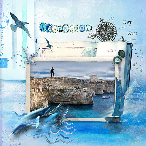
Thanks for this lovely challenge which got me going in a different direction. I used the 3rd column, wings, blue, stripes.

What a delightful monochromatic LO. Love the soft and dreamy look to your page.
The accent of the bird flair is wonderful. Thanks for joining the challenge.
 

isDK

Well-Known Member
Thanks for the fun challenge!
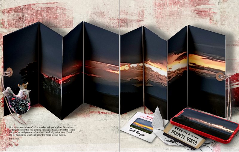
Well, I used the left vertical, Red, camera and sky. The reddest sky was this morning but the sliver of light wasn't very nice for a more traditional page. Happens that my phone case is red too, and it's my camera. To solve the issues of a weird photo, I saw Martha Stewart doing something with an accordion page and thought, "Hey! that's it!" It took a lot of work but I learned a lot which is what it's about for me. :p


BrightEyes

Kay
CHEERY O
Thanks for the fun challenge!
Well, I used the left vertical, Red, camera and sky. The reddest sky was this morning but the sliver of light wasn't very nice for a more traditional page. Happens that my phone case is red too, and it's my camera. To solve the issues of a weird photo, I saw Martha Stewart doing something with an accordion page and thought, "Hey! that's it!" It took a lot of work but I learned a lot which is what it's about for me. :p

Great choice for the challenge - and really like the accordion folds for the photo. It adds some extra piazza to the LO. You really thought outside the box and created a fabulous page. Thanks for joining the challenge.
 

BrightEyes

Kay
CHEERY O
thank you for the challenge
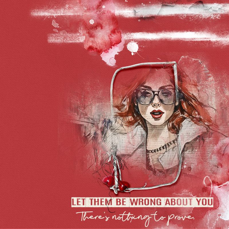
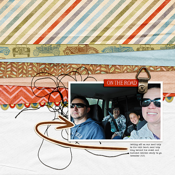
my row = red | person | stripes

Love the mostly red with a bit of white in this LO. Great photo masking with the funky frame around it. The quote is fantastic... and we should all remind ourselves that. Thanks for joining the challenge.
 

BrightEyes

Kay
CHEERY O
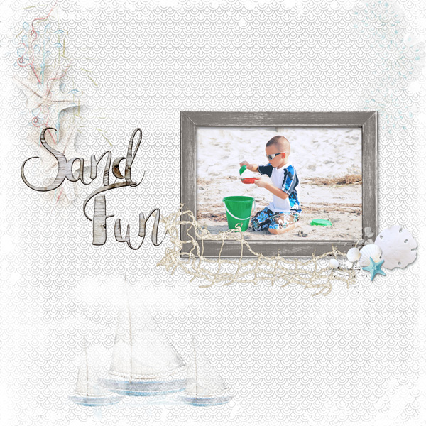
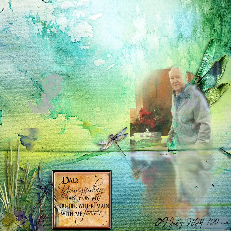
I went down the middle with Title, Person and White. Thanks, Kay, for a fun and creative challenge!

I really like the soft white background with the delightful framed photo. The barely there elements swinging in a soft diagonal down and over the edge of the frame leads the eyes right to the photo. Lovely title. So glad you shared this with us.
 

BrightEyes

Kay
CHEERY O
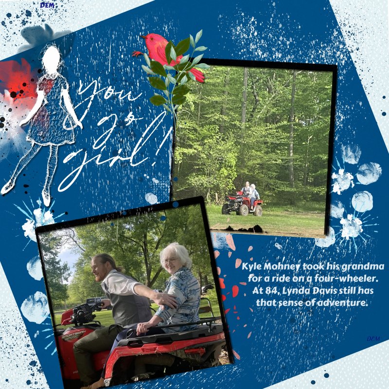
I took the middle column - Title, Person, White. This is one of my nephews taking his 84 year old grandma for a ride on a four wheeler. It may have been her first time riding one!
Such a wonderful thing to do for his grandmother. Love her spirit of adventure. I like the angled blue paper over the white and blue background paper... perfect for letting the 2 photos take center stage. Thanks for joining the challenge.
 

BrightEyes

Kay
CHEERY O
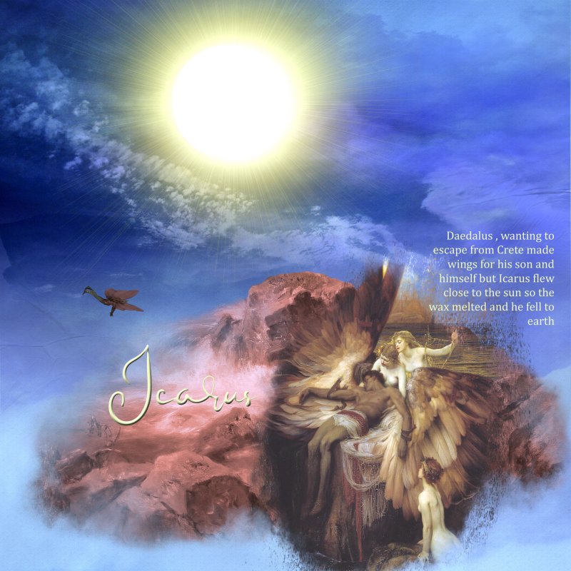
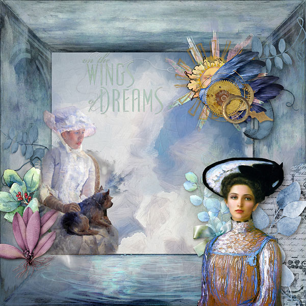
Hah!! The choices were trickier than I expected them to be. I used the diagonal- wings/person/sky

And such a beautiful LO you created. Love the soft colors and blended images of the lady. The large frame in soft blue brings the eye right to those image of her. Love the title... we all need the Wings of Dreams to give us strength for each day. Thanks for sharing this delight page with us.
 

JeanneMN

GrOwing Old is mandatOry grOwing up is OptiOnal
CHEERY O
Rookie question here. Does it have to be one person or can it be persons?
 

BrightEyes

Kay
CHEERY O
Red, White, and Blue by ET Designs
person, sky, wings

View attachment 423689
Oh.. what a fun and wonderful celebration themed LO. Love the masked and blended Lady Liberty with the birds fly over her. The black/white brushes in the side border along with the blue and red flowers are the perfect accent to the theme. Thanks for joining the challenge.
 

Mary-11

Well-Known Member
Oh.. what a fun and wonderful celebration themed LO. Love the masked and blended Lady Liberty with the birds fly over her. The black/white brushes in the side border along with the blue and red flowers are the perfect accent to the theme. Thanks for joining the challenge.
Than you
 
Top