Oscraps

Fav. Scrapping Tricks?

Caro

Well-Known Member
CHEERY O
Share your favorite scrapping tricks.
One of favorite things to do when I'm scrapping a page is to edit a photo to give it a vintage feel to use with a vintage style kit.
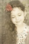
Technique: I duplicated my photo layer and applied a sepia tone filter to the second photo layer. Then I used a 30% opacity eraser and swiped it across the photo. Then I used it again over the brighter colors of the photo like the reds and blues in her flower and dress. I then used a paper from my chosen kit and placed it on the top of my layers and to use it as a texture and swiped the 30% opacity eraser over the paper until desired effect. Finally I took one of the word art overlays in the kit and placed it on the photo. I merged the layers and then scrapped my page. :D
Original
DSC_0292.jpg
Edited
DSC_02921.jpg
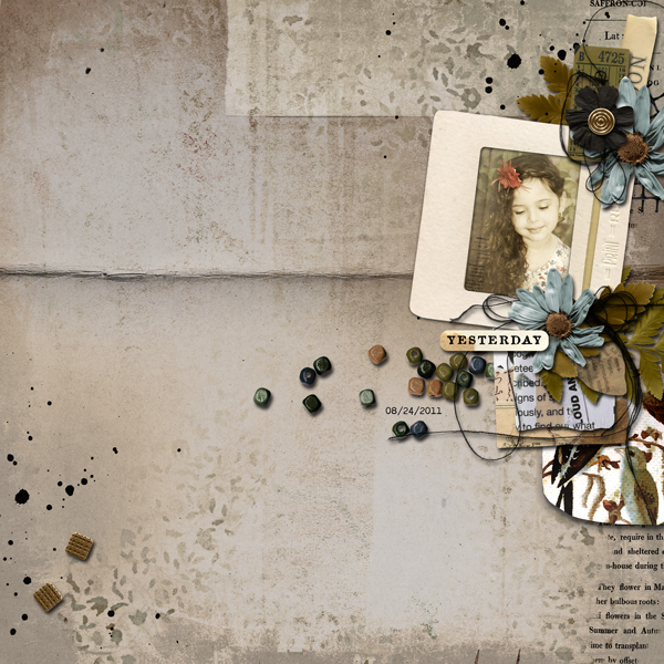
Layout
using
ColorPlay
The Assembles Collection: Olive and Saffron | The Complete Mixed Media Collection by @Rachel Jefferies
 

mywisecrafts

Sarcasm is the way I Roll
CHEERY O
Some of my favorite go to options:
1. If I have a photo that I love, I will reuse it in other layouts.
2. If you have the perfect photo but the coloring is wrong and will clash with the collection, recolor. B&W photos are a quick go to for me
3. If I'm recoloring a photo and I want it to look it belongs with the collection, sometimes I will apply a color overlay but use a color in the collection by use the color picker function in PS.
4. When all else fails in a cluster, throw in some messy threads or paint splatters. Messy threads and paint splatters are the perfect band-aids.
5. Can't get the perfect background look, just blend. blend some papers together and make it all your own.

I may be back with some more.... LOL.
 

Veronika

Well-Known Member
My absolute favorite tip for scrapbooking is to use the blend mode functions with the sliders in the layer style in Photoshop to achieve wonderful effects
this is quick and easy and can be applied to anything - elements, paint, brush strokes, text....
I use this function in almost every one of my layouts
Screen1.jpg
 

tanteva

Mistress of Mayhem
Almost everytime I make a layout: when it's "done", all elements picked and placed, shadows and everything done etc, I try other papers for background.

I often find that the layout look better with another color on the background. Or maybe lighter or darker background.
 

LSlycord

Well-Known Member
I don't really have any favorite tricks but I will be watching this thread closely because I sure want to improve.
 

Amandajk

Holy Nomad
When making a paper layout, especially Art Journal ones, I would often finish with a glaze of color that blended the page and made it homogeneous. In Digital, the same can be done with a paper, or a texture and adjust with the blending modes and transparency levels. :D
 

DesignsByCRK

Well-Known Member
Designer
To give my photos a subtle pop I duplicate it, change the blend mode to screen at 50% opacity and then duplicate that layer again and change it to Soft light.

I have no problems using photos multiple times.

I have been known to dress Ethan in certain colours to match a collection so that I have photos to scrap lol.

I like to layer, layer layer - I'm not much of a blender (probably because i suck at it.

Shadows are your friend. the higher the layer, the bigger the shadow.

If you have a template that requires multiple photos, but only 1 or 2 that suit - use those photos multiple times on the one layout - use a close up cropped version, and the standard version of each photo to give you extra "photos" in your layout.
 

bcgal00

Well-Known Member
CHEERY O
Here's a couple of things that I like to do:

  • duplicate photos and resize/crop/flip them, giving them a new look/perspective.
  • I re-use photos often.
  • I blend papers with a gradient map, erase with a brush or clip to a mask.
  • Blend modes are so versatile. That's a whole conversation in itself. One thing I like is adding a bit of oomph to a LO by adding a blend mode layer. Experiment by soft light layer or overlay works great, sometimes a more vivid contrast mode like hard light. For any of them I reduce the opacity to very low.
  • Put shadows on their own layer and then manipulate it by warping.
I'll come back with more later, I have to get going...
 

tanteva

Mistress of Mayhem
One thing I like to do is to use a photo and then draw attention to a detail in the photo with my jornaling.

One example I come to think of is a layout I made way back in paper scrapping days. I took a photo of me holding John when he was a baby. Then I wrote all about the sofa we're sitting on. How we got it, how old and ugly it was, all nights I slept on it when I was pregnant cuz I had so much heartburn I couldn't lie down and sleep, all the hours spent in it feeding John & watching Emmerdale and so on.

Been a while since I did a layout like this. Need to look through my photos!
 

LSlycord

Well-Known Member
One thing I like to do is to use a photo and then draw attention to a detail in the photo with my jornaling.

One example I come to think of is a layout I made way back in paper scrapping days. I took a photo of me holding John when he was a baby. Then I wrote all about the sofa we're sitting on. How we got it, how old and ugly it was, all nights I slept on it when I was pregnant cuz I had so much heartburn I couldn't lie down and sleep, all the hours spent in it feeding John & watching Emmerdale and so on.

Been a while since I did a layout like this. Need to look through my photos!
I love this Eva. I've tried to do a little bit more of that more recently.
 

ClaireG

Well-Known Member
CHEERY O
My go to is creating sticker style titles using strokes and shadows.
I also love love love close photo crop
 

Jam-on-toast

Well-Known Member
CHEERY O
Almost everytime I make a layout: when it's "done", all elements picked and placed, shadows and everything done etc, I try other papers for background.

I often find that the layout look better with another color on the background. Or maybe lighter or darker background.
Eva, there is no telling how many times I've done this!!! I rarely end up with the background I started with.
 

Jam-on-toast

Well-Known Member
CHEERY O
Oh, this thread is a treasure! Here's one from me:

I love using word strips and journaling - the former are a greta addition to any cluster and an irregularly-shaped custom-made text frame is one of my go-to solutions when a page feels off.
 

scribler

The O is my hOme.
CHEERY O
I've seen a lot of my favorite tricks already but I have a few more to add.

One thing I really like to do is add a black layer mask to a paper layer and then use a brush to reveal only the part of the paper I want to use.

I also really like using Inner Glow to create an inked edge look on photo mats and titles.

My newest one is using the Threshold adjustment layer on photos for art journaling pages.
 
Top