mywisecrafts
Sarcasm is the way I Roll
Hey My Friends. In the US we are are what I call knee deep into summer. Many have vacation in full swing. Our family enjoyed some early summer adventures between Hawaii (my favorite place thus far) and Japan and now we are are back getting into our normal daily routine. We are officially entering into the last half of the year.
As a reminder, here is overview of the approach to the 2024 Mixed Media Challenges:
Each month through 2024 a broad theme will be provided for the challenge and you can interpret these themes as literally or as loosely and abstractly as you wish.
Please feel inspired and relaxed to experiment and personalize these challenges this year to your advantage. Our goal for 2024 is for you to get pages scrapped, use your stash of digital art, and if you’d like, and have time, practice some fun techniques to build confidence in your mixed media scrapbooking.
If you’d like to learn something specific please inbox Rachel with your suggestion.
For July 2024, our challenge will be to choose one of the quotes from below that resonates with you the most or helps you to get a page scrapped!!!
This is a casual challenge and you can interpret these monthly themes as literally or as loosely and abstractly as you wish and put your own spin on it. Here are the list of quotes for this month's challenge . . .
"a hero is an ordinary individual who finds the strength to persevere and endure in spite of overwhelming obstacles."
-Christopher Reeve
"The best way to find out what you want in life is to try a lot of things."
- Oprah Winfrey
"Do one thing every day that scares you."
-Eleanor Roosevelt
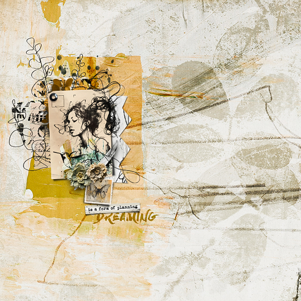
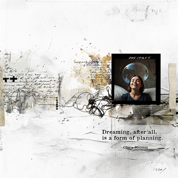
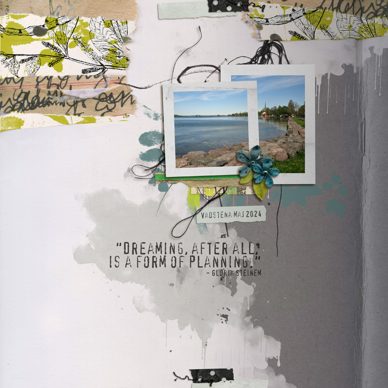
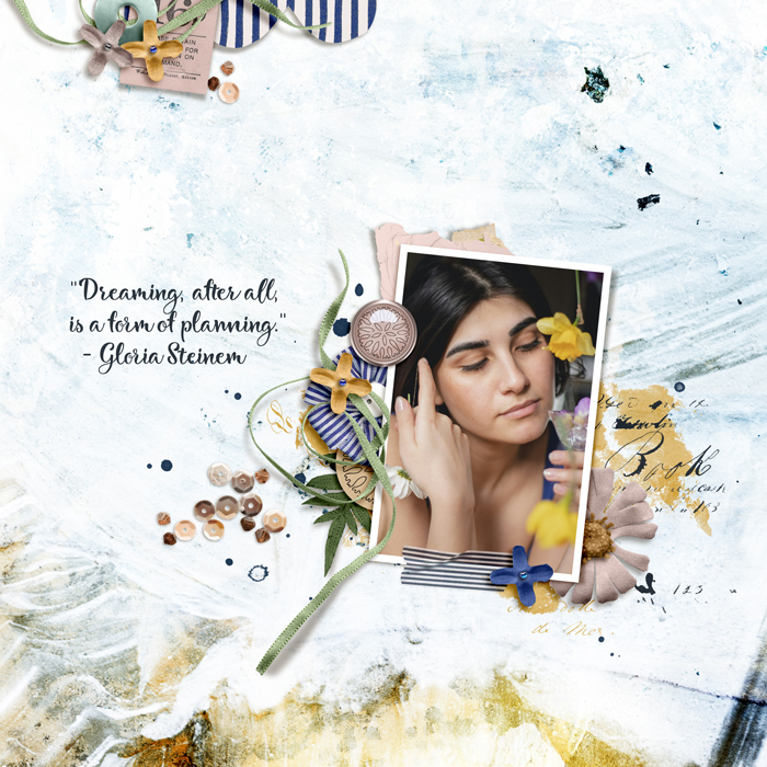
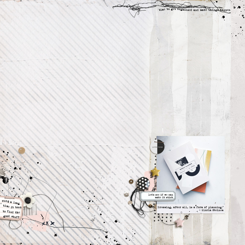
"Dreaming, after all, is a form of planning."
- Gloria Steinem
Tips/Technique/Tutorial:
With each challenge, a tip/technique/tutorial will be included. There is no pressure to incorporate the tip/technique/tutorial into your challenge page, the choice is entirely yours.
My tip or technique for you, is how to give digital layout some additional depth that adds an element of realism that one would see in a physical layout or hybrid approach.
I absolutely love my background paper that chose for this layout. Now I did do some gradient blending and some masking to achieve the overall background look but I'm going to focus on one particular aspect in my tip for you.
Below is how this background paper looks in its original format (left) and on the right is how it looks as my end design. Pay particular attention to the areas that are section off in red.
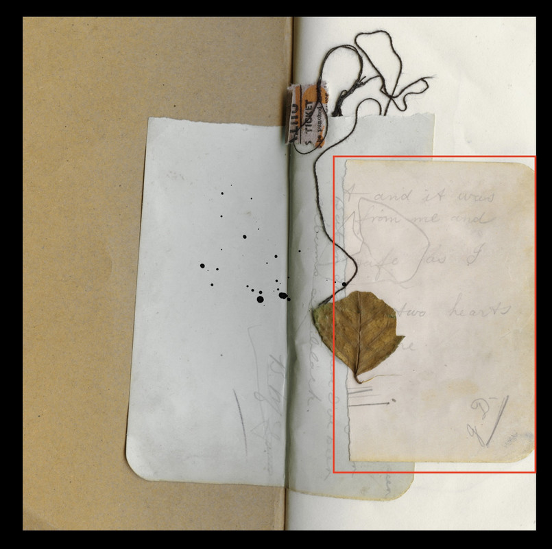
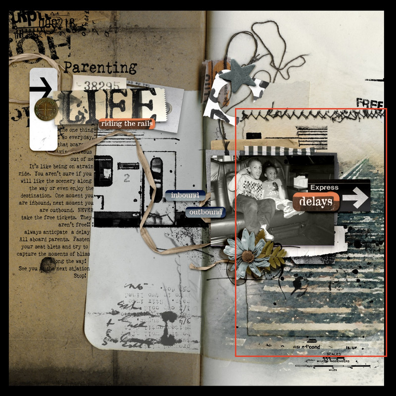
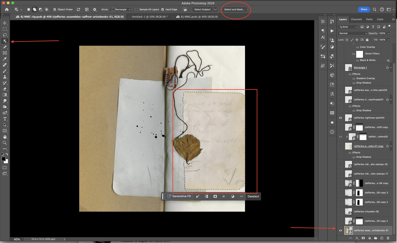
I started off with my background paper selected and then used the object selection tool to extract this section of the background paper. Once you see the marching ants, I go above and hit the "select and mask" button.
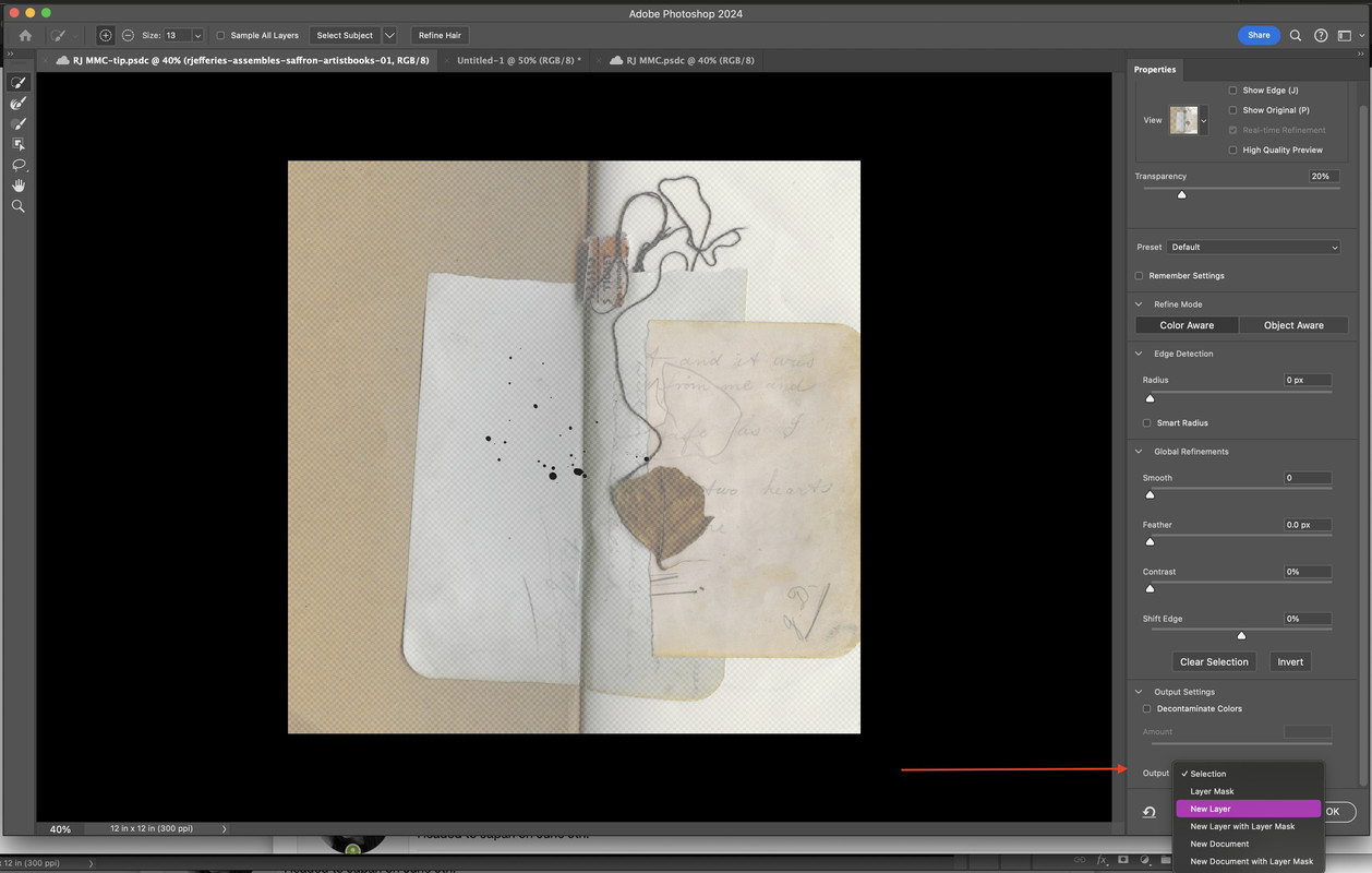
Once you do this everything but your selection appears to fade in color with just the selection a little darker or more visible. The next step is to indicate the "output selection" for this object. I always opt to have my new object as a new layer (just in case I need to redo anything, make corrections etc).
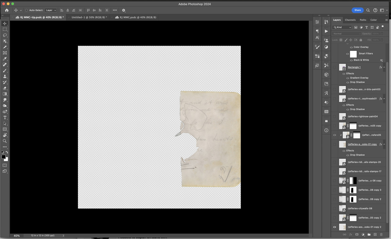
Since I only extracted this piece of the background paper, it automatically hid the actual background paper, that is why it isn't showing. Don't worry, it's there. I just go down and click the box to make it visible again.
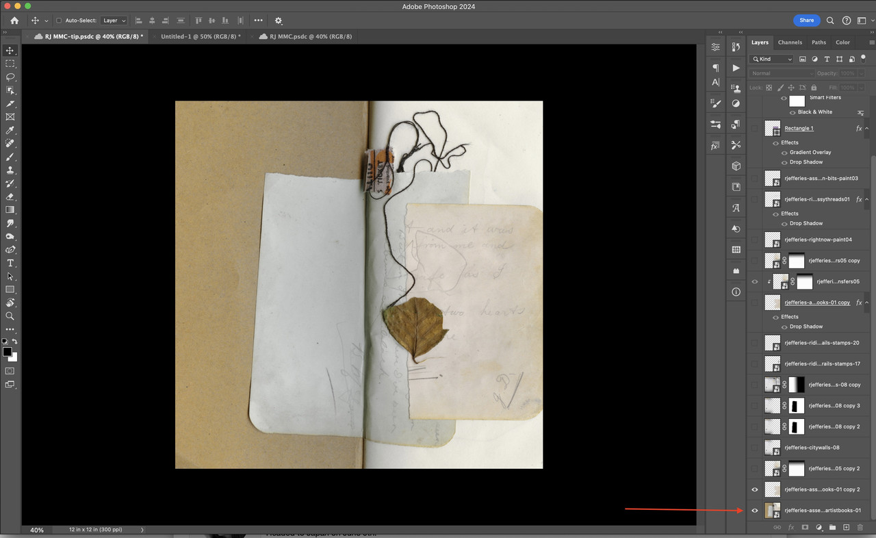
I then go back to my extraction selection layer and add a drop shadow to that layer. (Normally I tend to add shadows to the right of the element, but for this extraction, I'm going to add it to the left side since I want it to look more like a physical piece of paper added here).
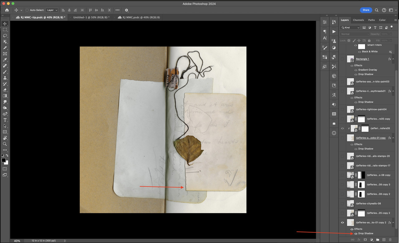
From here, I layered in a "stamp" under the extracted paper and I clipped a copy to to the extracted paper as well. This gives the appearance that the "stamp" was "stamped" on the extracted paper but to large for the paper piece and the "extra" went onto the rest of the background.
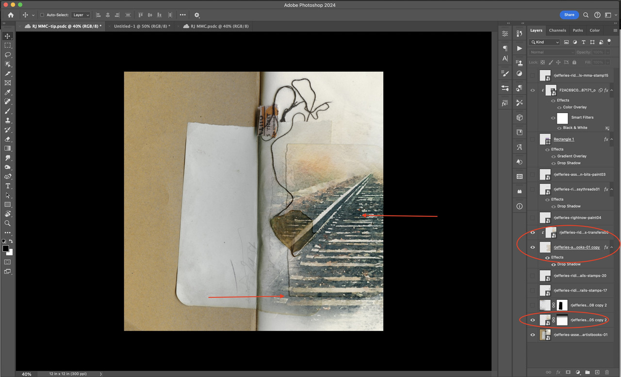
From here, I then continued to build the rest of my layout until I achieved the end result as below. (Note: I did do some additional gradient blending that isn't discussed here, if you want to know how I did that, message me with the platform that you use and I can give some pointers (or try to).
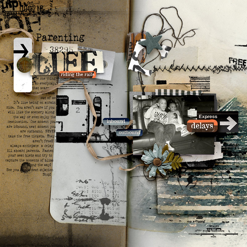
Here's my layout. I was inspired by:
"Do one thing every day that scares you."
-Eleanor Roosevelt
While there is some definite humor in my creative direction, there's also the element of truth. Parenting scares me everyday of my parenting life. (My journaling is located in my gallery post).
Here's an example from @Rachel Jefferies
Challenge Requirements:
If you have any questions just tag me and I will get back to you as soon as I can. As always, I look forward to your creations!
As a reminder, here is overview of the approach to the 2024 Mixed Media Challenges:
Each month through 2024 a broad theme will be provided for the challenge and you can interpret these themes as literally or as loosely and abstractly as you wish.
Please feel inspired and relaxed to experiment and personalize these challenges this year to your advantage. Our goal for 2024 is for you to get pages scrapped, use your stash of digital art, and if you’d like, and have time, practice some fun techniques to build confidence in your mixed media scrapbooking.
If you’d like to learn something specific please inbox Rachel with your suggestion.
For July 2024, our challenge will be to choose one of the quotes from below that resonates with you the most or helps you to get a page scrapped!!!
This is a casual challenge and you can interpret these monthly themes as literally or as loosely and abstractly as you wish and put your own spin on it. Here are the list of quotes for this month's challenge . . .
"a hero is an ordinary individual who finds the strength to persevere and endure in spite of overwhelming obstacles."
-Christopher Reeve
"The best way to find out what you want in life is to try a lot of things."
- Oprah Winfrey
"Do one thing every day that scares you."
-Eleanor Roosevelt
"Dreaming, after all, is a form of planning."
- Gloria Steinem
Tips/Technique/Tutorial:
With each challenge, a tip/technique/tutorial will be included. There is no pressure to incorporate the tip/technique/tutorial into your challenge page, the choice is entirely yours.
My tip or technique for you, is how to give digital layout some additional depth that adds an element of realism that one would see in a physical layout or hybrid approach.
I absolutely love my background paper that chose for this layout. Now I did do some gradient blending and some masking to achieve the overall background look but I'm going to focus on one particular aspect in my tip for you.
Below is how this background paper looks in its original format (left) and on the right is how it looks as my end design. Pay particular attention to the areas that are section off in red.


I started off with my background paper selected and then used the object selection tool to extract this section of the background paper. Once you see the marching ants, I go above and hit the "select and mask" button.

Once you do this everything but your selection appears to fade in color with just the selection a little darker or more visible. The next step is to indicate the "output selection" for this object. I always opt to have my new object as a new layer (just in case I need to redo anything, make corrections etc).

Since I only extracted this piece of the background paper, it automatically hid the actual background paper, that is why it isn't showing. Don't worry, it's there. I just go down and click the box to make it visible again.


I then go back to my extraction selection layer and add a drop shadow to that layer. (Normally I tend to add shadows to the right of the element, but for this extraction, I'm going to add it to the left side since I want it to look more like a physical piece of paper added here).

From here, I layered in a "stamp" under the extracted paper and I clipped a copy to to the extracted paper as well. This gives the appearance that the "stamp" was "stamped" on the extracted paper but to large for the paper piece and the "extra" went onto the rest of the background.

From here, I then continued to build the rest of my layout until I achieved the end result as below. (Note: I did do some additional gradient blending that isn't discussed here, if you want to know how I did that, message me with the platform that you use and I can give some pointers (or try to).
Here's my layout. I was inspired by:
"Do one thing every day that scares you."
-Eleanor Roosevelt
While there is some definite humor in my creative direction, there's also the element of truth. Parenting scares me everyday of my parenting life. (My journaling is located in my gallery post).

Here's an example from @Rachel Jefferies

Challenge Requirements:
- Create a new page inspired by one of the above quotes, please include the quote that inspired you in your post in this thread.
- Use at least 75% of Rachel's Product currently available in her Oscraps shop.
- Any remaining percentage must be product from another current Oscraps designer. This could also include retired products from Rachel or the other current Oscraps designer.
- Hybrid projects are also welcome and the same product rules apply. Where digital products are used in a hybrid project they must all come from current Oscraps designers, and at least 75% must be Rachel's Product.
- Upload your layout to the Rachel Jefferies Designs Gallery at Oscraps with your product credits.
- For your challenge entry to be counted, you MUST upload your finished layout to this thread. Please link your gallery image to your post in this thread, as it helps us leave love on your layout (and validate your project).
- No double-dipping… your layout must be created for this challenge only, no others.
- You must create a NEW layout for this challenge.
- This challenge will remain open for the monthly coupons through July 31, 2024
- All participants who post their page during the challenge month by the end of month deadline and meet the criteria will be eligible for a coupon of 15% off their next order (from Rachel's shop) of $10 or more.
- ONE lucky random winner who posts their page during the challenge month by the end of month deadline and meets the criteria will receive a $8.00 coupon for Rachel's Shop here at Oscraps!
- By completing ALL twelve of Rachel's Mixed Media Challenges at Oscraps in 2024, this will give you the chance to win a $25 coupon to her shop!
- In order to be eligible for $25 Coupon to Rachel's shop you will need to do the following:
- Complete ALL twelve of Rachel's Mixed Media Challenges at Oscraps in 2024 by December 31, 2024 by 1159 PM PDT.
- Post the challenge layout in the appropriate challenge month thread in Rachel Jefferies Challenge Threads (for example: January Challenge layout must be posted in the January Challenge thread that is linked back to the gallery--even if you complete it in November, it still must be posted in the January Thread).
- Complete your tracker thread with a link to each layout by December 31, 2024 by 1159 PM PDT.
- In order to be eligible for $25 Coupon to Rachel's shop you will need to do the following:
If you have any questions just tag me and I will get back to you as soon as I can. As always, I look forward to your creations!
