Oscraps
Search results
-

Comment by 'musicmom3' in media 'anna-aspnes-art-play-frondescence-digital-art-diane-Oz-moment'
VERY pensive! The hat! The face! Congrats on the Standing O. That tint thing you're doing is fabulous, and I love the seed sprinkle on the left.- musicmom3
- Gallery comment
-

Comment by 'musicmom3' in media 'September 2022, FotoInspired Template Pack 2Y'
Excellent use of FotoInspired. Love how prominent that buck is and the relationship between the b/w squirrel and the b/w deer at the bottom.- musicmom3
- Gallery comment
-

Comment by 'musicmom3' in media 'anna-aspnes-digital-art-artsy-layered-template-frondescence-michelle-blink-of-an-eye.jpg'
How the photos work with the wordART--a big WOW from me, too! Congrats on the Standing O!- musicmom3
- Gallery comment
-

Comment by 'musicmom3' in media 'anna-aspnes-digital-art-artplay-Frondescence Collection-Jerri Lantz-Turkey Tails'
Totally eyecatching!- musicmom3
- Gallery comment
-

Comment by 'musicmom3' in media 'Thanksgiving Casserole Edition'
That layering! I love the three tree-shape forms to the right. And the story is pretty cool.... Congrats on the Standout!- musicmom3
- Gallery comment
-

Comment by 'musicmom3' in media '1969'
Love the bus speeding off into the future.- musicmom3
- Gallery comment
-

Comment by 'musicmom3' in media '1969'
Wow! What a treasure this album is going to be. Love the artstrokes and that hit of green.- musicmom3
- Gallery comment
-

Comment by 'musicmom3' in media 'Anna Lift, Buzzards - Frondescence'
Fabulous work! And congrats on that Standing O. Love the buzzards and the whole mood of this design.- musicmom3
- Gallery comment
-

Comment by 'musicmom3' in media 'anna-aspnes-digital-art-artplay-collection-frondescence-fallen-blush-diane-thanks'
I love the tint on this spread...we had a similar transition with both of the grandkiddos this Autumn. Great job on the embellishment!- musicmom3
- Gallery comment
-

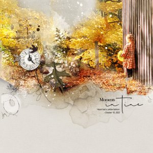
Hazel Had a Yellow Balloon
A picture from the baby shower we recently threw for my daughter, and we were grateful for the glorious Fall day. I blended the photo of Hazel directly into ArtsyPaper #3 with blending brushes and duplications of the photo on different blend modes, further blending with layer masks. This...- musicmom3
- Media item
- Comments: 9
- Category: Anna Aspnes
-

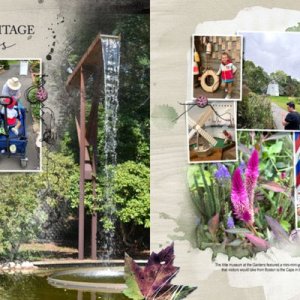
Cape Escape spread 10
We really packed a lot into our family vacation on Cape Cod—here we are at the Heritage Gardens in Sandwich, MA. Despite being into September, there were still plenty of hydrangeas. We loved that there were no crowds. I'm working on the next to last day of the trip, and there are spreads that...- musicmom3
- Media item
- Comments: 11
- Category: Anna Aspnes
-

Comment by 'musicmom3' in media 'Season Change/Anna color chall'
The photo is captivating and the embellishment enhances it subtlely and so effectively. The art of restraint is not one that comes naturally to me so I am admiring your deliberate placements here.- musicmom3
- Gallery comment
-

Comment by 'musicmom3' in media 'Life is About Change'
Okay, the work with the Kardz is fabulous. I really don't use them as much as I should. The combo of colors is refreshing, too. Stunning work here!- musicmom3
- Gallery comment
-

Comment by 'musicmom3' in media 'jolie petite sorcière copie.jpg'
That hat! Adorable little witch, with priceless facial expressions.- musicmom3
- Gallery comment
-

Comment by 'musicmom3' in media 'OXFORD AnaLift Challenge'
I want to go to Oxford! This is gorgeous, and loving your title work.- musicmom3
- Gallery comment
-

Comment by 'musicmom3' in media 'AnnaColor-Autumn.jpg'
Love how you've edged this page! Stunning!- musicmom3
- Gallery comment
-

Comment by 'musicmom3' in media 'Défi AnnaLift 30.09.22 - 14.10.22'
This is so cool! I also am loving that photostrip at the top!- musicmom3
- Gallery comment
-

Comment by 'musicmom3' in media 'ANNACOLOR-thru-10-20-22-Celebrating-Mom's-Passing-Sunrise'
Your journaling is beautiful, as is your imagery. I am so sorry for your loss, and so touched by this emotive design.- musicmom3
- Gallery comment
-

Comment by 'musicmom3' in media 'He's waiting'
You set the scene for the photo perfectly. Love that heart!- musicmom3
- Gallery comment
-

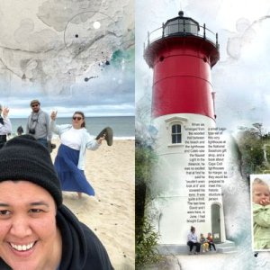
Cape Escape Spread 9
I wanted to include two views of the lighthouse so used a Fotoblendz from one of the Template Album pages to blend the overview shot on the right page. I could have used it to transition across the gutter, but I was liking how the big selfie was looking by itself on the left. Not sure about this...- musicmom3
- Media item
- Comments: 8
- Category: Anna Aspnes
