Oscraps
Search results
-

**WINNER ANNOUNCED** Day 8 - Show Me game | GAME
Show me a beautiful pink poinsettia- easyeyes4you
- Post #28
- Forum: Challenges & Games
-

**WINNER ANNOUNCED** DAY 6 - Scrap the Lyrics of a Holiday Song | CHALLENGE
Well, the QR code was scanning on the page on my computer, but not getting it to scan in the gallery... So I don't know if that is going to work or not... Please expand or go to the gallery for everything in a readable size...- easyeyes4you
- Post #39
- Forum: Challenges & Games
-

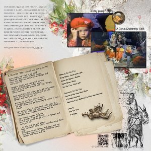
2023-Oscraps.Day-6-Lyrics-.jpg
Years ago I was a Billy Ray Cyrus “groupie”... I traveled far and wide to his shows... fan club member and many photos with him... Back in the day, one of the musicians he worked with was Don Von Tress,, who wrote Achy Breaky Heart and many more of his hit songs... one year he wrote this...- easyeyes4you
- Media item
- Comments: 2
- Category: 2020 12 Days of December Event
-

Comment by 'easyeyes4you' in media '2023-Trip-to-Spokane-Gayle-Livengood-Oscrap-Re-Do-Day4-.jpg'
OMG... unexpected... thanks so much- easyeyes4you
- Gallery comment
-

FORUM BASICS | Using the Attach Files function.
Thanks so much- easyeyes4you
- Post #6
- Forum: Need Help with Our Site?
-

**WINNERS ANNOUNCED** DAY 4 - Redo a Layout | CHALLENGE
Thanks... I was off reading the instructions posted above... Will try it first... if it doesn't work I'll try your way... Much appreciated....- easyeyes4you
- Post #54
- Forum: Challenges & Games
-

**WINNERS ANNOUNCED** DAY 4 - Redo a Layout | CHALLENGE
OK... here is mine... from my trip to Spokane this summer... I was very unhappy with my original version... this is much better, I think.. For me when you say re do, it means to do exactly that... use what you had originally but done in a different way with different products... Making a totally...- easyeyes4you
- Post #52
- Forum: Challenges & Games
-

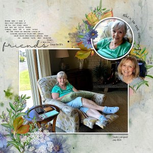
2023-Trip-to-Spokane-Gayle-Livengood-Oscrap-Re-Do-Day4-.jpg
AASPN_ArtPlayPaletteSerenity_Frame1 AASPN_ArtPlayPaletteShine_Frame2 oscraps-CC-paper-Emetodesigns-1 https://www.oscraps.com/shop/Early-Autumn-Kit-by-et-designs.html https://www.oscraps.com/shop/Sunny-Sorbet-full-kit-by-Simplette.html- easyeyes4you
- Media item
- Comments: 6
- Category: 2023 - 12 Days of December
-

**WINNERS ANNOUNCED** DAY 4 - Redo a Layout | CHALLENGE
Thanks , I read the rules, but I am in NO way new to this site... probably one of the oldest here.... Haven't looked yet, but I have a fairly recent one I do not like that I know of...- easyeyes4you
- Post #50
- Forum: Challenges & Games
-

2023-Oscraps-Day-3-border.jpg
Photo shoot at Petco with Santa... oscraps-CC-paper-ewright_2 oscraps-CC-paint-ewright_03 oscraps-CC-paint-ewright_03 oscraps-CC-overlay-ldavi-1 oscraps-CC-paint-circle-etd-01 Oscraps-CC-paint-spatter-Mediterrankadesign oscraps-CC-overlay-NLDDesigns Oscraps-CnJ-FLOWER-AftermidnightDesign-2...- easyeyes4you
- Media item
- Comments: 4
- Category: 2023 - 12 Days of December
-

Comment by 'easyeyes4you' in media 'Avatar Challenge'
I so love this caricature... Such a feeling of abandon, and freedom... Saw it the first day I think.... and still love it.... thus I am writing to let you know...- easyeyes4you
- Gallery comment
-

*WINNERS ANNOUNCED* DAY 5 - Gallery Love - | GAME
1. https://oscraps.com/community/media/cookies-for-santa.386221/ 2. https://oscraps.com/community/media/day-4-the-hat.386200/ 3. https://oscraps.com/community/media/day-3-create-a-border.386155/ 4. https://oscraps.com/community/media/day-4_redo_christmas-shopping-jpg.386130/ 5...- easyeyes4you
- Post #31
- Forum: Challenges & Games
-

Comment by 'easyeyes4you' in media 'Day 1 - Special Gift'
This page has so much to look at! I read your words first... I like scrapping on rainy gloomy days, but you have such a bright well lit spot... it is not gloomy... I found it interesting that you turn off all noises... while I typically turn on Pandora, and light a candle, if I am really ready...- easyeyes4you
- Gallery comment
-

Comment by 'easyeyes4you' in media 'oscraps 2023 12 day 3.jpg'
What a charming page... love all the animals and trees on the border.... The scene in the photo is lovely.. I would guess it is your Christmas card ???? spotlighted for posterity!- easyeyes4you
- Gallery comment
-

Comment by 'easyeyes4you' in media 'Day 3 Border Challenge'
Love it, starting with the tattered paper on top of the red stripe... And I think that is Karen's reindeer... I have that too... your photos illustrate the page very nicely... assuming they are from a prior year... Surely you do not have your gifts all wrapped already, or the tree up???? Nice...- easyeyes4you
- Gallery comment
-

Comment by 'easyeyes4you' in media 'Winter Time'
Well, the contrast between the images certainly drew me in for a closer look... Beautiful scenery shot, and then the fun little village along the bottom... Makes you mind do a double take and then wander a bit...- easyeyes4you
- Gallery comment
-

Comment by 'easyeyes4you' in media '23-12_O_DAY-4---Redo-a-Layout-_-CHALLENGE'
The re do is definitely better... Really calls attention to the photos and what all is in them... I don't like pages with tiny photos... Why take a photo if it is too small to see... This one is a great example of how bigger is better...- easyeyes4you
- Gallery comment
-

Comment by 'easyeyes4you' in media 'Day 4_redo_Christmas Shopping.jpg'
Definitely an improvement.. Love the Christmasy theme... it is perfect.... Such a charming little town to shop in... Not sure about the yellow school bus??? There must be a story there?- easyeyes4you
- Gallery comment
-

Comment by 'easyeyes4you' in media 'Day 3 * create a border'
I love this... So different from my style.. simple and clean, using our prize items.... Love the green paper behind the row of houses... Simple and VERY effective.... One has to wonder if you know where you are headed when you start a page... I never know , and as a result end up with lots of...- easyeyes4you
- Gallery comment
