Oscraps
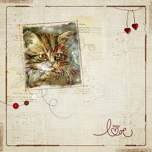
- Credits list
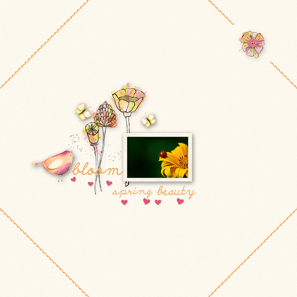
- stitched lines - MA JOLIE ROBE FRAMES & EDGES by reginafalango (oscraps.com)
splatters - Oscraps.com Digital Scrapbook Store | Scrapbooking | Art :: All New :: Splatz 3 :: Paint + Something Rather More...
hearts - Oscraps.com Digital Scrapbook Store | Scrapbooking | Art :: All New :: Be Mine Elements
butterflies - Nature Escape (CU elements) by Simplette (oscraps.com)
bird - 52 Inspirations 2015 by Vicki Stegall (oscraps.com)
flowers - Oscraps.com Digital Scrapbook Store | Scrapbooking | Art :: All New :: Flower Frenzy
word art - Oscraps.com Digital Scrapbook Store | Scrapbooking | Art :: All New :: Bloom And Grow WA
photo frame - Oscraps.com Digital Scrapbook Store | Scrapbooking | Art :: All New :: Vintage Album Collection Necessities Element Pack
photo - courtesy of Pixabay
- Designer(s) Used:
