Art Journaling ~ Are You Looking for Space?

Hello fellow Digi-travelers!!! I hope this day finds you in a good space and having fun scrapping your holidays as they unfold! I. know I always make a goal to scrap things as they happen, but that never seems to be the case. I wind up picking old pictures. Oh well…as long as they get done, right?
So far, we have talked about lines, shapes, color, and the design principle of C.R.A.P. – or Contrast, Repetition, Alignment, and Proximity. We then dove deeper into the principles of Value, Form, and Texture. Now here we are at the seventh principle: Space. The Final Frontier…no wait – that is Star Trek. Sorry.
Space can be described as the distance around and/or the area between design objects or elements. Some people call it “breathing room” or places where one’s eyes can rest. I have heard it discussed in digi circles as “white space”. I first was introduced to it as “negative space” in the graphic design world. Without this “breathing room”, our pages would be so cluttered that it would be hard to find a place for our eyes to focus on let alone rest.
Now remember: white space doesn’t mean it needs to be a white background. It simply means that it’s a simple background. Little or no design on it. It’s just meant to be the canvas the main elements are placed on.
There are people who scrap with negative space, or white space. They are typically called graphic or clean and simple scrapping. One of my all time favorite white space scrapper is *Sylvia* . Look at this amazing layout. We will discuss it and how it follows certain design principles.
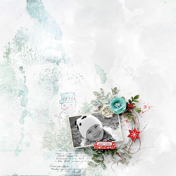
First of all, notice that her background is NOT plain – it has paint splooshes and brush work on it and a subtle cloud like background. The backgrounds just need to be there, but not intrusive with dark colors or bold shapes. She has a cluster around the main event: That fabulous photo! She used contrast, color, and value by 1. turning her photo to black and white. 2. using the red and blue as pops of color. 3. using the green and blue paint below the photo and elements to create more visual interest. If you notice, your eyes are drawn directly to the photo cluster – and that’s what negative space can do for a page.
Here’s another very simple one from Sylvia that is just so precious:

Here she used a background that does have color variations, but combining that with the cloud and the beautifully shadowed hot air balloon, it works and makes the page very cohesive. It grounds the cluster and brings your eye directly to the photo.
It doesn’t have to just be one cluster to be clean and simple, or take advantage of the negative space of a page. Remember, the negative space is “breathing room” around the main event elements! It’s meant to give rest between looking at everything else.
Here is one that does not use just one cluster. This page by *gina* has two distinct clusters with white space all around:

Two places of interest with a rest in between!
So there you have it! The seven design principles to help you have a more effective and cohesive layout! Come join me next week as we start another group of principles to work on!