Art Journaling ~Putting it All Together
So, on our journey, we have so far stopped at these places: Lines, Shapes, Color, Value, Form, Texture, and Space. We have also introduced the topic of CRAP – Contrast, Repetition, Alignment, and Proximity as they relate to the above 7 design principles. I hope that this short course of design principles has been helpful to you and your art journaling pages.
One thing that I want to address today is Creativity. Art Journaling is all about putting onto paper (or into a computer layout) our feelings and perceptions of things. Principles can sometimes stifle creativity if you take them TOO seriously. Look at them as guidelines. What if you want to have only thick line weights on your page. Is it wrong? Absolutely not. If you want to break the design principle of color and use colors that clash to show the emotion of anger and confusion, is that wrong? No! There is a saying in the design community ~ You have to know and understand the rules (principles) before you can break them.
I most CERTAINLY don’t want to break anyone’s creativity by introducing these topics and make one think that if their page doesn’t fit these principles, it’s a bad page. That is NOT what I am saying at all, so throw that thought away. Sometimes when one is starting out, it is helpful to try to practice the principles of design first, and then break out as you get more and more comfortable with the medium.
I come from the graphic design world. Before I ever scrapped a page or even thought of doing so on my computer, I was steeped in learning about Graphic Design. I devoured all of Robin Williams (the writer not the actor) books on design. “The Mac is not a Typewriter” was really helpful to me to learn all about fonts and how to use them effectively. My husband has a degree in Industrial Design and Transportation Design from Art Center College of Design. I have watched him run a Graphic Design business and teach me the ins and outs of design so that I can help him. I look at my pages as Graphic Art – so you will probably see that I pay attention to these principles more than most might. However, you will see me break these rules and go for broke at times when I am really emotional about something. That’s the freeing part about Art Journaling! You can do whatever pleases you and gets those emotions out and across to the world! It’s FREEING, not limiting!
In the new year, we will be diving into other topics around the art journaling world. I will be pulling from different design sources that have helped me throughout my journey to put my emotions into my layouts. As I said on an earlier post, I would go a little more deeply into Robin’s “CRAP” design principle. Yeah, it’s a crude way to remember them, but it’s a hard mnemonic to forget, eh?
Today we will talk about Contrast as it relates to Fonts and Journaling:
~Contrast: enhancement of the apparent brightness or clarity of a design provided by the juxtaposition of different colors or textures. An easy example of this would be with font work. If you have a title and body copy, make the title a bold big font, and the body copy an easy to read font. Or if you use a font that is decorative, use a very plain font to contrast. You can vary the font width, the type of font, etc… Here are some examples of what I mean: You can use color and font face to create contrast and visual interest in your journaling.

One caveat: PLEASE don’t use decorative fonts for your journaling body copy. They are SO HARD to read. Unless of course, you WANT to disguise your journaling – then by all means, have at it!!
Here’s one of my AJ pages that I think shows the font/contrast work I’m describing. The font title is made of a Serif and a San Serif font, and then the body copy is another font that is easily readable.
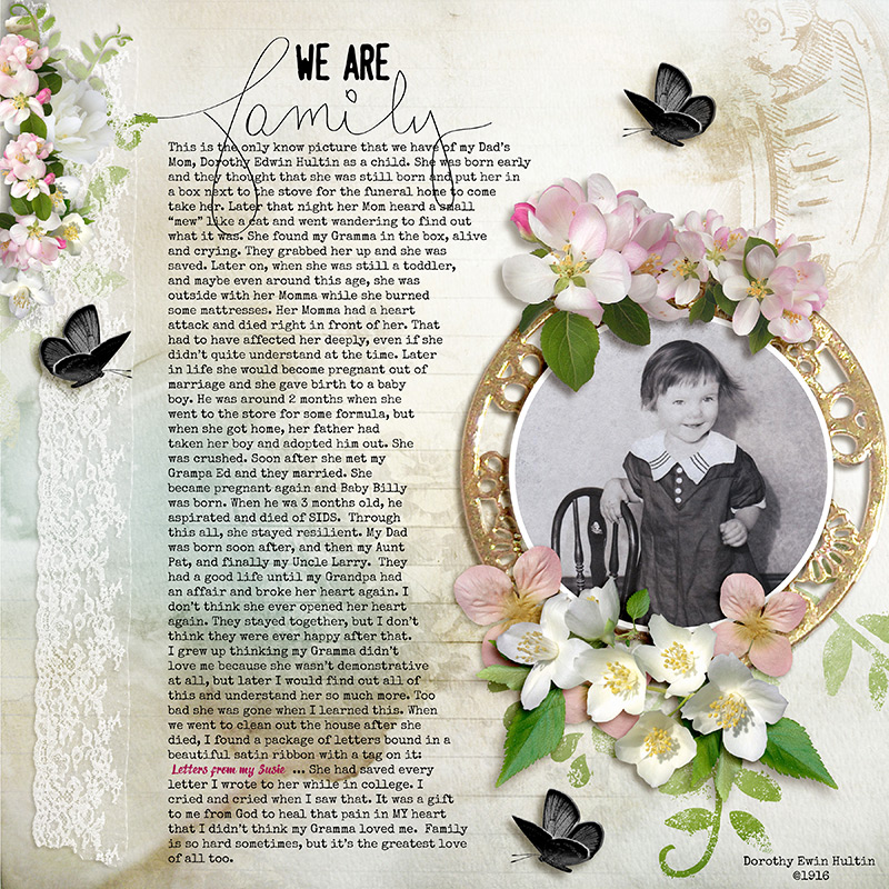
This next one is using word art as the Title work and its color and shape create contrast with the body copy underneath. (Coincidently, this page is my Gramma, who is the same little girl in the page above! )
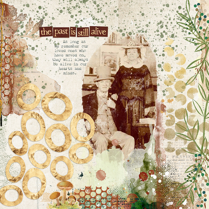
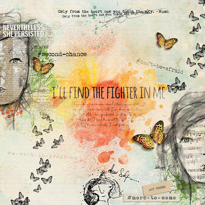
This last one shows how you can somewhat hide your journaling with fonts and blending. I used the san serif font for the title “I’ll Find the Fighter in Me” and then used a script/decorative font in a very small size so that it is difficult to read. If one REALLY wants to read it, they can try but they won’t get all of it. I blended some of the words into the background too.
I hope these examples help to understand the concept better! I’ll see you next week when we talk about Repetition!