Friday’s Standout: A Glimpse into Creative Excellence
The first Friday of the year, I hope everyone took advantage of the holiday to rest and enjoy their offline time with family and friends. These moments have become increasingly precious.
I must say, what a huge responsibility it is to be here choosing the 10 pages that made my eyes widen this past week. After all, we have beautiful pages—thanks to our spectacular designers. Each one, in their own style, brings us the best for our enjoyment.
Hold on to your seats, and we’ll start browsing this week’s highlights.
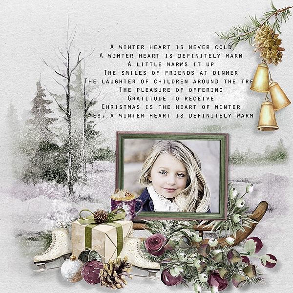
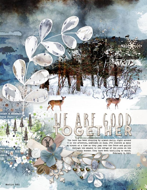
Beginning with a captivating page, I’m enchanted by the winter ambiance evoked through the background. The meticulous use of space to incorporate text is truly commendable, adding an extra layer of charm to the overall design.
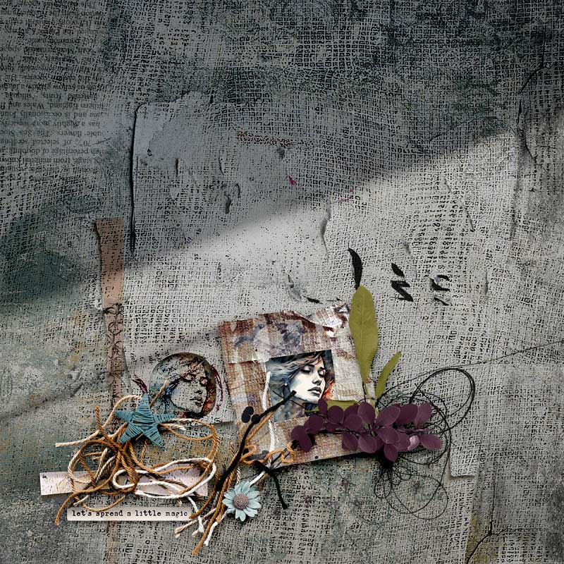
Wow! The shadows cast across this page create an enchanting air of mystery. The carefully chosen paper texture adds a delightful touch of realism, enhancing the overall allure of the design.
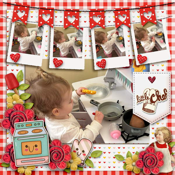
I’m captivated by the abundance of photos on this page—a delightful chronicle of a budding mini-chef with a promising future in crafting delicious dishes.
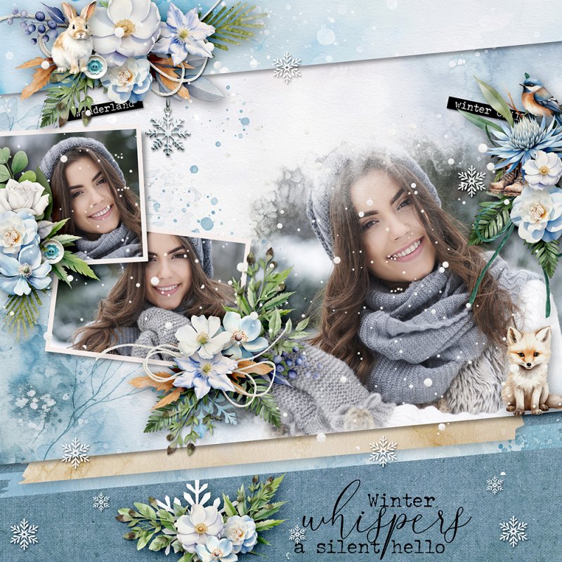
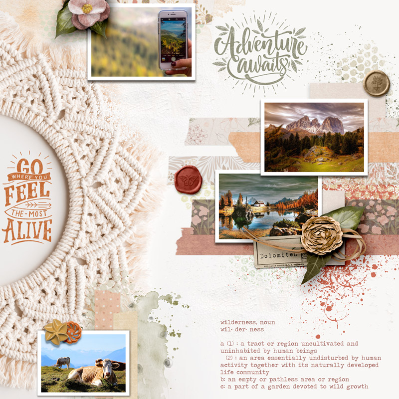
This week, the spotlight is on pages adorned with large featured photos, and what sets this particular page apart is the brilliant combination of a prominent feature image accompanied by a delightful repetition of smaller ones, adorned with beautiful floral clusters. A harmonious blend that truly catches the eye.
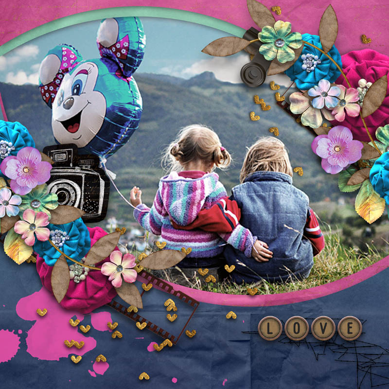
Just as I was wrapping up this post, this page caught my eye and earned its place on the list. Beyond the captivating large featured photo, it’s the vibrant colors and the way the cluster gracefully adorns the entire image that I truly appreciate. A visual masterpiece worth celebrating.
The delicacy of colors on this page is truly enchanting. I’m smitten by how the photos seamlessly blend into the background, creating a visually harmonious composition. The thoughtful use of both photos and text on the page is simply delightful — a design that I absolutely adore!
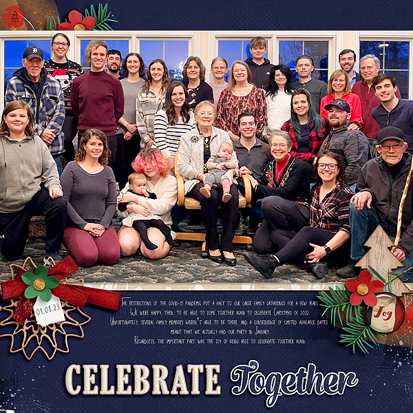
Let’s pause and savor this beautiful family photo occupying the entire page—absolutely wonderful! I appreciate the seamless integration of elements with the text, allowing the photo to remain the focal point while enhancing the overall visual appeal.
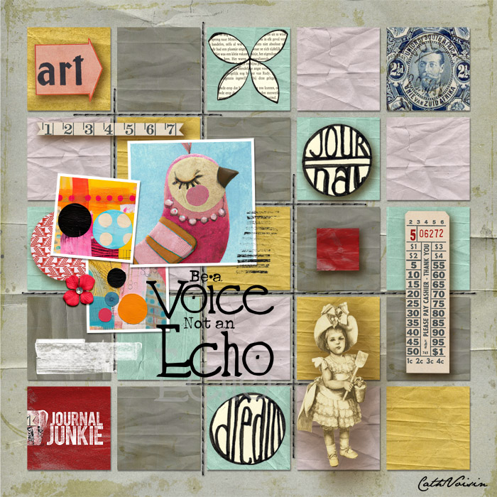
What a beautiful page! The vibrant colors and delicate small stitched squares contribute to its charm. Of course, it’s the images that truly transform the page, giving it a unique and captivating aspect.
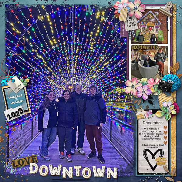
Here’s another page featuring a captivating photo. I adore the play of lights in the background, adding a magical touch. However, what truly stole my heart are the photos on the side, expertly bringing balance to the entire narrative of the family’s special day.
A truly wonderful page! I’m captivated by the seamless blending of the photo with the background, and the way the title and text gracefully complete the entire composition adds an extra layer of charm.
I hope you enjoyed this week’s selection, and I look forward to seeing your page in the gallery next week.
A quick moment to thank everyone. I’m very happy to be a permanent designer at the store now. I’m thrilled that you’re enjoying my products and having fun with your projects.
See you next week! Everyone, have a good weekend.
hugs,
Kel
