Oscraps

Your first layout

AnaSantos

The O is Awesome
CHEERY O
Remember your first digital layout? I have a challenge for you. Dig into your files and share the first digital work and no cheating, it has to be the first one. I'll start by sharing mine if you promise you won't laugh, LoL
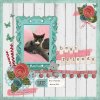
LO-.JPG

Here it is, made in 2017, probably around September, with a freebie I found online and using CorelDraw which was the first software I learned to use. The first thing you'll notice, which is what I noticed too... no shadowing LoL all flat.

Let´s see yours!!
 

Madi

Diane
CHEERY O
the oldest layout I could find in my oscraps gallery, from 2007.
My son, now 24 years old!

full
 

Jam-on-toast

Well-Known Member
CHEERY O
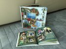
I can't access the digital copies of the first two years of my digital scrapbooking - but here are the albums from 2016... Although there are some pages I like, if I had the time I'd redo most of them...

1668311629658.jpeg

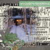
And this is the very first challenge layout I posted in February 2017 -
1668311120658.png

and this is the comment I received from site CT
Very appealing layout! The warm glow is a delightful welcome home, though the cold and snow might be a bit of a shock if you've been vacationing somewhere warm. The background paper and large bottom cluster wrap around your masked photo perfectly.

It just made me cringe all over, but at the time this comment encouranged me to continue posting my pages and I will be forever grateful to that person. I had been digi scrapping for a about three years by then, but had never participated in anything, so joining a forum and sharing my layouts opened up my world and lead me to where I am today - a CT member for some of the designers I used to admire and buy from regularly. Some of those designers are now here at Oscraps - and I still have their kits I bought elsewhere 7-8 years ago.
 
Last edited:

scribler

The O is my hOme.
CHEERY O
Coming to you from June 2006.

EasterJoy.jpg

And because I still have the credits file, here is a trip down memory lane for y'all.

Background Paper - Peach Stripes from the Summer Sorbet Paper Pack by Valeri Brumfield.
Photo Mat - Peach Green Plaid from the Summer Sorbert Paper Pack by Valeri Brumfield.
Ribbon - Midsummer Swelter by Rina Kroes.
Vellum - Butterfly Heaven by Marcee Duggar.
Alpha - Summer Celebration by Mada Engel.
Flower - Fabric Flower Frenzy by Jamie Rousselle.
Doodle - Stitched Flower by Jenna Beam.
 

AnaSantos

The O is Awesome
CHEERY O
I can't access the digital copies of the first two years of my digital scrapbooking - but here are the albums from 2016... Although there are some pages I like, if I had the time I'd redo most of them...

View attachment 383397

And this is the very first challenge layout I posted in February 2017 -
View attachment 383396

and this is the comment I received from site CT
Very appealing layout! The warm glow is a delightful welcome home, though the cold and snow might be a bit of a shock if you've been vacationing somewhere warm. The background paper and large bottom cluster wrap around your masked photo perfectly.

It just made me cringe all over, but at the time this comment encouranged me to continue posting my pages and I will be forever grateful to that person. I had been digi scrapping for a about three years by then, but had never participated in anything, so joining a forum and sharing my layouts opened up my world and lead me to where I am today - a CT member for some of the designers I used to admire and buy from regularly. Some of those designers are now here at Oscraps - and I still have their kits I bought elsewhere 7-8 years ago.
An amazing story, Olga!! true, a wonderful comment can encourage people to keep posting their art and wanting to continue to learn and improve their knowledge. Thanks for sharing!! oh, and your book looks amazing. xx
 

AnaSantos

The O is Awesome
CHEERY O
Coming to you from June 2006.

View attachment 383409

And because I still have the credits file, here is a trip down memory lane for y'all.

Background Paper - Peach Stripes from the Summer Sorbet Paper Pack by Valeri Brumfield.
Photo Mat - Peach Green Plaid from the Summer Sorbert Paper Pack by Valeri Brumfield.
Ribbon - Midsummer Swelter by Rina Kroes.
Vellum - Butterfly Heaven by Marcee Duggar.
Alpha - Summer Celebration by Mada Engel.
Flower - Fabric Flower Frenzy by Jamie Rousselle.
Doodle - Stitched Flower by Jenna Beam.
Fabulous layout and priceless memory!! Glad you shared the credits, it made me feel like a newbie, LoL I don´t know any of those designers. xx
 

LSlycord

Well-Known Member


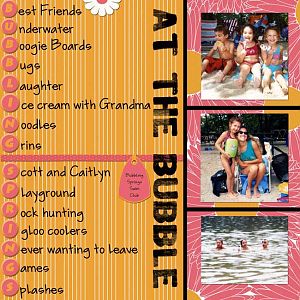
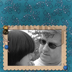
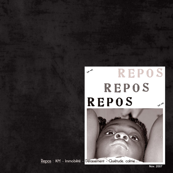
My first from the Oscraps gallery back in the summer of 2007. And I still love it. I was so proud of myself...and I love the crop on the photo and the fact that I turned it to black and white. What a trip down memory lane. Thanks for asking about this!
 

LSlycord

Well-Known Member
I can't access the digital copies of the first two years of my digital scrapbooking - but here are the albums from 2016... Although there are some pages I like, if I had the time I'd redo most of them...

View attachment 383397

And this is the very first challenge layout I posted in February 2017 -
View attachment 383396

and this is the comment I received from site CT
Very appealing layout! The warm glow is a delightful welcome home, though the cold and snow might be a bit of a shock if you've been vacationing somewhere warm. The background paper and large bottom cluster wrap around your masked photo perfectly.

It just made me cringe all over, but at the time this comment encouranged me to continue posting my pages and I will be forever grateful to that person. I had been digi scrapping for a about three years by then, but had never participated in anything, so joining a forum and sharing my layouts opened up my world and lead me to where I am today - a CT member for some of the designers I used to admire and buy from regularly. Some of those designers are now here at Oscraps - and I still have their kits I bought elsewhere 7-8 years ago.
I love this Olga! It reminds me of the importance of comments in the gallery!
 

janedee

Well-Known Member
Here's one of my first pages from 2009. I think the elements must have come with shadows as I'm sure I didn't know how to shadow back then.
1668384412920.png
 

pachimac

I solemnly swear I am up to no good!
CHEERY O
Looks like most of us skipped the drop shadowing back then...still looking for an old one of mine. I went the opposite. I never went without, but my shadows and elements were big and dark! LOL
 

pachimac

I solemnly swear I am up to no good!
CHEERY O
I found 3! These were from 2004/2005:

Blurry photo, HUGE shadows and ribbons.
blueMel.jpg
I was SO PROUD of this layout back in the day. No one knew how to "burn" wood for the title and I figured it out in Photoshop. I still love this layout, although the shadows again were humungous.

woody.jpg.
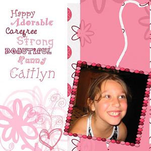
This one I shudder at - both for the shadowing and the very busy look to it. I did the unthinkable and not only drop shadowed my journaling, but also put a stroke on it!!!! My shadow around the photo is SOO dark, and I think the "Melissa" bracelet is huge and again, shadowed poorly. I tried. LOL I no longer like this style of kit, but at the time I thought it was da bomb!

afterbath.jpg
 

scrap-genie

Well-Known Member
I started in 2004, not online or with work by designers, but with a book based on PaintShop Pro (which I used then and still now). It had instructions on creating layout design and lots of examples and ideas. Looking back at those, I see how much I learned from it. Didn't go online until 2006 and then began using work by designers. This one seems to have been the very first in 2004 of my BiL's garden and cat from the directions. (I think it was "Creative Digital Scrapbooking: Designing Keepsakes on Your Computer" by Katherine Murray.)


tulsa-garden_sm.jpg
 
Last edited:

EvelynD2

Well-Known Member
CHEERY O
I first started with the Daisy Trail website. I did not realize they were going to shut down the website so I lost most of my layouts as I did not save them anywhere else. I know better now!
 

pachimac

I solemnly swear I am up to no good!
CHEERY O
I wanted to find some early pages that I didn't have anymore, and I went searching for my old scrap lift blog that I ran and found these beauties!!! I was so happy to see some of my old pages, even if they weren't technically great!

I found one from my first year of scrapping! This was in 2004IMG_3127.jpg

Then this one was 2006 - one of my first attempts at good shadowing (albeit still too dark) and a bit artsy!
80101457-FAB2-4840-A0F1-35EDD0DD1EED_1_105_c.jpg
 

AnaSantos

The O is Awesome
CHEERY O


My first from the Oscraps gallery back in the summer of 2007. And I still love it. I was so proud of myself...and I love the crop on the photo and the fact that I turned it to black and white. What a trip down memory lane. Thanks for asking about this!
This is a beautiful layout and I´m impressed with your work, you used shadows in 2007 ... wonderful!! thanks for sharing!! xx
 

AnaSantos

The O is Awesome
CHEERY O
I love this thread... it shows how much has changed...
Thanks Olga!! and this thread is also important to show people that no one born´s knowing how to make wonderful and stunning layouts, we were all there, in the beginning, struggling with the software and sometimes a little sad that our result was not the same as other people we admire so much. This proves that the important thing is not to give up.
 

AnaSantos

The O is Awesome
CHEERY O
I found 3! These were from 2004/2005:

Blurry photo, HUGE shadows and ribbons.
View attachment 383461
I was SO PROUD of this layout back in the day. No one knew how to "burn" wood for the title and I figured it out in Photoshop. I still love this layout, although the shadows again were humungous.

View attachment 383462.
This one I shudder at - both for the shadowing and the very busy look to it. I did the unthinkable and not only drop shadowed my journaling, but also put a stroke on it!!!! My shadow around the photo is SOO dark, and I think the "Melissa" bracelet is huge and again, shadowed poorly. I tried. LOL I no longer like this style of kit, but at the time I thought it was da bomb!

View attachment 383460
Well, I can see you were a master of shadows way ahead of all of us!! thanks for taking your time on digging and sharing. xx
 
Top