Oscraps
- Home
- Forums
- Archive - Previous Challenges and Events
- Challenges Archive
- 2023 CHALLENGES ARCHIVE
- SEPTEMBER 2023 CHALLENGES
You are using an out of date browser. It may not display this or other websites correctly.
You should upgrade or use an alternative browser.
You should upgrade or use an alternative browser.
September 2023 Challenge #3 - Quote to Wordart
- Thread starter *gina*
- Start date
*gina*
Well-Known Member
Gorgeous page and what a creative way for the wordart. Because the layout is photoless, there is room for what needs to be decided.Fonts MV Boli - December Sky Font - Bookman Old StyleAnna-Aspnes-digital-scrapbook-artplay-Palette-Rudeneja-One-Day-Joan.jpg
- Joansmor
- 2
This is my response to the Quote to Wordart challenge
Thank you so much for taking part in the challenge.
*gina*
Well-Known Member
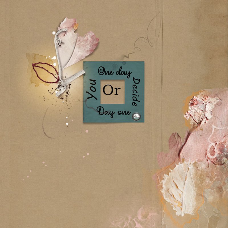
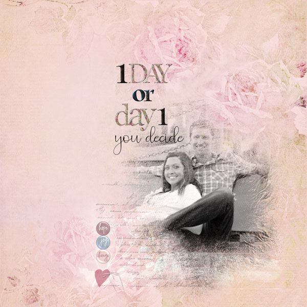
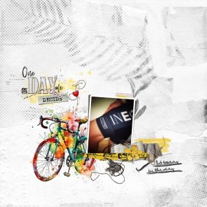
Gorgeous page, Sonja - I love the way how you created the wordart. The colorful bike and the photo with all the elements fit perfectly.here is my page
I wanted to make a wordart in the style of Anna Aspnes
Fonts used are :
The word "Day" is made with letters from White Wood AlphaNumberSet No 1 by Anna Aspnes
- Mom's typewriter (decide)
- BigNoodleTitling (or)
- Bestromello script (One, one)
The beaded thread is from BeadedThreadz No 3 by Anna Aspnes, but I replaced the beads by some made by me, and recolored the heart a bit.
Thank you so much for taking part in the challenge.
*gina*
Well-Known Member
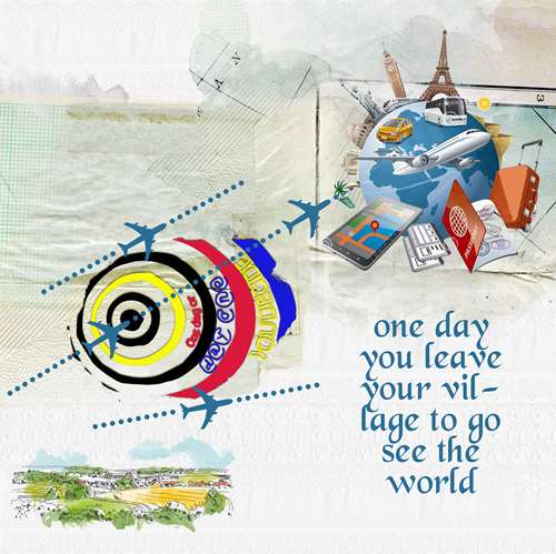
Gorgeous page, Myla - I love the way how you created the wordart. The theme to start a journey all over the world you portrayed it wonderfully.
Thank you so much for taking part in the challenge.
Scrapbyirre
Well-Known Member
*gina*
Well-Known Member
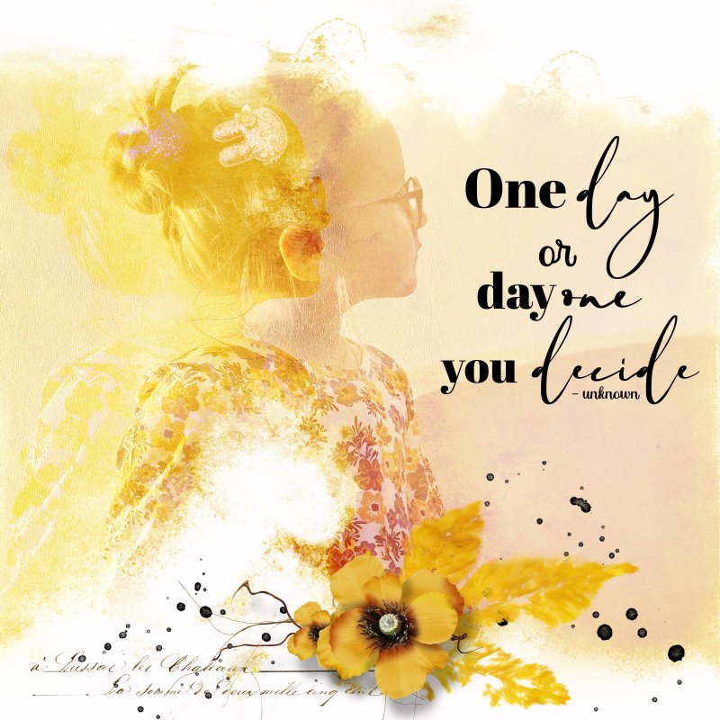
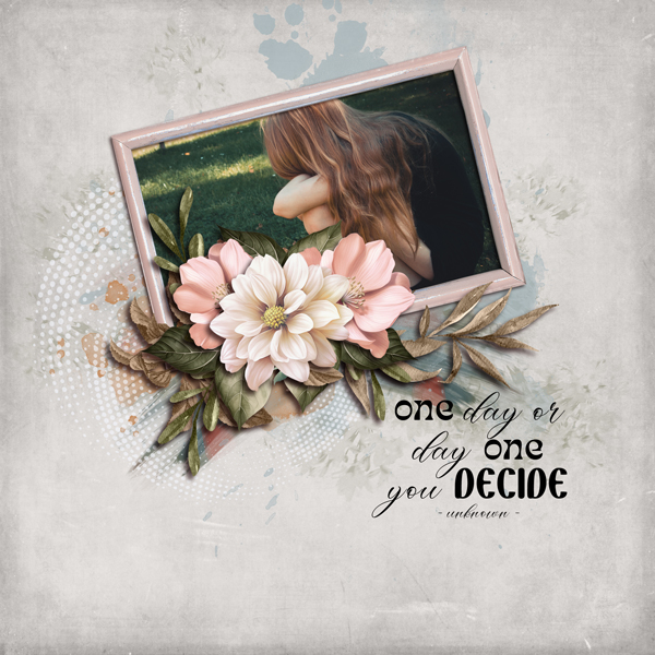
Gorgeous page - the wordart that you created from the quote comes into its own very well with the different fonts. The background with the great blended photo and the cluster are well coordinated.
Thank you so much for taking part in the challenge.
pachimac
The World Needs Love, ❤️ Not Hate. Be a Lover.
I Choose Day One
September Challenge 3 - Quote challenge
Fonts:
Sunflower
Birmingham
Back to School
Fonts:
Sunflower
Birmingham
Back to School
Fonts:
Sunflower
Birmingham
Back to School
Pia/Pippin
Well-Known Member
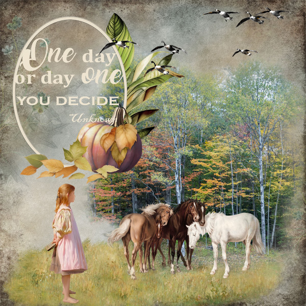
Great quote! The fonts I used are: Amarillo, Cambria, Copperplate Gothic.
Here is my page.
Here is my page.
One-day.jpg
Created with Country sampler freebie (time place kit, farmgirl addon, autumn adventure, hello...
Trinanne209
Well-Known Member
*gina*
Well-Known Member
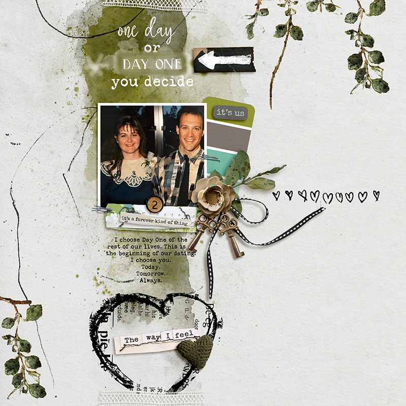
Gorgeous page, Susie - I like the fonts you used for the wordart. The vertical flow on your page with the beautiful photo is fabulous.I Choose Day One
September Challenge 3 - Quote challenge
Fonts:
Sunflower
Birmingham
Back to School
Fonts:
Sunflower
Birmingham
Back to School
Thank you so much for taking part in the challenge.
*gina*
Well-Known Member
Gorgeous page, Pia - I love your framed wordart - it turns out so beautifully. And the little girl is dreaming of an own horse... I think - one day she will have one.Great quote! The fonts I used are: Amarillo, Cambria, Copperplate Gothic.
Here is my page.
One-day.jpg
Created with Country sampler freebie (time place kit, farmgirl addon, autumn adventure, hello...
Thank you so much for taking part in the challenge.
*gina*
Well-Known Member
Gorgeous page - I like the beautiful wordart with the different fonts - especially that you turned the word one to a number. The blended photo and the elements fit together very well.
Thank you so much for taking part in the challenge.
*gina*
Well-Known Member
Gorgeous page, Géraldine - I love the way how you changed the quote to a wordart with these beautiful fonts. The blended photo and your choice of elements are perfect.
Thank you so much for taking part in the challenge.
*gina*
Well-Known Member
Gorgeous page - I like the fonts you used for the wordart. The stacked papers and the elements are beautifully placed to highlight the photo. I also like the repetition as a blending.using fonts: Countryside2, Bickley Script & Nowharehouse
Thank you so much for taking part in the challenge.
*gina*
Well-Known Member
Gorgeous page, Nina - I love the way how you change the quote to the wordart. The beautiful photo fits perfectly and the wonderful cluster is the perfect addition.
Thank you so much for taking part in the challenge.
zlemon
Christy
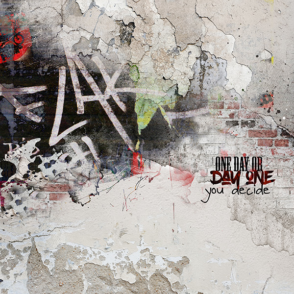
Fabulous challenge, thanks for hosting, Gina.
fonts used: bernard mt condensed, bold brush and daniel
Used Anna Aspnes' APP City Limits and Urbicolous
fonts used: bernard mt condensed, bold brush and daniel
Used Anna Aspnes' APP City Limits and Urbicolous
#3: Day one
- zlemon
- 6
This quote reminded me of something that you would see on a crumbly wall filled with graffiti...
*gina*
Well-Known Member
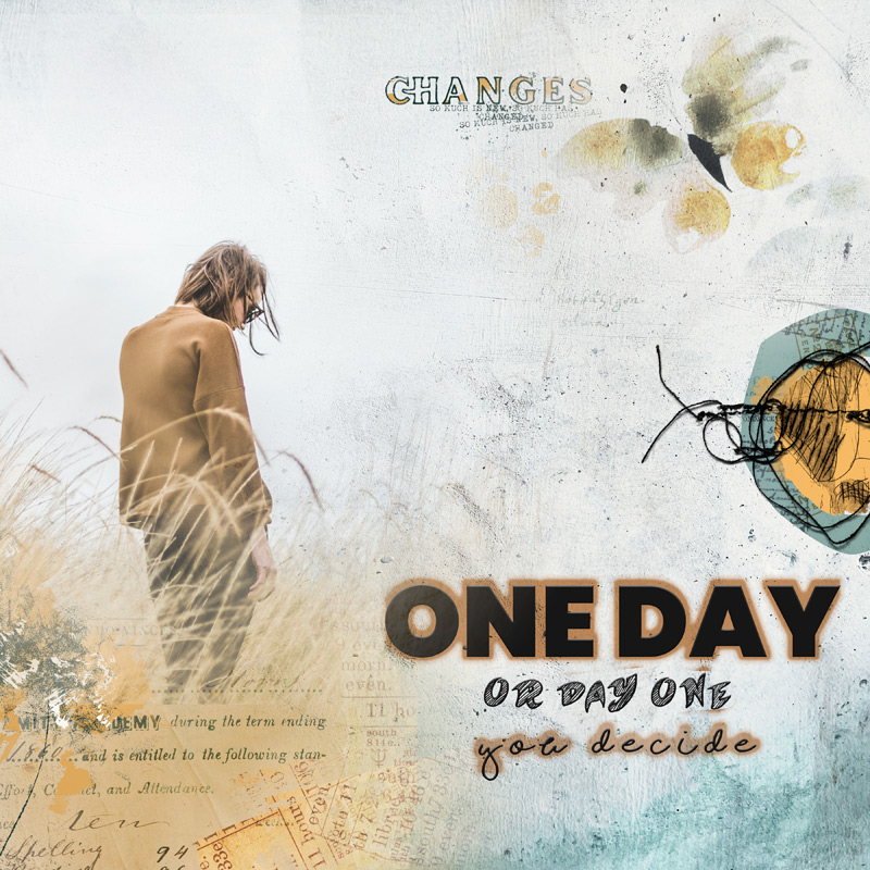
Gorgeous page, Christy - your wordart turns out great with the different fonts and the wall with the graffiti is so beautifully placed and fits perfectly to the background - perfect.Fabulous challenge, thanks for hosting, Gina.
fonts used: bernard mt condensed, bold brush and daniel
Used Anna Aspnes' APP City Limits and Urbicolous
#3: Day one
- zlemon
- 6
This quote reminded me of something that you would see on a crumbly wall filled with graffiti...
Thank you so much for taking part in the challenge.
