LauraD
Scrapbooking reminds us that life is beautiful.

All members that participate, can everyone PLEASE ensure that you read all the rules for this challenge
so that you can claim your challenge points. Thank you!

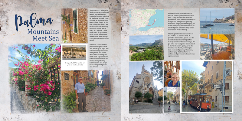
Hello. My name is Laura. I will be your host for this month's challenge! I LOVE fonts. Fonts are very important in the design of your layout. For example, if it is too artsy, you may not be abler to read the journaling. But, sometimes the words are irrelevant and only added to create a mood or artistic nature. I find that mixing up the fonts can really add a kick to your layout.
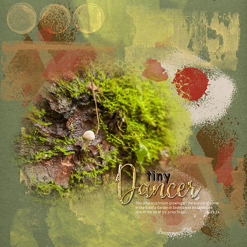
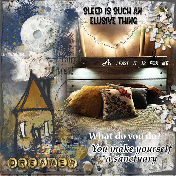
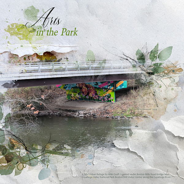
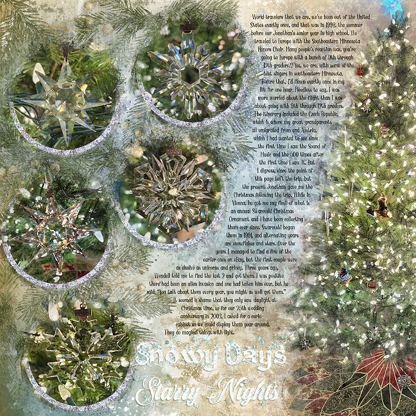
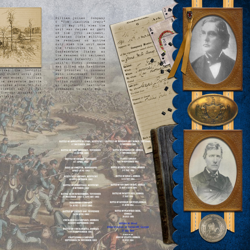
For this challenge, I would like for you to use at least 2 different fonts together in your layout. Here are some examples on how to do this:
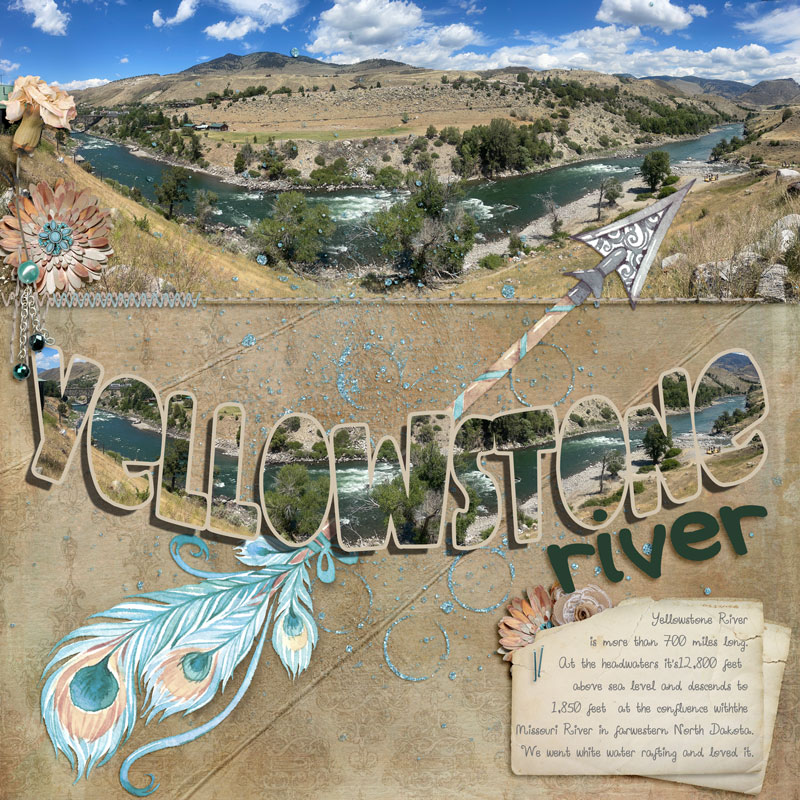
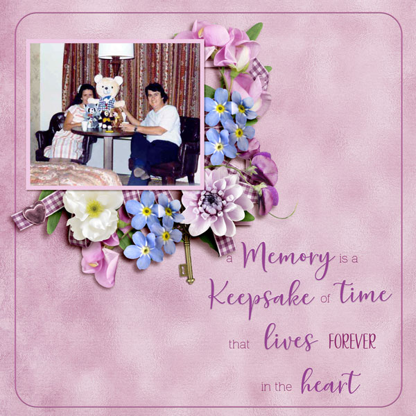
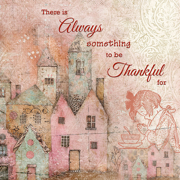
1. It can be done by created a word art element with a standard type and cursive type. Here is an example:
Challenge #2: Poems & Lyrics
- LauraD
- 3
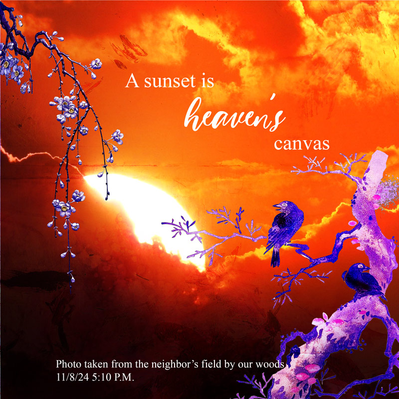
I chose the line from the poem "With the rising sun to greet him", it was prefect for this photo.
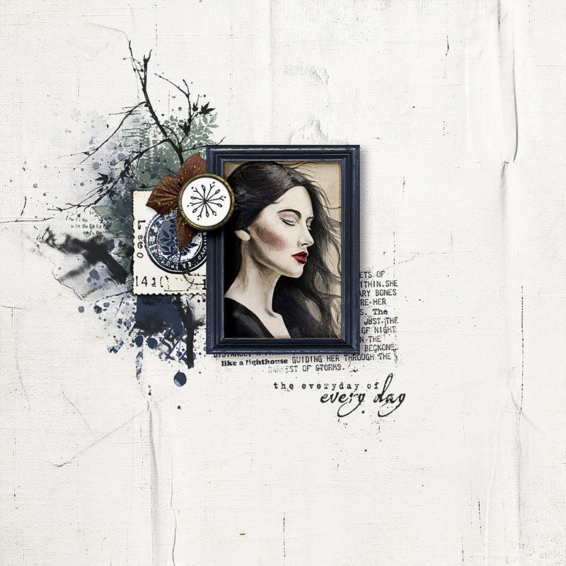
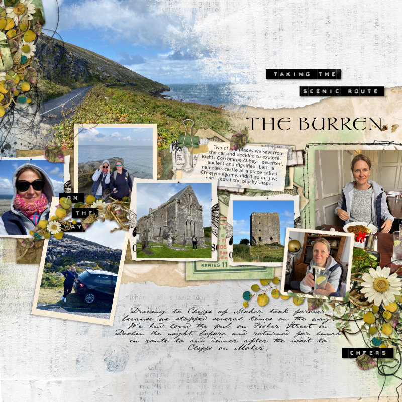
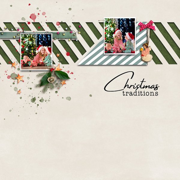
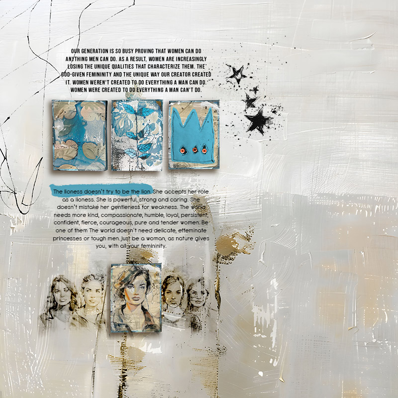
2. You can add interest to your journaling by accenting words to quickly show the message you are trying to communicate, while telling a more elaborate story with the regular font. Here is an example.
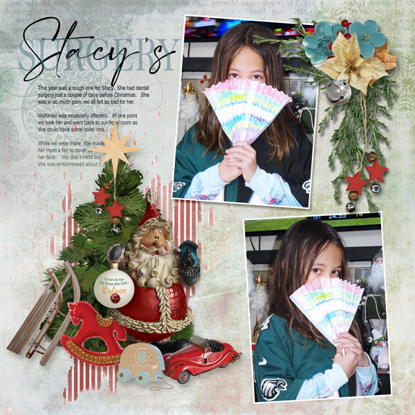
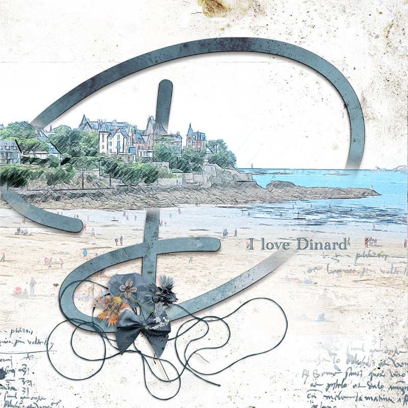
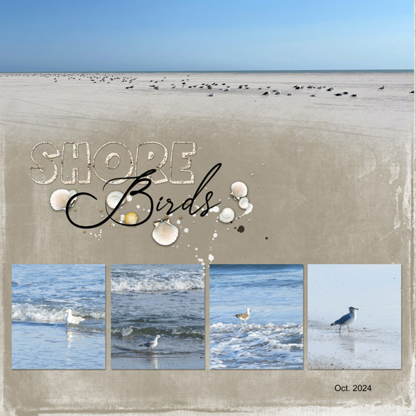
3. You can use fonts as your template or frame. Here is an example
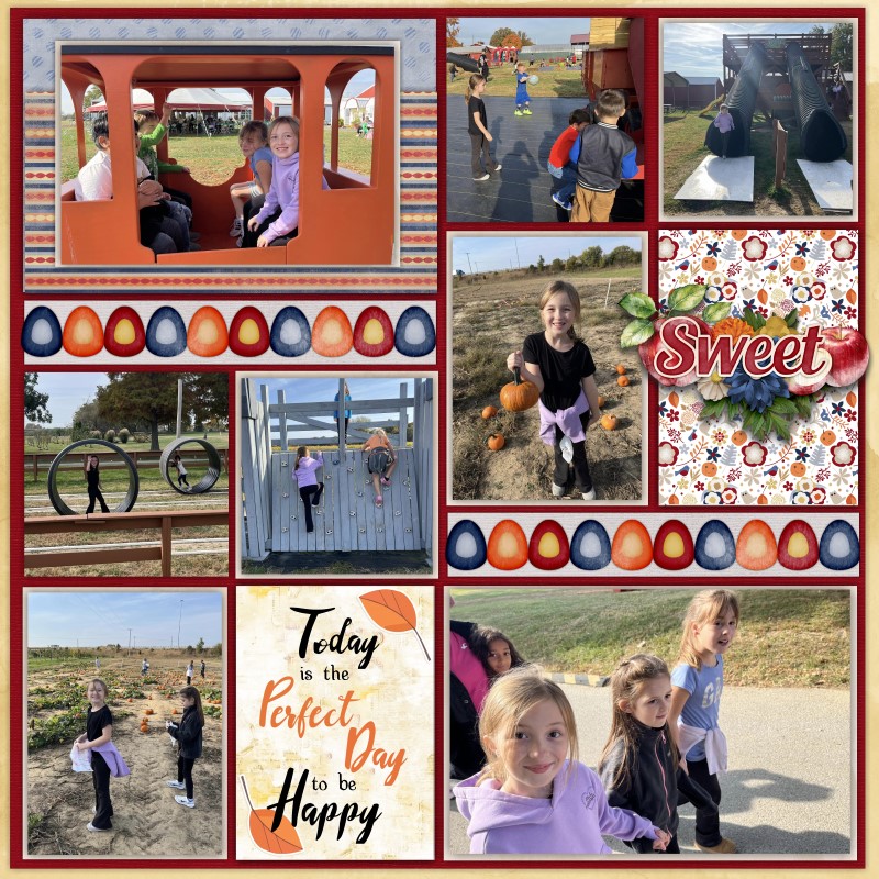
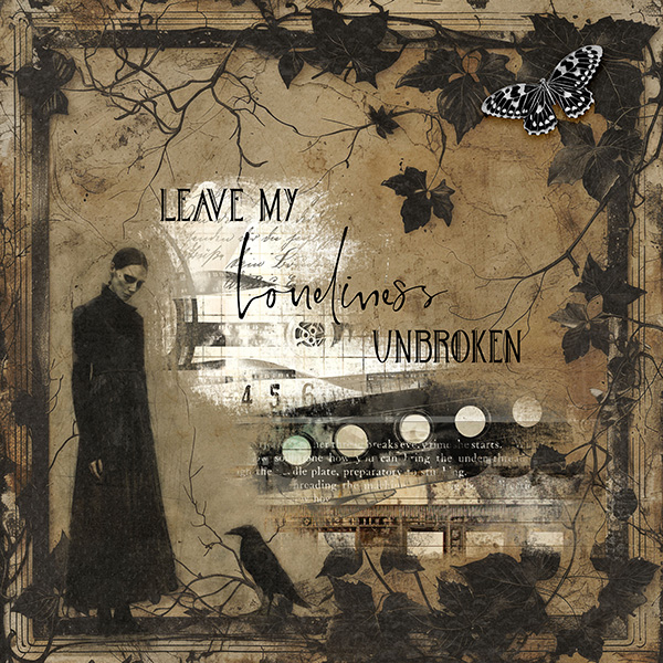
4. You can use fonts to create a background texture in your paper. Here is an example.
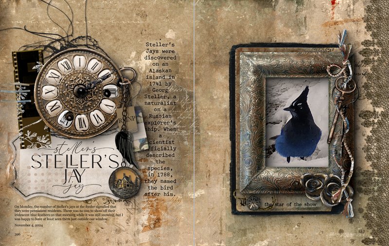
5. Add a style to your font to add dimension and interest. Here is an example of using the shadow style to add depth:
RULES:
- Use two (or more) different fonts in your layout to create a word art or add interest to your layout or journaling.
- Please use 80% Oscraps products that are currently in the store.
- Non-Oscraps products or retired O designer products can be used whether the designer is selling elsewhere or not.
- You need to credit all the products used on your layout.
- Your layout can not be used for more than one challenge.
- Your page must be posted in the Challenge 7 gallery by midnight PST 30 November 2024 and linked back to this thread (see below on how to add your linked layout).
- And do not forget to update the CURRENT MONTH'S TRACKING THREAD to be eligible for your coupon.
Adding a linked layout from the Gallery to a thread:
1. Upload your layout to the gallery first. In your forum post click the Gallery Embed icon (little camera).
2. This will open your gallery, simply click on the layout you require, then scroll down to the bottom of the screen and click the Continue button.
3. Your linked layout is now in your post, the image will appear once you have clicked the Post Reply button.
Last edited by a moderator:
