Oscraps

March Challenge #6 - Tic-Tac-Toe

*gina*

Well-Known Member
1708786270417.png

All members that participate, can everyone PLEASE ensure that you read all the rules for this challenge
so that you can claim your challenge points. Thank you!


Hi and welcome - Gina here with the March Tic-Tac-Toe challenge.

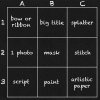
Below you will find a card with 9 squares which can be read vertically, horizontally or diagonally.
Chose one line for your layout using the three products of that line.
You can add more elements but you must include all the items in the line you choose.
The style is up to you.

But - there is a little bit more.
Your layout must have something in yellow and templates are not allowed.

When you upload your layout here in the challenge thread
please let us know which 3 products you have selected.
tictactoe.jpg


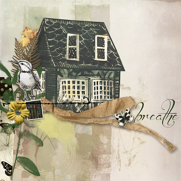
For my my page I used row 3 (script, paint, artistic paper)
and the Urban Oasis Page Kit by Daydream Designs.
relax.jpg

Looking forward to your pages but most of all - have fun!

RULES:
- Use the elements from any row, column or diagonal line on your layout. Please list which three items are on the page.
Don't forget something in yellow. Templates are not allowed.

- Please use 80% Oscraps products that are currently in the store.
- Non-Oscraps products or retired O designer products can be used whether the designer is selling elsewhere or not.
- You need to credit all the products used on your layout.
- Your layout can not be used for more than one challenge.
- Your page must be posted in the Challenge 6 gallery by midnight PST (insert the end date here) 2024 and linked back to this thread (see below on how to add your linked layout).
- And do not forget to update the CURRENT MONTH'S TRACKING THREAD to be eligible for your coupon.

Adding a linked layout from the Gallery to a thread:
1. Upload your layout to the gallery first. In your forum post click the Gallery Embed icon (little camera).
2. This will open your gallery, simply click on the layout you require, then scroll down to the bottom of the screen and click the Continue button.
3. Your linked layout is now in your post, the image will appear once you have clicked the Post Reply button.
 
Last edited:

*gina*

Well-Known Member
thank you for the challenge
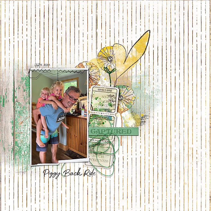
row 2 horizontal | 1 photo | mask | stitch

What a gorgeous page, Sylvia - I love the beautiful photo with the stitching in the middle (great idea). The mask and the added element are so wonderfully placed, the yellow comes out great and it is a typical Sylvia page.
Thank you so much for taking part in the challenge.
 

*gina*

Well-Known Member
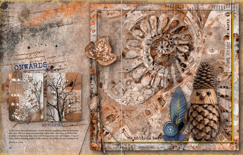
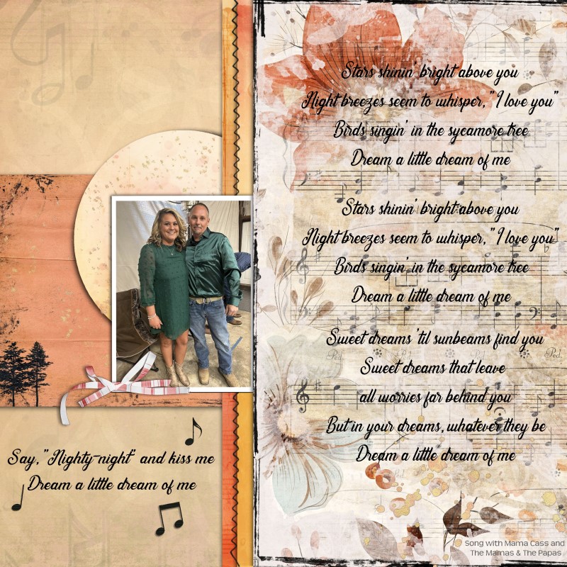
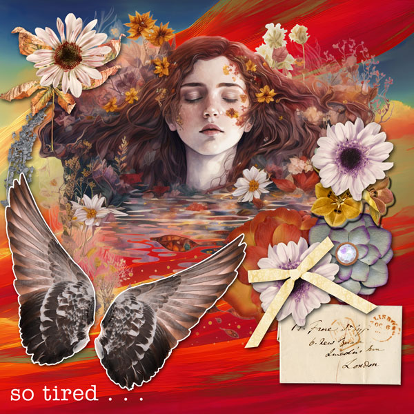
Thanks for the challenge. I picked row 3: script paint & artistic paper

Gorgeous double page - I love the artsy background with the script, the paint and all the added elements. Very clever to integrate the yellow into the frame. It fits perfectly without being annoying.
Thank you so much for taking part in the challenge.
 

*gina*

Well-Known Member
Another interesting challenge, thanks Gina. I chose column A

I hope this fixes the problem Gina!:rolleyes:
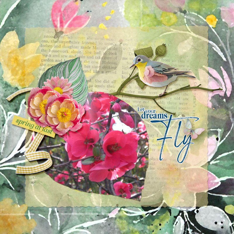
Gorgeous page, Christi - I like the idea to create a leaf for your beautiful photo - so it is part of the other leaves and flowers. The script in the background is well chosen and the little cluster with the ribbon fits perfectly.
Thank you so much for taking part in the challenge.
 

*gina*

Well-Known Member
Thank you for the challenge!
I choose Col. C: splatter, stitch, artistic paper.

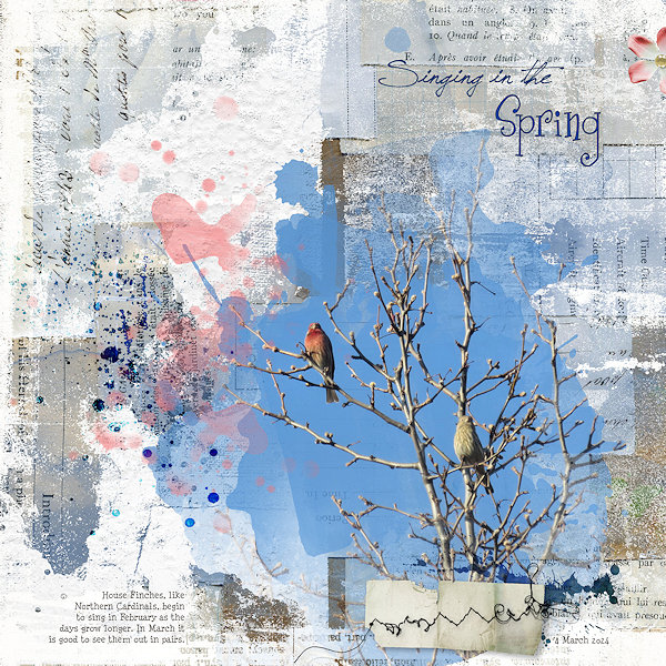
Gorgeous page - you found the right artistic paper for your beautiful photo. The paper piece with the stitching and the the splatter fit perfectly.
Thank you so much for taking part in the challenge.
 

*gina*

Well-Known Member

janedee

Well-Known Member
I used the middle horizontal - one photo, mask and stitching
full
 

*gina*

Well-Known Member
I used the middle horizontal - one photo, mask and stitching
full
Gorgeous page, Jane with a beautiful photo - I love the framing with the stitching on the top and the mask behind it. The chosen elements and the title fit perfectly.
Thank you so much for taking part in the challenge.
Can you link back your beautiful page to the gallery, please?
 

*gina*

Well-Known Member
Thank you for this challenge !
I used row 2 horizontal | 1 photo | mask | stitch

Gorgeous page, Géraldine - I love the old photo with the photo treatment and the mask behind it. The stitching on the top is perfect to put the papers together. The chosen elements are beautifully placed as well as the title.
Thank you so much for taking part in the challenge.
 

*gina*

Well-Known Member
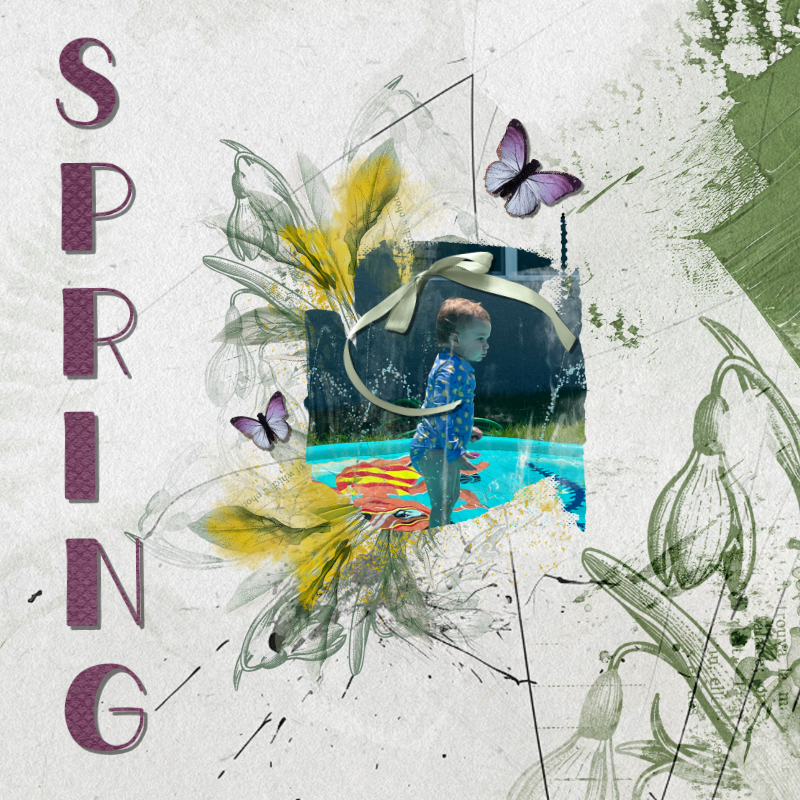
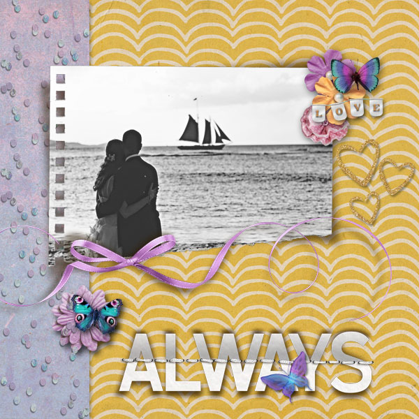
Thanks so much for the challenge, Gina. I used the diagonal from the top left to the bottom right: ribbon/bow; mask and artistic paper.

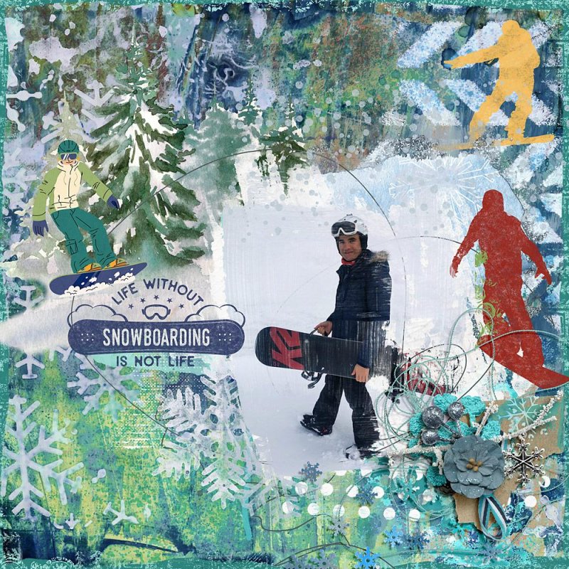
Gorgeous page, Cheryl - I love the colorful background with the masked photo and the flowers around. And the title is just perfect.
Thank you so much for taking part in the challenge.
 
Top