Oscraps
- Home
- Forums
- Archive - Previous Challenges and Events
- Challenges Archive
- 2023 CHALLENGES ARCHIVE
- JULY 2023 CHALLENGES
You are using an out of date browser. It may not display this or other websites correctly.
You should upgrade or use an alternative browser.
You should upgrade or use an alternative browser.
July Challenge #1 - Artsy / Mixed Media
- Thread starter *gina*
- Start date
- Status
- Not open for further replies.
*gina*
Well-Known Member
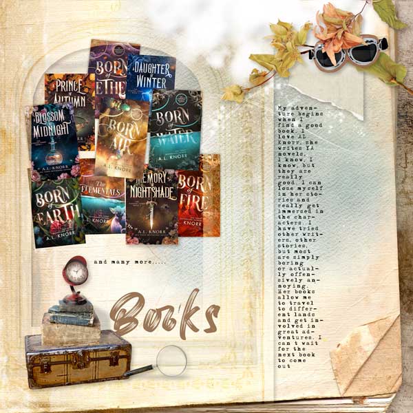
Gorgeous page, Anke - I love the way how you brushed in the second paper. All the books, the journaling and the clustering fit so perfectly to the page design - great work.That was a fun challenge and nice little lesson! Thank you
Thank you so much for taking part in the challenge.
*gina*
Well-Known Member
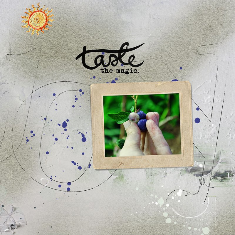
Gorgeous page, Joan - I love the simplicity of your page with the beautiful photo. The texture comes out wonderfully. The scribble and the splatter behind it are just perfect - also the title. And the sun is the icing on the cake.
Thank you so much for taking part in the challenge.
Enjoyable challenge. Thanks!
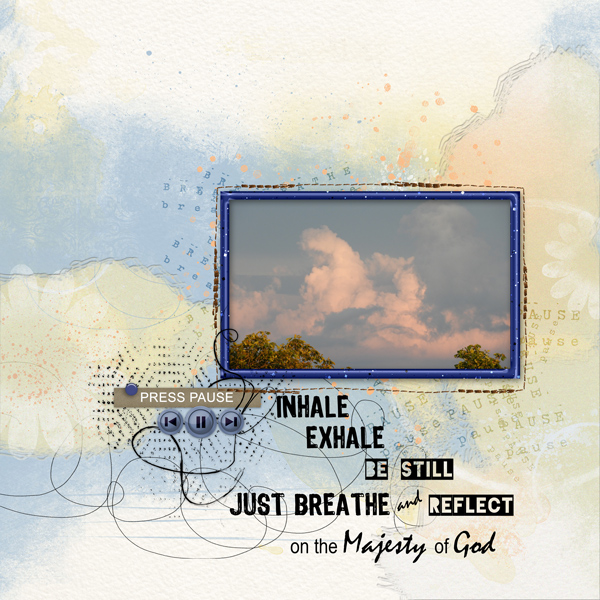
Press-Pause-Artsy-Mixed-Media
Done for the July Artsy/Mixed Media Challenge found here...
*gina*
Well-Known Member
Gorgeous page, Vicky - I Like the beautiful photo with the double framing and the splatter and word stamp behind it. The texture come out beautifully.Enjoyable challenge. Thanks!
Press-Pause-Artsy-Mixed-Media
Done for the July Artsy/Mixed Media Challenge found here...
Thank you so much for taking part in the challenge.
*gina*
Well-Known Member
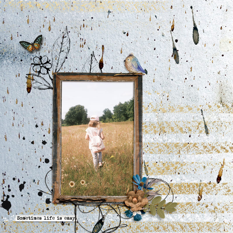
Gorgeous page, Géraldine - the texture comes out so beautifully. The picture with the wooden frame and the little cluster fit perfectly to the background. And the text on the word strip is so true.
Thank you so much for taking part in the challenge.
Trinanne209
Well-Known Member
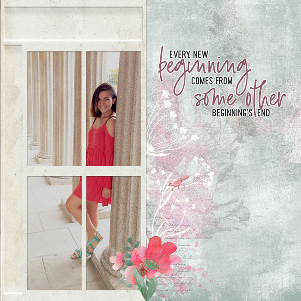
Thanks for the heads up Gina. I removed the second photo, the window is a frame and the pink behind the frame at the bottom is a splatter.
Last edited:
wvufan04
Well-Known Member
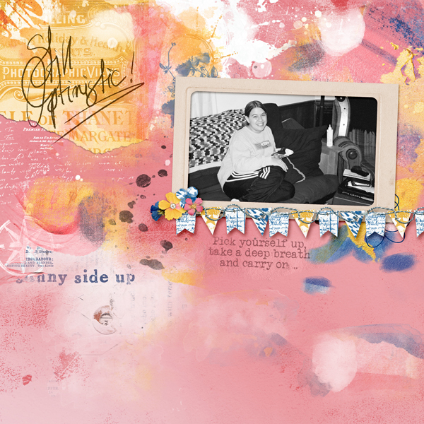
This was a fun challenge, I had not ever used the bevel and texture like that to blend two papers. I used brighter mixed media papers to keep with the optimistic feeling I was hoping for on the page. Definitely something I will try again in the future
*gina*
Well-Known Member
Gorgeous page - I like the background with the texture - so beautifully done. And the frame as a window is a great idea. I also like the repetition of the color from her dress in the flowers.Thanks for the heads up Gina. I removed the second photo, the window is a frame and the pink behind the frame at the bottom is a splatter.
Thank you so much for taking part in the challenge.
*gina*
Well-Known Member
Gorgeous page - I like the b/w photo against the colorful textured background. The added elements fit perfectly. I also like the quote.This was a fun challenge, I had not ever used the bevel and texture like that to blend two papers. I used brighter mixed media papers to keep with the optimistic feeling I was hoping for on the page. Definitely something I will try again in the future
Thank you so much for taking part in the challenge.
mary-lynne
Well-Known Member
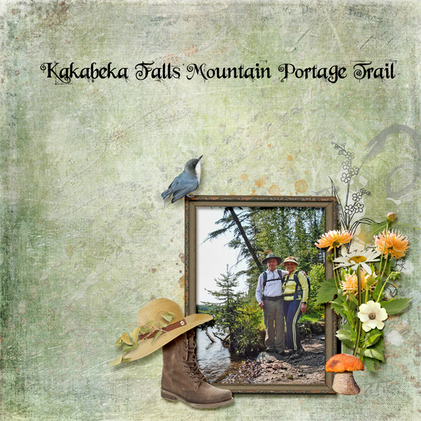
Thanks so much for this technique...it pretty much doubles my paper stash!!!
I followed it exactly with two papers from Karen Schulz' Nature Hike II.
I followed it exactly with two papers from Karen Schulz' Nature Hike II.
zlemon
Christy
Thanks for hosting and the tut, Gina. Superb challenge.
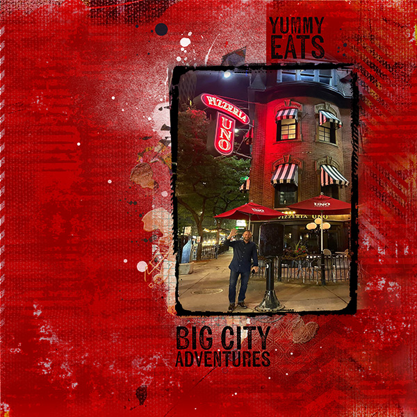
Used a photo of a well-known Chicago eatery and Anna Aspnes' APP Metro.
Used a photo of a well-known Chicago eatery and Anna Aspnes' APP Metro.
#1: big-city-eats.jpg
Super creative challenge. Used a photo of Uno Pizzeria in downtown Chicago, my home town. Uno's...
*gina*
Well-Known Member
Gorgeous page, Mary-Lynne - it must have been a wonderful hike. The background paper with the texture is perfect for the page theme. I love the beautiful photo with the fabulous cluster. But the icing on the cake is the boot with the hat - great idea.Thanks so much for this technique...it pretty much doubles my paper stash!!!
I followed it exactly with two papers from Karen Schulz' Nature Hike II.
Thank you so much for taking part in the challenge.
*gina*
Well-Known Member
Gorgeous page, Christy - I love the read background with the texture. The photo is just perfect with the painted frame.Thanks for hosting and the tut, Gina. Superb challenge.
Used a photo of a well-known Chicago eatery and Anna Aspnes' APP Metro.
#1: big-city-eats.jpg
Super creative challenge. Used a photo of Uno Pizzeria in downtown Chicago, my home town. Uno's...
Thank you so much for taking part in the challenge.
Pia/Pippin
Well-Known Member
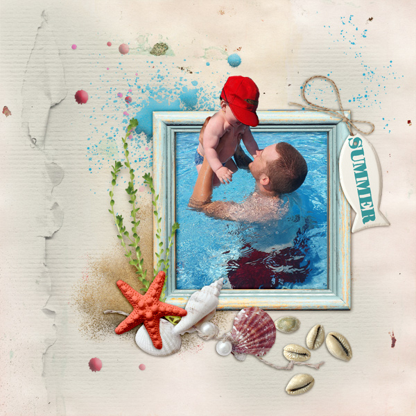
I am working with PSE so I don't have all those things you show in your lesson. I did the best that I could, hope it's alright.
Summer.jpg
Created with [URL='https://www.oscraps.com/shop/Enjoy-Sunny-Days-kit.html']Enjoy Sunny Days...
*gina*
Well-Known Member
Gorgeous page, Pia and you did it great - I love the texture and the beautiful photo with the OOB. The added elements fit perfectly.I am working with PSE so I don't have all those things you show in your lesson. I did the best that I could, hope it's alright.
Summer.jpg
Created with [URL='https://www.oscraps.com/shop/Enjoy-Sunny-Days-kit.html']Enjoy Sunny Days...
Thank you so much for taking part in the challenge.
- Status
- Not open for further replies.
