Oscraps

How to high light parts of the journaling?

tanteva

Mistress of Mayhem
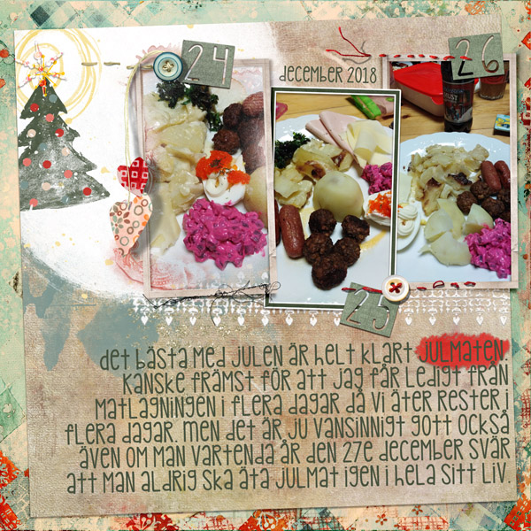
I was just making a layout, and I was thinking I wanted to high light one of the words in the journaling - but I don't know how to do that so that it looks good, and not just messy. Anyone having a nice trick to share? Or maybe a special product in the shop that you use.

I'm thinking like circling the word - or underline - or making it look that I've use a marker pen, or ... whatever. Everything I tried just looked like crap. LOL

Hope you have some fun ideas! Thanks!
 
After you type in your journaling using Type Tool and while it is still active, go to the word/s you want highlighted and select them; then go to color and change it to another color. You can also make just that word/s bold or Italic.
 
I use brushes for that - some of the default brushes work fine ... look in the Dry Media brushes. One of my favorites is the Conte Pencil but there are all sorts there. The Calligraphic brushes are another option because they are thicker. I adjust the size until the thickness is what I want and visible and then sort of scribble — just as I would if I were writing on paper. I also have lots of "artsy scribble" brushes with loops and lines in my shop and sometimes those are an artful way to draw attention to something.
 
Using a paint overlay or a brush, drag across the word you want highlighted with a color that will stand out, then reduce the opacity and/or you can go into the blending options and move the sliders, fading the highlighter color into the layer below.
 
you can use a different font/color? my latest fave is dymo-style- there are lots of free one available. If you are using a mouse - free-hand drawing is a challenge so I rarely use brushes for that...
 
you can use a different font/color? my latest fave is dymo-style- there are lots of free one available. If you are using a mouse - free-hand drawing is a challenge so I rarely use brushes for that...
I DO use a Wacom pen instead of a mouse (for everything … don’t even know where my mouse is, lol) so free-hand is definitely easier. But your idea of different fonts is a really good one … just like in art journaling where change writing style in the middle of text. Hmmm … gives me an idea for a future blog post. Lol.
 
I still have a Wacom. I haven't used it for years until I plugged it in another usb port, The performance was a lot better
 
I'm another Wacom user. I could not scrap without it. I find the mouse too clumsy for scrapping with. I have the cheapest wacom (the Intuo) and it does the job, I love it.

BTW @scribler You can never have enough brushes IMO :)
 
lol... I have just googled Wacom pen... had no idea what it was... do you use it on your computer? or a tablet? I'm feeling rather quaint now with my external drive and a mouse plugged into my PC... but then again, I can't draw - like at all, stickman is a challenge - so brushes and pens and the like are NOT for me... I wasn't a good paper scrapper, that's for sure.
 
Here's what I ended up doing:


I wanted to high light the word "JULMATEN" (The Christmas Food) since it's the topic of the layout, and I hadn't added any title. Used a brush called "Wax Pen" (my own translation of the Swedish PSE, it might be called something else, I'm not sure). Picked up a color from the background paper, and draw a line on a separete layer under the journalling. Changed the blend mode to linear light, and lowered the opacity a bit. I'm pleased with how it turned out.

Thanks for all the suggestions - will definetely do this again.
 
Back
Top