Oscraps
Search results
-

Comment by 'scribler' in media 'Perfect Moment'
Wonderful layering of paper and elements! Love all the torn paper. Great page.- scribler
- Gallery comment
-

Comment by 'scribler' in media 'This boy This year'
Congratulations on the birth of your new nephew! Love the bright colors and the paper stacking. Great page!- scribler
- Gallery comment
-

Comment by 'scribler' in media 'Snowy-Egret'
This is a beautiful page! Such great photo blending.- scribler
- Gallery comment
-

September 2021 - Standing O's
Okay, I know I am back already but I just love this take on the grid/block layout from @dwsewbiz. Love all the photos and her use of the Take Flight brushes is so good.- scribler
- Post #13
- Forum: Standing O's
-

Comment by 'scribler' in media 'Ambages Collection Companion Assets Fly'
I love your blocked design and your use of the Take Flight brushes fits the layout perfectly. I had to give this a Standing O.- scribler
- Gallery comment
-

Comment by 'scribler' in media 'Change Can Be Beautiful'
This is absolutely beautiful. Such an amazing scene with great photo blending. I had to give it a Standing O.- scribler
- Gallery comment
-

September 2021 - Standing O's
This page from Jana (@jlholden15) is just gorgeous and the photo blending is amazing.- scribler
- Post #12
- Forum: Standing O's
-

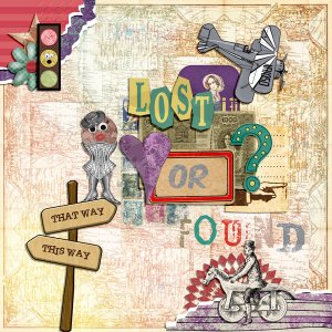
Lost or Found?
Creating this page was so fun for me.- scribler
- Media item
- #art journaling
- Comments: 2
- Category: Vicki Robinson Designs
-

Comment by 'scribler' in media 'Together'
Love the background you used with the added texture. Great use of the template too. Great page.- scribler
- Gallery comment
-

Comment by 'scribler' in media 'Celebrating Friends'
Beautiful page! Great element cluster and using the Soft Overlay mode on the white paper totally makes it look like vellum. (I gottat try that in the future.)- scribler
- Gallery comment
-

Comment by 'scribler' in media 'Anna Lift: Panda-monium'
Love this! It is so cute and creative!- scribler
- Gallery comment
-

Comment by 'scribler' in media 'Luca'
Congratulations on the new family member. Thank you for adopting. Love your flower borders and the way the bring total attention to that beautiful fur baby.- scribler
- Gallery comment
-

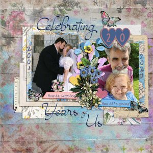
Celebrating 20 Years of Us
Created for the September 52 Inspirations Challenge. I didn't purposefully coordinate the 20th anniversary clothes to match our wedding colors but sometimes things just work out.- scribler
- Media item
- anniversary love
- Comments: 5
- Category: Challenge 5
-

Comment by 'scribler' in media 'my lessons'
I think this page is just awesome. I had to give you a Standing O.- scribler
- Gallery comment
-

August 2021 - Standing O's
I just had to give this beautiful art journal page from @Kellygirl! a Standing O. I love all the layers and think it's an awesome page.- scribler
- Post #75
- Forum: Standing O's
-

Comment by 'scribler' in media 'Sea of Flowers'
Loved the way you did the journaling. Plus beautiful clustering. This is a wonderful page.- scribler
- Gallery comment
-

Habit tracker
I was gonna suggest SparkPeople as I used to use it. But ti seems that it closed all it's communities and apps a couple of weeks ago.- scribler
- Post #2
- Forum: Healthy O's
-

Comment by 'scribler' in media 'Anna Color Challenge Aug/Sept.'
Love how well you pulled together so many different pieces. This is a great page!- scribler
- Gallery comment
