Oscraps
Search results
-

Comment by 'ksacry' in media 'AnnaLift: Blackbirds'
I love how you accented this photo in the large frame with all the brown tone elements. I have a similar reeds photo that I didn't know what to do with, I may have to "Lift" your LO.- ksacry
- Gallery comment
-

Comment by 'ksacry' in media 'anna-aspnes-digital-art-artplay-de-novo-collection-ksacry Story'
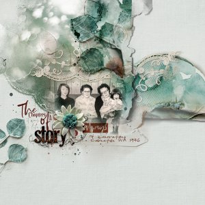
Yes I am in the photo, I'm on the left.- ksacry
- Gallery comment
-

Comment by 'ksacry' in media 'Let it Be'
Gorgeous! I love your cluster that looks like it is a part of her clothing.- ksacry
- Gallery comment
-

anna-aspnes-digital-art-artplay-de-novo-collection-ksacry Story
Text Reads: 4 generations Carnation, WA 1976 Construction: I used ArtPlay Palette De Novo Solid Paper #2 with paper #1 overlaid and blended with Soft Light for the background. I clipped a photo by Monika Stawowy free on PxHere (an abstract blurred sunlight) to the entire group of De Novo...- ksacry
- Media item
- Comments: 11
- Category: Anna Aspnes
-

Comment by 'ksacry' in media 'anna-aspnes-digital-art-artplay-palette-monstertreats-artsy-kardz-denovo-Brooke'
A beautiful tribute to your lovely furbaby!- ksacry
- Gallery comment
-

Comment by 'ksacry' in media 'lets do this'
I love the vertical placement of the frames with the journaling. The black and white photos are perfect with the deep brown background, especially the one at the bottom that isn't quite B&W and how the eyes can be followed to the journaling.- ksacry
- Gallery comment
-

Comment by 'ksacry' in media 'Cape Escape Spread 9'
I love lighthouses. I would have never thought to place the journaling on the top of the fotoblendzed lighthouse. I like how that worked out and will have to remember that trick.- ksacry
- Gallery comment
-

Comment by 'ksacry' in media 'ANNACOLOR-thru-10-20-22-Celebrating-Mom's-Passing-Sunrise'
A beautiful tribute!- ksacry
- Gallery comment
-

Comment by 'ksacry' in media 'Défi AnnaLift 30.09.22 - 14.10.22'
A match for the AnnaLift! I like how all the cars were added to enhance the kiddo photos.- ksacry
- Gallery comment
-

Comment by 'ksacry' in media 'Fall Leaves - Caducous'
Love the fall colors of your photos! The glows added behind really make it pop!- ksacry
- Gallery comment
-

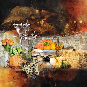
anna-aspnes-digital-art-artplay-palette-monster-treats-ksacry Trick or Treat
Text Reads: Autumn brings change and Halloween Trick or Treat Construction: I started with the a 12x12 layered template by Katie Pertiet Designs, Photo Strips Scrap Pack 13 #1. I used Anna Aspnes ArtPlay Palette Monster Treats Solid Paper #3 for the background (black). I then took and...- ksacry
- Media item
- Comments: 3
- Category: Member Galleries
-

Comment by 'ksacry' in media 'Life is About Change'
What a wonderful layout! Love how you placed the artsy kards and the leaves on top for focus.- ksacry
- Gallery comment
-

Comment by 'ksacry' in media 'anna-aspnes-digital-art-artplay-luster-collection-ksacry New Season'
Thanks for noticing the "wind blown" look. That is what I was going for in the design.- ksacry
- Gallery comment
-

Comment by 'ksacry' in media 'anna aspnes-digital art-artsykardz de novo-nadams-mourning dove always.jpg'
I love the simplicity and yes, your extraction too!- ksacry
- Gallery comment
-

Comment by 'ksacry' in media 'Shadows Dance at Close of Day'
Definitely halloween looking. I love the 3 frames stacked together with the dark photos!- ksacry
- Gallery comment
-

Comment by 'ksacry' in media 'Bits of Beauty - De Novo'
So dreamy looking, just Beautiful!- ksacry
- Gallery comment
-

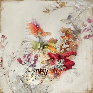
anna-aspnes-digital-art-artplay-luster-collection-ksacry New Season
Construction: I started with ArtPlay Palette Luster Solid Paper #5 for the background. I added Artsy Transfers Luster #5 in the lower left corner and I placed Artsy Transfers Luster #2 in the upper right corner, turning off some layers. I then placed Luster FotoBlendz No 1 #3 in the center under...- ksacry
- Media item
- Comments: 8
- Category: Anna Aspnes
-

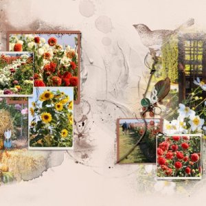
anna-aspnes-digital-art-artplay-de-novo-collection-ksacry Life In Color
I had intended on making more travel project layouts for each month but have fallen behind so I'm back making a few of recent excursions. Text Reads: Autumn said, "Surprise," the days are sunny and warm in October this year, even setting heat records! We took a leisurely country drive on...- ksacry
- Media item
- Comments: 5
- Category: Anna Aspnes
