Oscraps

Month in Review: January Hikes
musicmom3

Month in Review: January Hikes

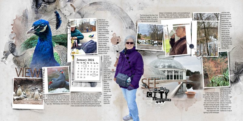
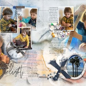
This is the first spread in my Month In Review “My Hikes” book, though these 4-mile treks in the Bronx Zoo and the New York Botanical Garden were more “walks” than “hikes.” At this point in this winter, though, where “freezing mix” is the order of the day, we take what we can get. The idea is to do a spread a month, with some supplemental spreads as needed.

To make this spread, I opened the January templates onto a 24x12 canvas—I actually print at 8x8, so immediately resized the text to 12 pt on 14 pt leading. Before populating the templates, I like to make any structural tweaks, and in this case I added the title next, amending WordART Cluster #1 with word labels from the #5 Cluster. I also added a metal word from the #5 cluster so I would have a triangle of big words to anchor what promised to be a spread full of uncoordinated photos. My last step in template preparation was to add the date boxes to the calendar—a variety of markers comes as a bonus with the MIR template set. My background is Enigma Solid 5 (duplicated, on overlay blend mode), with transfers #6, #8, and #9 atop. I filled in some of the stains with a terra-cotta color to pick up the pot in the Conservatory photo and added a button for embellishment.
Credits list
Designer(s) Used:
  1. Anna Aspnes
This beautiful design in the inspiration for the AnnaLift Challenge!

In Month Review: January Hikes, musicmom3 shares her artsy journal. The neutral ground is subtle and allows the vibrant colors of the photos to guide the viewer on the tour. The rich blue and indigo of the palette artsy transfers are positioned as accents for movement and visual interest. The template showcases many photos and includes spaces for her design choices: stacked and extended photos, painted mats, and a calendar. Simple accents of threads and buttons attach the photos to the design. Journaling is a key component of her artistry. She documents the day trips with fluidity and beauty in her heartfelt style. A trio of artsy titles are layered and blended with dynamic focal images. An extracted self-portrait with terracotta splashes connects the double page in a unique and creative method.

Thank you for sharing your beautiful and inspirational journal!
 

Layout information

Category
Anna Aspnes
Added by
musicmom3
Date added
View count
533
Comment count
13
Rating
0.00 star(s) 0 ratings

Image metadata

Filename
anna-aspnes-digital-scrapbook-month-in-review-template-album-no-8-Holmes.jpg
File size
237.4 KB
Date taken
Mon, 29 January 2024 2:01 PM
Dimensions
1296px x 648px

Share this layout

Top