Oscraps
Know
- pmjames
-
- Tags
- #cheeryofave
- Credits list
- Artplay Palette Reverie
Hipster Plume Template Album No.5
ArtsyKardz Reverie MultiPack
Reverie WordART Mix No.1
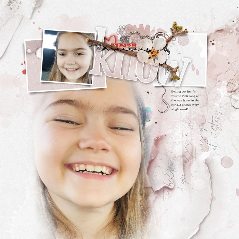
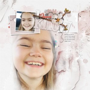
Process A Solid Paper and page 2 of the Hipster Plume Template Album No.5 forms the foundation of this layout. The focal image was clipped to the FotoBlendz layer which was adjusted via a Layer Mask and Brushes to suit my image. Some layers of the Template were turned off and others filled with colour. Transfers, Overlays, and some layers from the ArtsyKardz were placed below the frame clipping set. Two copies of the title word were placed on top of the frames with blending modes LighterColor and Lighten applied. Drop shadow and stroke were added to the WordART. Splatters and dimensional elements were placed on top of the layout completing the page.
- Designer(s) Used:
