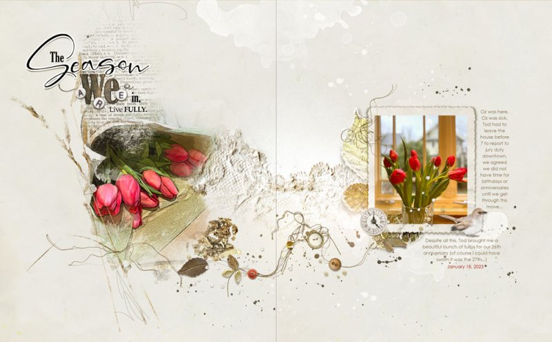
I am inspired by fellow team members [B]Adryane [/B]and [B]Marleen [/B]to try something simpler and with white space. Hard to do when you have 30 great photos from a day, but a little easier when there is just one thing, one image I want to focus on.
The bunch of tulips on the left has a Poster Edged filter (thank you, [B]Michelle [/B]for introducing me to this!).
I used a Sayonara Trasnfer, duplicated about 3-4 times, as the blending mask. Embellished this with just a couple of elements and Threadz, adding the word art.
On the right I used the Sayonara Frame for another of the tulip photos, adding a few more elements just to cluster things.
More light Transfers and Splatters added, and almost finally, added a MM Sprinklez to connect the images/pages. I rearranged the elements and recolored some, making them all smaller to fit my pages.
Finally finally, I was adding a color overlay to something, and accidentally unclipped it, and found it added a wonderful warmth to the whole page.
