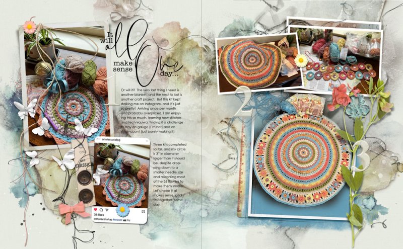
When choosing an ArtPlay Palette, the primary consideration is color. The ArtPlay Lost collection colors look so nice with my crochet mandala project :) Normally I wait until I've completed a project to document it, but this subscription project is a new experience.
Background is Artsy Papers (left turned 90 degrees) plus Artsy Transfers.
On the left I used the ArtPlay Frame plus a Custom Shape (Rounded Corner for the Instagram screen shot). On the right I used Frames from the Artsy Layered Template, resized and rearranged, plus a Framed Mask.
Added elements (some recolored) to create flow and Visual Triangles.
For the Framed Mask on the right, I filled the Mask with blue, then brushed away some of the photo for a primitive extraction (taking photos on a dark solid background really helps with this!).
My new favorite title technique - duplicate title, fill with white, nudge and add drop shadow to the underneath white version.
