Oscraps
- Credits list
- Artplay Strom Collection
Artplay Palette Strom
MultiMedia Documents 10
Strom WordART Mix 1
Strom FotoBlendz 1
Artplay Palette Anew (arrow)
Artplay Palette Vivacity (gold button)
Splatters 15
Process
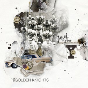
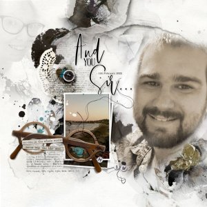
Artsy paper 1 was used as the foundation of the page. The photo was clipped to a fotoblendz mask. The photo was given a sepia tone look to blend in better with the colors of the paper. The cluster was built using MM Documents 10_3 and the vintage car image. The page was completed by adding word art, more dimensional embellishments and some splatters and tape.
Thank you for looking!
- Designer(s) Used:

