Oscraps

AnnaLift: Just my type
zlemon

AnnaLift: Just my type

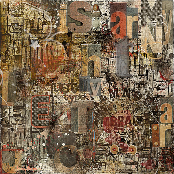
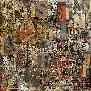
Occasionally I'll do some boy art* for my favorite photographer who is a graphic designer by trade. This is a homage to his favorite designer, Bill Golden. Golden was an American design icon who designed the CBS logo and used type in very interesting ways. He was one of the pioneers in the art of visual communications, advertising and branding.

*boy art tends to be more masculine in design and/or subject matter.

Oh, there's a few words in this. Can you find them?

Used APP Riant, Vintage Things brushes and lots of stains, transfers and splatters. Also used a type set from Snickerdoodle Designs.

Thanks for looking.
Gorgeous. I love how there are swoops of dimension throughout. This must have taken forever and I can see it being very meditative to create. Applause!
 
Really nice! It looks like it took a ton of work to get the worn and weathered look and work all the shapes and sizes out. I did a Type Drawer series in rubber stamps one time, and it was much more of a project than I first expected it to be.
 
Brilliant! I find a personal lift a challenge, but you made this one as unique and creative and more personal!
 
I'm in love with this, Christy! I LOVE typography and you've done such a fantastic job with all of this! I do see "just my type" and "embrace" and "lmnop" twice. I'm just awestruck by this! You even used the same tonal quality, yet all of the different letters manage to stand out! I would have loved to have been a typesetter years and years ago. I'm still fascinated by the old cabinets they used. This is just brilliant.
 
Christy, I just gave you a Standing O! I'm in love with your page! You must have put so much work and time into this, but I can see where it would be like a meditation at the same time.

https://ozone.oscraps.com/gallery/data/1351/just-my-type-600.jpg
 
This is amazing art. Yes, I see several words but mostly I see wonderful depth, artistry and imagination. Congratulations on the Standing O. It is well worth the mention. Wow. Just wow. Every time I look at it, I see more words & magic of lettering. Bill Golden would be proud!
 
Cheryl beat me to it, the is such a FAB page. I keep staring and staring at it, so many layers and depth. Amazing job!
 
What an amazing layout. Creative take on the challenge; love all the typography. Congrats on your Standing O!
 

Layout information

Category
Anna Aspnes
Added by
zlemon
Date added
View count
966
Comment count
20
Rating
0.00 star(s) 0 ratings

Share this layout

Top