Art Journaling ~ Make it Line Up!
Hello everyone!! I hope if you celebrated the holidays that you had a wonderful time! We had a very quiet but beautiful Christmas with family and LOTS of food!! I am sure gonna need the gym right about now!
We have been talking about Robin Williams’ Principles of Design: Contrast, Repetition, Alignment, and Proximity. As a summation, Contrast is the enhancement of the apparent brightness or clarity of a design provided by the juxtaposition of different colors or textures. Repetition is the key to attractive, consistent designs. It creates visual connections and establish a strong visual style. Repetition can be reflected in the use of the same or similar colors, shapes, lines, fonts, and other elements, and it differs from its other principles because it is not always meant to be noticed. Today we are going to talk about Alignment.
Alignment is I think more important in many of our page layouts, but sometimes, as in many instances in art journaling, all the rules are thrown away. I get that. However, I find myself still wanting to use these design principles because I like the way a well designed page looks. So, a definition of alignment is an arrangement of groups or forces in relation to one another.
How does alignment work in art journaling or scrapbooking in general? Well, when items are aligned on a page, we want to see a strong cohesive unit. Even when elements are separate from each other on the page, an invisible line connects them. Psychologically, the principle of alignment tells the person looking at the page that even if the elements aren’t right next to each other, they still belong to the same page. Where fonts are concerned, sometimes it makes a strong statement to use left or right alignment of your words to create a strong invisible line, and justifying a paragraph can make for great invisible lines as well!
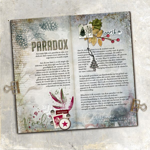
Here’s an example:
Sonja always uses her fonts in a very designerly way. As you can see in this piece “Paradox”, she has the fonts right aligned on the left page and left aligned on the right. Her Title lines up with the right side of her text block. All of these things create a very strong invisible line to line up to.
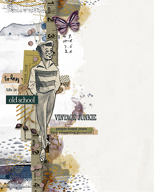
Here’s another great example of using strong invisible lines to make a visually appealing page. I. have showcased Madi’s page “Vintage Junkie” before, but this one is clearly a great example for alignment. See how all of the items she has placed on her page are grouped around her vertical line of the measuring tape. Placing the man on top, and the elements around it keep your eye right where it should be: on the strong line she has created.
That’s it for today – I’ll see you in the new year!!!