Art Journaling ~ Can You Feel It?
Welcome to this week’s art journaling post.
Today we will talk about TEXTURE. I know, you’re probably asking “How in the heck can we have texture with digital art??”. Well, like everything else, we need to CREATE it. Texture adds visual interest and dimension to our pages. We can make texture and dimension by the simple use of contrasting colors, shading, drop shadows. We can also use scanned items in our pages and use drop shadows to give them dimension and depth. When an element has dimension and depth, it also has texture. Think about it – if you see an element that is beautifully shadowed and colored, don’t you sometimes want to reach out and touch it and see if it’s real?
Texture is all about the tactile senses. One of the reasons many people would accuse us digi girls of not being true “scrappers” is that our pages completely lacked that tactile feel and dimension of scrapping. They hold the paper in their hand, they cut with the scissors, they glue elements on, and everything they do has to do with “touching” something. We don’t have that luxury in digital scrapping and art journaling. So what do we do?
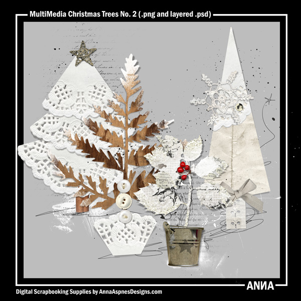
Well, we try to emulate objects as best as we can. One thing that I love to do is to scan in doilies and use them as texture in my backgrounds.
Look at how Anna Aspnes used doilies to create some fabulous Christmas Trees!
I also love some thick and chunky gesso and gloppy paint splashes. I also like to use painted textures that have cracked so that they look like peeling paint.
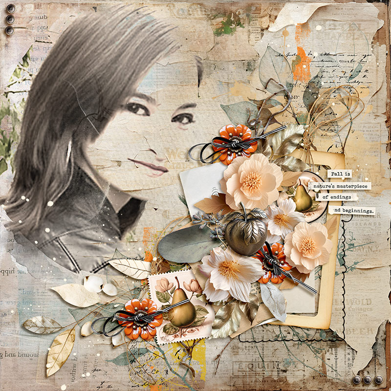
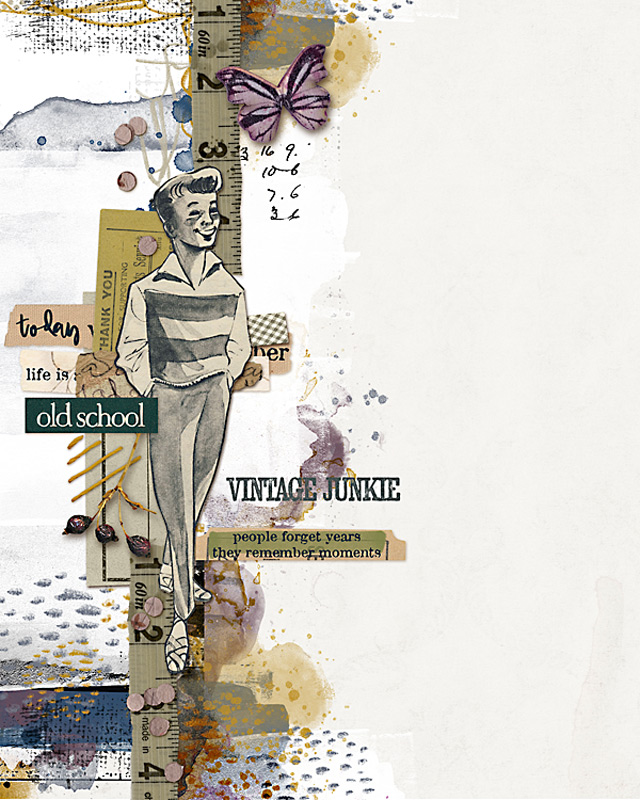
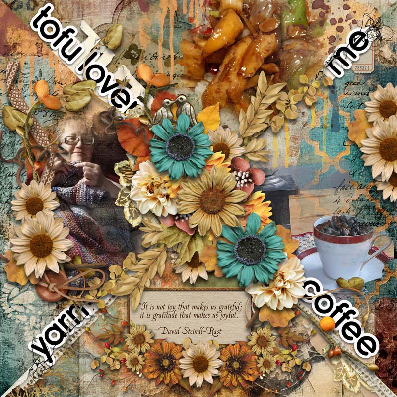
Here is one of my pages that I think has a lot of texture in it. See the crackly paint? Some items that show texture are the stitches, the crackles, the paper that looks like it is disintegrating, the brass buttons, the twine ribbon – see how they all create depth and texture?
Without the combination of texture, dimension, and shadowing, our pages would look flat.
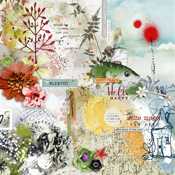
Now here is a caveat: There are some people who love to art journal and they rarely use drop shadowing. That is a different style and it’s perfectly fine to NOT drop shadow things. For example, this layout by Madi (Diane) uses very little drop shadows. All the dimension and texture that we see comes from blending and layer work and just a few items shadowed. I absolutely ADORE this page, and I’m often looking at Madi’s pages and really enjoying how she interprets art journaling.
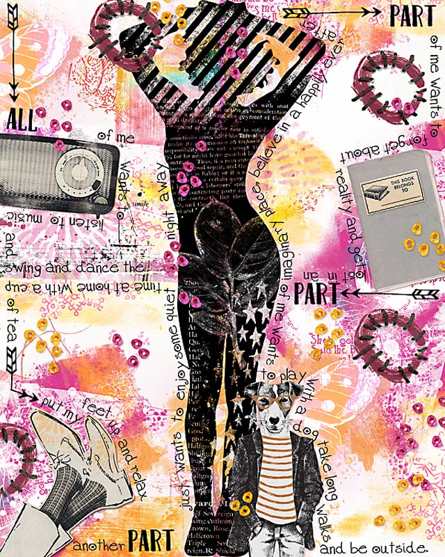
And finally, here is an artist who used only two items with drop shadowing, no scanned items, yet it still feels texture-y! That’s because of her use of layering and colors. This is also by Madi (Diane)
So, there we have it. Texture. I hope this was helpful for you, and I look forward to talking about our last design principle, Space!
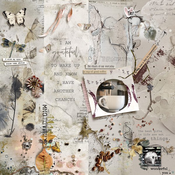
Before I go, I would like to share 3 of the final week of the Art Journaling Challenge on Gratitude.
See you next week!! We will be taking the month of December off of the Art Journaling Challenges, but we will be back and raring to go in January. In December we will still be highlighting topics about Art Journaling. If you have any topics you’d like me to address, please let me know in the comments, or PM me @pachimac in the oScraps forum!