Art Journaling ~ Let’s Dive into Form
Hello friends!!! I hope today finds you healthy and happy and having some good scrapping time!
We have worked through a few design principles in the past few weeks. We talked about lines, shapes, color, and value. We also reviewed the principles of Contrast, Repetition, Alignment, and Proximity and how they relate to the four principles we have talked about. Today our design principle is form.
Form is the three-dimensional development of a two-dimensional shape. For example, a 2D shape like a circle could be transformed into a 3D form like a sphere. In most graphic design, the addition of a third dimension is an illusion, because we are still working on a two-dimensional art form. Since we are doing our designs digitally, form can be tricky. How do we show three dimensional art in a 2D environment of a computer? There is one main way that we show form digitally: shadowing!
If you’ve been around digital scrapbooking / art journaling for a long time, you will know that drop shadows weren’t always used in our art, and the “real” scrapbook / art journal communities did not really accept orlike us “Digi’s” and didn’t believe we were “real” scrapbookers. It took a while to be accepted into the community, and one of the ways was to work on making our pages look 3D and real. One of my goals when I was first starting out was for my pages to be mistaken for paper. If someone said “Is that digital or paper??” I was thrilled!!
Drop Shadows are very important to form. In order to make a realistic drop shadow, you have to take into account the angle of the light you are trying to imply, the color of the light, and the distance of the object from the background. Most photo programs have a default drop shadow, but I find them too harsh and too black for my purposes. Shadow isn’t simply using shades of black/grey to imply the dimension. Here is an ATC card that I made for a challenge at oScraps this month. On the left is the finished card. On the right is the card with the drop shadows taken off so that you can see what shadowing can do for a page.
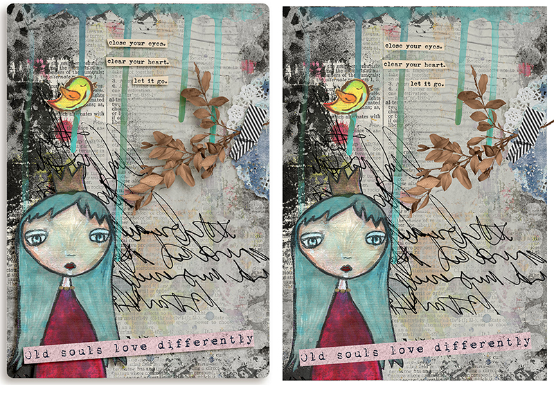
Compare the two: Look at the leaves. She how it looks like it’s coming off the page? That is because of the drop shadow. See the word strips? They are shadowed on the left and bottom. I tend to use my drop shadows at a 45 degree angle. The art doll’s shadowing is seen best to the left of her hair.
Here is an example from the gallery of a page that is using form/shadow so well that if I didn’t know that it was digital, I would think it was a paper page!
Leave the Roads, Take the Trails by isDK
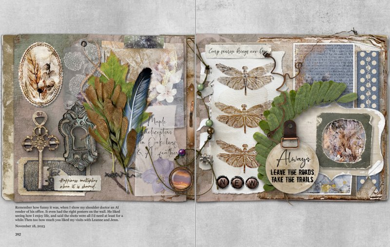
Look at the dimension shown in this two page spread! The string of beads look like you can just pick it up. The dog eared pages beg to be touched! The shadowing is superb in this page!
I have always found it very difficult to make a realistic drop shadow, so I rely on purchased actions for my pages. There are many available all around digi land. These are usually made for Photoshop or Photoshop Elements. You simply load them into your program and voila! You can also modify or edit them to personalize them.
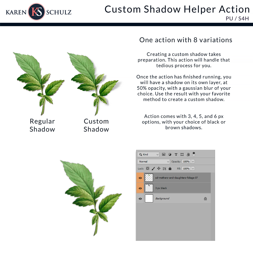
Here is one from oScraps by Karen Schulz. Click through to the store on the image:
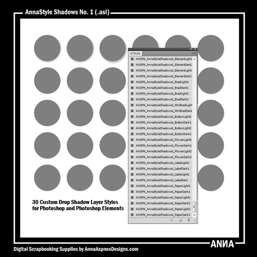
Then we have this one from Anna Aspnes:
So, in our art journaling, if you want something to pop out of your page, try using drop shadows to see if you can make that effect!!!!
Thank you for the visit – see you next week when we talk about yummy textures!!!!