Art Journaling – The Shape of You

I hope you had a chance to try out one (or more!) of the challenges last week. We will be starting a new topic on November 1st. Hopefully we will see some new faces playing!
Last week we talked about lines and how they create movement and interest in a page. Today we are going to talk about shapes.
If a line is the most basic of elements, then shape is next. A shape is created when a line is enclosed. A shape has two dimensions – it has length and width. Some of the most popular shapes are circles, triangles, rectangles, and a trapazoid. These are the geometric shapes, and these shapes are those that we learned about in school. We can all easily recognize these shapes.

There are also other types of shapes – organic or free form! These are shapes that don’t particularly follow any rules. They resemble things we see in nature like a blob, tree, or a drawing of a bird, or a foot outline. These shapes are made out of many lines joined together.

Shapes are the building blocks of drawing and representing anything in an art piece. Lines form together to form shapes. Different lines, line weights, and shapes combine to make objects that we can identify.
Ok Susie, I get what shapes are, so how do they work in art journaling?
Well, remember that we talked about lines last week, and lines are similar to mark making? In art journaling, shapes take the form of paint, gesso, and ink markings! Circles dipped in digital paint make great bubbles, you can repeat triangles in a line, or squares in a grid. You can digitally draw line art ( any image that consists of distinct straight lines or curves placed against a plainish background ) to represent flowers, or vegetables, or faces. You can take your brush tool in your program and draw shapes. You can scribble lines, and create any shape that you can imagine. You can use strings as visual lines. Shapes can be simply line art, or you can fill them in with color or patterns.
Shapes bring personality to your page. They also can bring dimension and visual interest. Here is an example I snatched from the gallery by Ga’L – Be That Girl. You can click through to the gallery to see her credits.
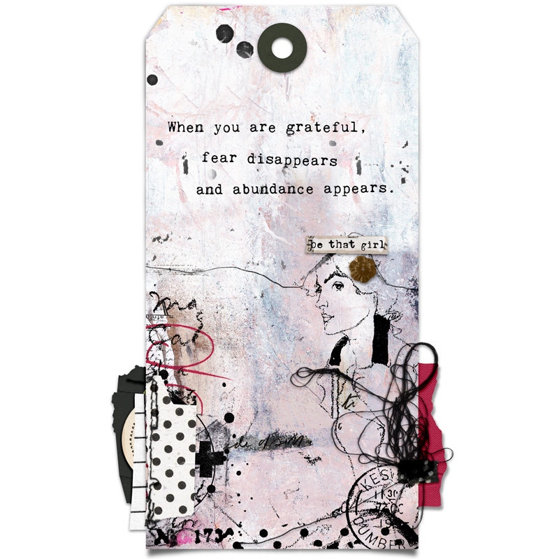
I left it large so you can see some of the elements. See the way the girl is drawn as line art? It uses varying thicknesses of lines. There’s a line above her head going across horizontally that gives movement and also divides the tag between the quote and the embellishments. The string is a messy line, and then you can see circles at the bottom and top that are used for visual interest. She has the shape of a cross (or plus sign) and some writing. All of these things are lines and shapes that cause your page to be interesting to look at, and in some cases they can convey emotion. Here is an example of lines/marks/shapes that definitely evoke a mood. This is by CherylnDesigns – Art Journaling Challenge of last week.
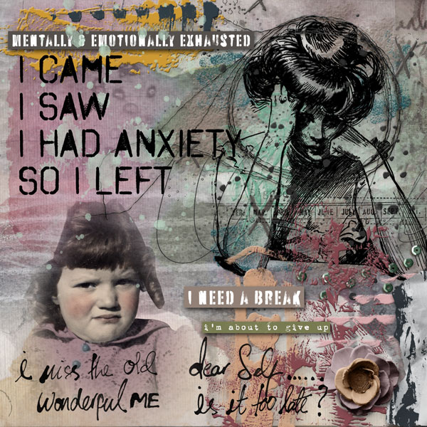
See how all the elements, lines, and shapes she chose evokes that feeling of anxiety, worry, and just plain exhaustion? She used word art, that acts as both shapes and lines, and the drawing of the anxious woman is a shape. The scribbly lines convey a sense of chaos and disarray, and the paint gives texture. See how she repeated the circles up top and the scallop paint near the bottom?
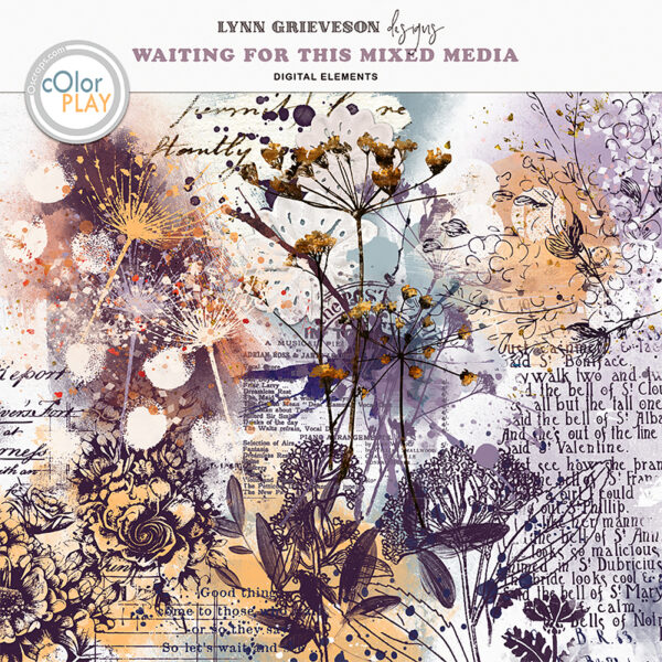
This is getting a bit long, so let’s wind up the lesson on shapes with a few products from the Oscraps store that have line art/shapes in them. And remember – shapes and lines don’t have to be just black and white line art! Here’s a pack by Lynn Grieveson called “Waiting for This” which includes text, line art drawings, stamps, gesso shapes, and they’re all different colors as well!
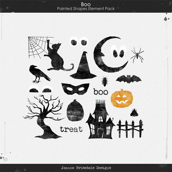
How about this fun pack for Halloween pages? These are all somewhat simple shapes that you can place on your pages! “Boo Painted Shapes Element Pack” by Joanne Brisebois.
One more: a pack with line drawn faces. I really like using faces on my art journaling pages. They convey emotions really well for me. This is “Wonky Women 05” by Vicki Robinson Design.
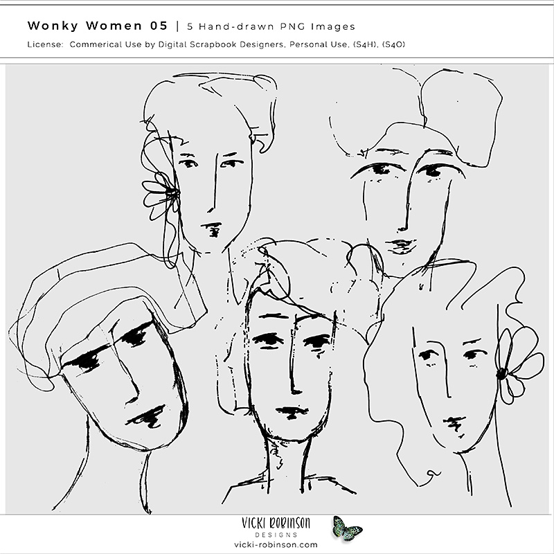
Aren’t these great?? I love using them in the backgrounds of my pages and sometimes I even fill in their faces with ghosted text.
I think that’s enough for today! Join me next Tuesday for our next installment: Color.
