Tutorial: How to create natural clusters

I’m often asked how I make the clusters on my layouts. Well, here I am with some tips to get nice results with creating them!
When I want a nice cluster on my layout I start with looking for a kit with lots of elements in it.
I often choose for a kit with natural elements, like leaves and flowers. But you can also use non-natural elements, of course.
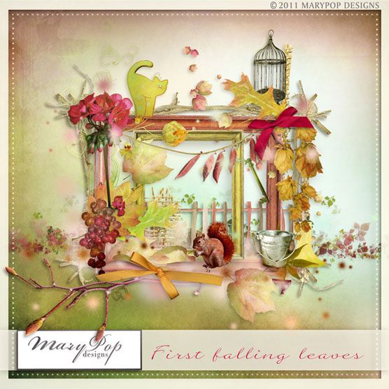
Of course the colors should match the colors of the photo(s) you are going to use. For this tutorial I chose the beautiful kit First Falling Leaves by MaryPop.
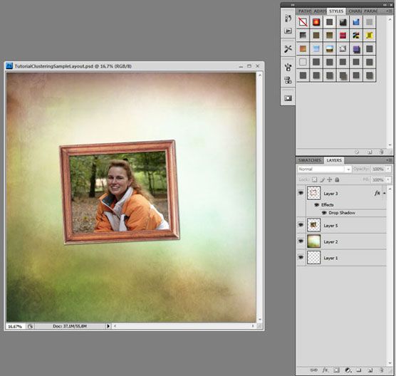
I start with a new file of 3600 x 3600 px. After that I choose a background and then I drag my photo to the layout. Depending on the kit I use I choose a frame for the photo. For this sample I did use a frame. The frame has a low soft shadow so it isn’t too visible on the photo.
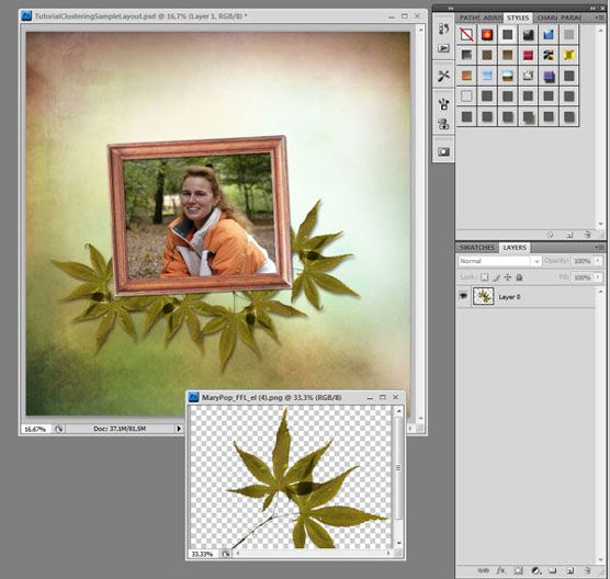
Then I will start selecting the elements I want to use. Normally with natural elements I start with some leaves. I picked one of the leave elements from the kit.
I tuck them under the photo, duplicate and flip some of them and place them slightly turned left or right on another spot under the photo, but a bit on top of another leave.
The most important part comes now: shadows!
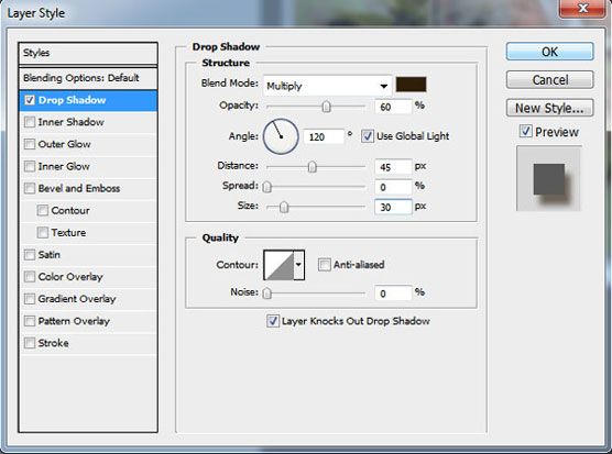
I always use high shadows for my clusters made of leaves and flowers! Always! It gives the feeling of depth to it and also the feeling of reality. If you give your element shadow before you duplicate it that will safe a lot of time.
Here you can see the settings I’ve used. If you click on New Style you don’t have to change the settings all the time, but you can just click on the style button!
After placing these leaves I chose another leave element and just like the other leaves, I duplicated this layer a couple of times, rotated them a bit and gave them high shadows.
Just place some them on top of the first group of leaves, some under the first group of leaves.
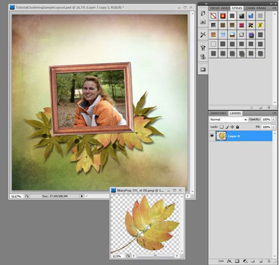
When you are finished with this basic cluster, you can see if there’s more stuff in the kit that you can tuck between the leaves. This way you add more color or depth to the cluster.
Also for these elements I use high shadows.
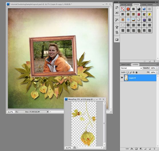
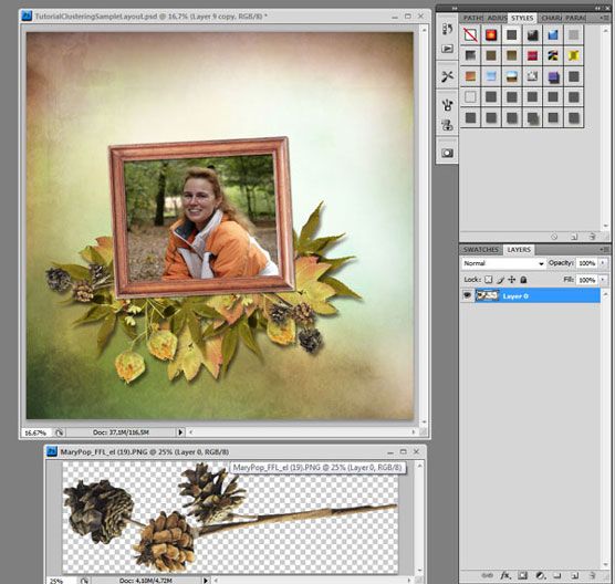
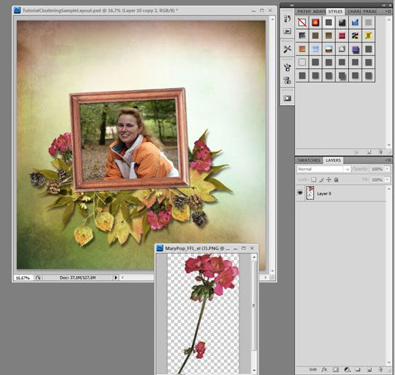
You can finish your layout by adding some paint strokes or glitter on top of the background paper and some small elements on top of the photo frame. Just place it slightly tucked behind the leaves in different angles. I don’t give those paint strokes shadows, because I think that doesn’t look nice. Without shadows they blend a bit into the background, which I think is nice.
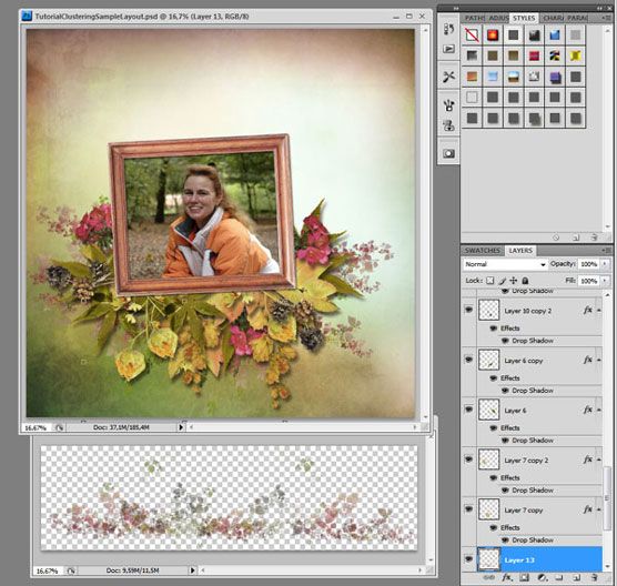
Hey! I also found a branch in the kit, let’s just tuck that between all those layers!
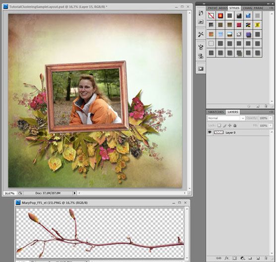
Now it’s time for the finishing touches. I duplicated some of the leave elements again and placed them on different spots in the cluster, just to make it look a bit more natural. I added some elements above the frame, so the photo and frame will also be a part of the cluster and not just lay on top of it. I chose the fabric frame and some natural elements for it.
And here’s my final result!
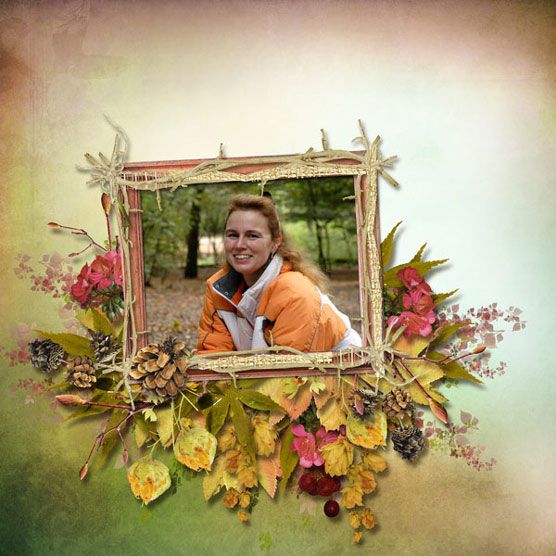
I hope you enjoyed this tutorial and find it as easy to cluster as I do!
What a wonderful tutorial,
Thank you Irene
Irene dank je wel. Maar ik heb photoshop elements, daar werkt het weer anders. zit altijd met die schaduwen te rommelen.ik had ps Cs5 maar helaas werkt die niet meer bij.
Great tutorial!
Mooie tutorial Irene.
Thanks. 😉
You’ve made it look so easy and your tutorial brilliant.
My only question is making “high shadows” in PE?
When you say high do you mean at 120 degrees? And would the settings be similiar? In Elements we are offered size, distance and opacity.
Thanks sooo much for your tutorial. 🙂
When I mean high shadows I mean they look like they are loose from the background. The angle isn’t that important, it is the size that makes the difference.
In Photoshop Element you choose the highest of the standard shadows to get the best result. You can lower to opacity, because maybe otherwise it’s to dark. Just click on the fx button and you can change the settings.
I can’t wait to try to cluster some more! Thanks Irene!!
beautiful, Irene! thank you for the instructions!
Wonderful tutorial – I’m bookmarking it so I can try it! Clustering has always been a mystery to me – thanks so much for this!!
Thank you very much!The tutorial is wonderful and easy to understand.
Thanks, Irene! Wonderful tutorial and beautiful page!
Great tut. Thanks.
Irene: This was an awesome tut! I used to work in a flower shop and this reminded me of arranging flowers! Love it!
Thank you for this easily understood tutorial. I’m new to digi-scrap software and appreciate all the help I can get!
Thank you! lovely page – I use PSE, but hope I can figure out a work around for the ‘high shadow’ and blend mode issue. Step by step tutorial is great..
thank you so much for sending me the link. It is a wonderful tut and I will start using high shadows from now on instead of low. I usually play with the low and they end up high, so to start with high makes more sense. A very easy tut, Irene and beautifully explained. Thank you so much for taking the time for us.
I luv this type of tutorial..Videos are hard to follow while doin the page..Also I have limited and slow internet, so videos are not a good thing for me..I would like to see some PDF files..
Thanks so much for this tutorial..