Frame It!
Yes, a picture may be worth a thousand words, but a picture can be just a picture. A framed picture, however, is a work of art, a treasure, something that is so special that one has taken the time to surround it, emphasize it, give it a border, a boundary, some umph! Where would we be without our frames!
I go through different frame moods in my scrapping. Sometimes I like classic, sometimes round, oh and I love Polaroid frames with the extra section on the bottom, perfect for a little journaling about the time, the place, the people, and I LOVE square-format Instagram-style frames. I could go on and on 🙂
We may think we have the corner on the frame market in the scrapping world, but before you throw that junk mail or catalog away, take a closer look.
Here’s what I found in my junk mail recently.
An ad for a health club had these wonderful polaroid-like frames, complete with some titling on the bottom rectangle:

My local yellow pages featured my current favorite frame, a rounded corner. And if you look carefully, the photos are matted with a second rounded-corner treatment, adding a touch of gray and some dimension. Very modern looking!
And then a catalog, this one for West Elm, featured a clean and classic treatment, white, rectangular, slight drop shadows.
Each of these simple frame treatments is easily creatable, but to make it even easier, I decided to go shopping for frames in my favorite place, the Oscraps store!
I found so many wonderful goodies, but here are just a few I wanted to share:
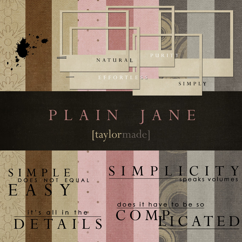
Some wonderful Polaroid-like frames, these from Taylor-made. This gives a bit of an old-fashioned look, and encourages that bit of journaling to make sure we don’t forget the provenance of the photo.
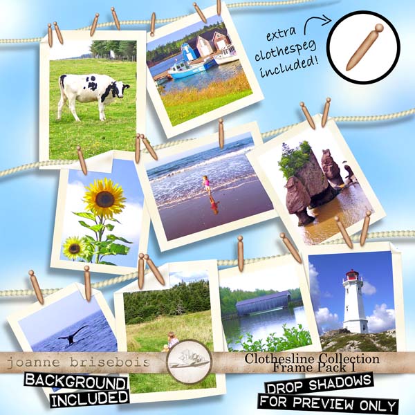
Here is a wonderful classic frame collection from Joanne Brisbois. I don’t know about you, but I really appreciate it when a designer gives me a classic size, in both landscape and portrait orientations.
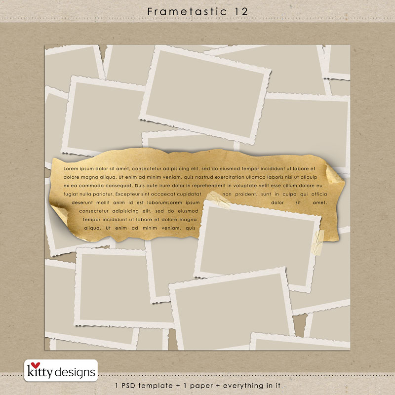
I love these next frames from Kitty Designs…they are ‘classic’, and they have that old-fashioned rippled-edge…how many of you remember rippled-edge snapshots?? I do 🙂 These are perfect for heritage pages.
Speaking of old-fashioned frames, this next set from Merkeley Designs make my heart go pitter-patter! A little grungy, and in sizes from a bygone era of photography.
While I didn’t find these in my junk mail, my iPhone is loaded with square-format pictures from fun apps like Instagram, Via.Me, Hipstamatic. We can get this look on our scrapbook pages with frames like these from Anna Aspnes:
Here’s another favorite format, the postage-stamp frame:
For something completely different, check out these “storage frames” from fei-fei’s stuff:
And finally, some whimsical variety from Ju Kneipp:
Frames can make the difference between the ordinary presentation of a photo and a photo set in the appropriate mood, timeframe, style. And we have it all in the Oscraps shop, from classical to whimsical, modern to heritage.
Check them all out in the Frames category of the store.
Now, I couldn’t help but go gallery-hunting for some impressive framing.
This page from Yvonnahenna jumped right out at me. It uses a frame from the Oscraps collab Evolution that is like an old-fashioned negative strip, perfect for showing how a child is growing and changing over the years.
Here’s a lovely page from Adryanne, with a simple and classic frame with wonderful shadowing emphasizing a lovely photo. Frame is Warping Frames No 2 by Anna Aspnes.
And one more I just had to include, an example of a whimsical, hand-drawn gallery-like frame, created by Madi from the Contrast kit by Maya de Groot:
Hope you enjoyed this little foray into frame-land. If you have a favorite I haven’t covered, please let me know! And I’ll see you in the gallery!


Love the examples, and I *heart* frames. Can’t help it!
Thanks for posting my layout 🙂
Fab article…full of inspiring examples!
Wow, I’m seeing stuff I’ve never seen before – great frames! I’m going to have to start paging backwards through the store lol!
i love frames, too! wonderful article, Diane. thank you for including my page.
Great frames!! Some I haven’t seen I don’t think!
Diane, wonderful selection of frame kits to highlight. Thank you!