Oscraps

WINNER announced: Tips & Tricks Challenge with Karen Schulz, January 2022

Karen Schulz Designs

Designer
Designer
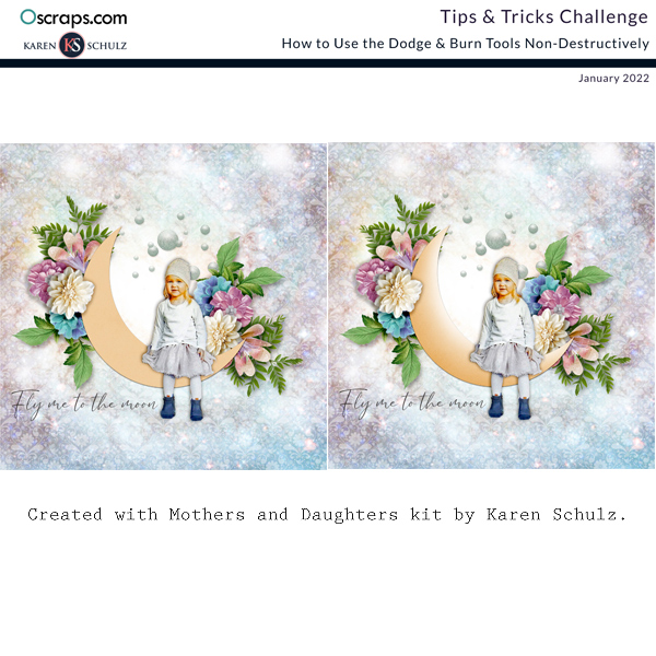
Great tut! I tried on some other elements, but didn't get it to work very well. So I used the moon and made this.

This looks great! The more you use the tool, the more you will become familiar with little nuances, like brush size & strength, etc. that will give you the results you want. I hope you continue to experiment with Dodge & Burn. Thanks for sharing your results.
 

Kythe

Well-Known Member
Hi Karen
I work on PSE 21
There are 2 areas that I have difficulty with.

1. "Get the Dodge Tool. In the Tool Options Bar, set the Brush size to 500 px, the Range to Midtones, and the Exposure to 50%."
I cannot find where to look for the Range /mid tones.. does exposure mean opacity?

2. "If you want to affect the Highlights of an image, you may choose Highlights as your Range; and if you want to affect the Shadows on your image you may choose Shadows."

I find it difficult to use the tools if I can't see what is happening on the element. The moon came out okay but I can't seem to replicate the process on anything else. What am I missing?
Well heck. I couldn't see the little arrow by the sponge tool. Everything works tickety-boo now. I have used this technique on lots of photos since. Thanks Karen. It just goes to show how one little thing can make a difference.
 

Karen Schulz Designs

Designer
Designer
Well heck. I couldn't see the little arrow by the sponge tool. Everything works tickety-boo now. I have used this technique on lots of photos since. Thanks Karen. It just goes to show how one little thing can make a difference.

You're so right. One little thing CAN make a big difference. i'm glad you're using the tool and it's working great for you. And I laughed at the phrase "tickety-boo". I haven't heard that before, but I think it definitely needs to be incorporated into my vocabularly.
 

Glori2

Well-Known Member
I'm in awe of how different using these tools can make a layout pop!! What a great tut...looking forward to your next ones!
 

Karen Schulz Designs

Designer
Designer
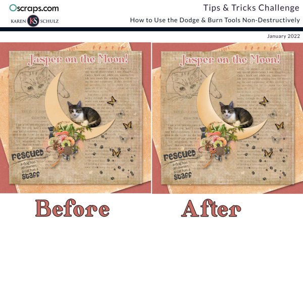
Tawnya, you've done a great job with this tutorial! Your extraction of the cat looks great too; she just pops off that page. Thanks for participating in this challenge!
 

tanteva

Mistress of Mayhem
Oh, I cannot believe it - I forgot to do this!!! I meant to really try and learn this technique.

Well, I'm gonna do a page in February - no matter that the challenge is over. I need to learn this. Thanks for sharing the tutorial!
 

Karen Schulz Designs

Designer
Designer
Great tut! I tried on some other elements, but didn't get it to work very well. So I used the moon and made this.

The settings you use will depend greatly upon the image upon which you are working. Try choosing from the dropdown, the different options - Shadows, Midtones, HIghlights. The size of the brush and the opacity of the effec also will have a great impact on your result. On some images you will need to experiment more than with others. I hope that helps.
 
Top