tanteva
Mistress of Mayhem
Often the kits we buy are full of lovely papers, and we end up using only 1 or 2 in our layouts. It's a shame really, so I started thinking: How can I best use more papers in my layouts?
One way to use more of the papers is to create simple templates of paper stacking. I've done an example of how it can look here:
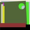
Doesn't look like much, right? But it is just a base for the layout, it will look better once you use it, I promise.
Start with a new empty document and build a sort of paper stacking template by duplicating and resizing squares and stack them on top of eachother. Variate by letting some squares almost fill the entire work space, and some of the just be tiny strips. Be creative!
Use the fill tool and fill the first layer with one color. Then duplicate that layer, change the color of the layer with the fill tool. Color doesn't matter, just make them really different from eachother, cuz then it will be easier to see the different layers. Take the new layer, resize it and turn it a bit. Then duplicate that layer, recolor, resize, turn - and so on. Do this again and again until you have a base for the layout. I added a shadow to all the layers here, just a small one (like size 10, distance 10 and opacity around 50%) but you can leave that for later if you want.
When I was satisfied with the stacking, I used the eraser tool and a simple circle brush, and erased circles out of the stacked layers. Use other shapes of brushes if you want, your imagination is the limit here.
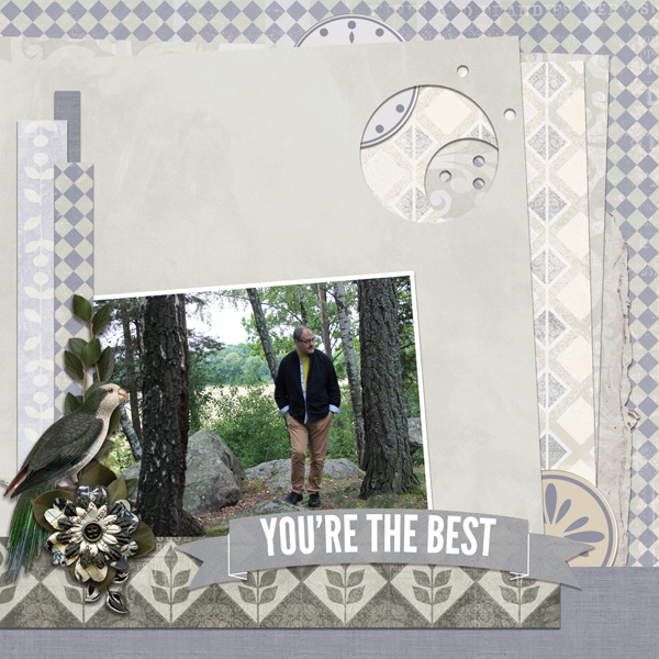
After that I used papers from the kit and clipped on to the different layers. Then added the photo, added a white stroke around it, and finally added the elements.
Here's what the finished layout looks like. I've used The Absolute Best Collection by Veronica Spriggs
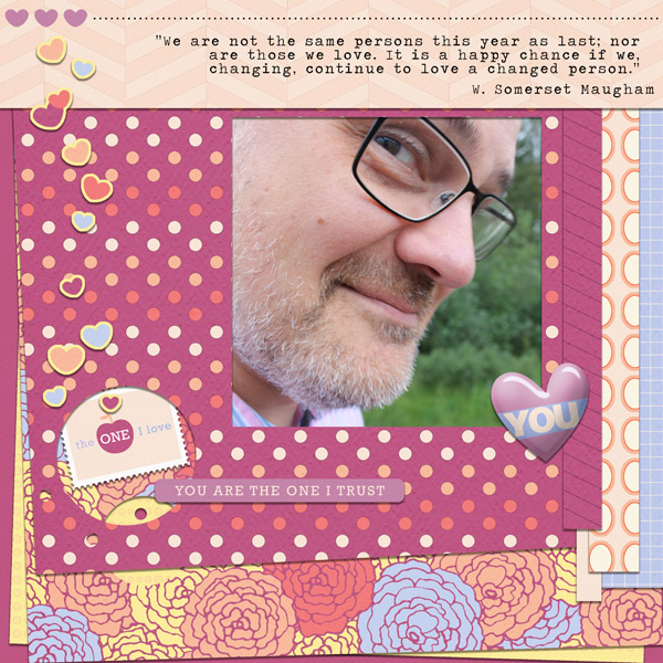
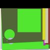
Well, why waste a good template, I thought, and decided to make another layout using the same paper stacking template again. This time I rotated the template, moved the layers around a bit, and also used a square brush and the eraser tool to cut out a frame of sorts for the photo on the top layer. This is the look of the new version of the same template:
This time I made a layout using The Short Notes Collection by Kitty Design and this is what the finished layout is looking like:
Hope you get inspired to use more papers and play around with paper stacking. Have fun!
One way to use more of the papers is to create simple templates of paper stacking. I've done an example of how it can look here:

Doesn't look like much, right? But it is just a base for the layout, it will look better once you use it, I promise.
Start with a new empty document and build a sort of paper stacking template by duplicating and resizing squares and stack them on top of eachother. Variate by letting some squares almost fill the entire work space, and some of the just be tiny strips. Be creative!
Use the fill tool and fill the first layer with one color. Then duplicate that layer, change the color of the layer with the fill tool. Color doesn't matter, just make them really different from eachother, cuz then it will be easier to see the different layers. Take the new layer, resize it and turn it a bit. Then duplicate that layer, recolor, resize, turn - and so on. Do this again and again until you have a base for the layout. I added a shadow to all the layers here, just a small one (like size 10, distance 10 and opacity around 50%) but you can leave that for later if you want.
When I was satisfied with the stacking, I used the eraser tool and a simple circle brush, and erased circles out of the stacked layers. Use other shapes of brushes if you want, your imagination is the limit here.
After that I used papers from the kit and clipped on to the different layers. Then added the photo, added a white stroke around it, and finally added the elements.
Here's what the finished layout looks like. I've used The Absolute Best Collection by Veronica Spriggs
Well, why waste a good template, I thought, and decided to make another layout using the same paper stacking template again. This time I rotated the template, moved the layers around a bit, and also used a square brush and the eraser tool to cut out a frame of sorts for the photo on the top layer. This is the look of the new version of the same template:

This time I made a layout using The Short Notes Collection by Kitty Design and this is what the finished layout is looking like:
Hope you get inspired to use more papers and play around with paper stacking. Have fun!
