Oscraps
Search results
-

Comment by 'lacy' in media 'Live'
Masterful job on the double page layout. Great combination of photos and elements.- lacy
- Gallery comment
-

Comment by 'lacy' in media 'anna lift'
OH Boy! This makes me dream of spring! Beautifully done. Love the photo treatment and the framing.- lacy
- Gallery comment
-

Comment by 'lacy' in media 'Get Me Outta Here!'
Can't say I blame him, I'm not a big fan either. Except for getting to eat out. Love the browns in the photo that make the small mirror reflection stand out.- lacy
- Gallery comment
-

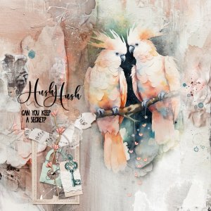
Hush Hush - Lavaliere
Lavaliere Artsy Paper 1 was placed for the foundation. The FotoBlendz Overlay was placed, grouped, and transformed to fit the artwork clipped to the group. A blank layer was added to the fotoblendz group and Anna Blendz Artsy Brushes No 11 were stamped in black to show more of the photo...- lacy
- Media item
- Comments: 11
- Category: Anna Aspnes
-

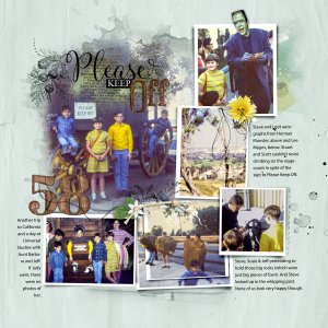
Project 2023 P58 - Please Keep Off EDIT
I just HAD to repost this with one change, Herman Munster's head. If only I'd thought of it before. His head was completely cut off in the original photo. So, I found an acceptable image to blend into the photo and did an OOB with a drop shadow. See the original with process and credit notes...- lacy
- Media item
- Comments: 8
- Category: Anna Aspnes
-

Comment by 'lacy' in media 'Project 2023 P59 - Hold the Memories Close'
Steve, the oldest. He got really good at ruining shots later in life.- lacy
- Gallery comment
-

Comment by 'lacy' in media 'Anna Lift Challenge - Jan 26 - Feb 09'
Wow! This one just jumps out of the gallery. Striking interpretation for the lift.- lacy
- Gallery comment
-

Comment by 'lacy' in media 'AnnaColor: Desert Sunset'
Love the white space design and the framing with the smudged brushwork behind the gorgeous sunset photo.- lacy
- Gallery comment
-

Comment by 'lacy' in media 'anna-aspnes-digital-scrapbook-artplay-enigma-collection-diane-birthday.jpg'
Wow! Love the colors, so bright and yet you made it work beautifully. Love reading about OZ.- lacy
- Gallery comment
-

Comment by 'lacy' in media 'Feb-2024-Free-for-All-#5-chall.jpg'
Gorgeous color on the photo and beautifully scrapped.- lacy
- Gallery comment
-

Comment by 'lacy' in media 'Heart to Heart'
Love that photo of you two. Beautiful sentiment.- lacy
- Gallery comment
-

Comment by 'lacy' in media 'Ann Lift Challenge 2-9.jpg'
Great take on the lift. Precious photos and good choice for the large photo in B&W.- lacy
- Gallery comment
-

Comment by 'lacy' in media 'Project 2023 P58 - Please Keep Off'
Just one more double spread, and I'm calling it done. Thanks! Although it's probably more like 'relentless', as Ron would say 'like a duck on a June bug'. LOL! It has been fun though.- lacy
- Gallery comment
-

Comment by 'lacy' in media 'Project 2023 P58 - Please Keep Off'
Thank you so much. I just have one more double page layout to do, and the project will be finished.- lacy
- Gallery comment
-

Comment by 'lacy' in media 'anna-aspnes-digital-scrapbook-artplay-collection-enigma-pam-4-.jpg'
Great old barn photo and treatment. Lovely containment with the paper textures.- lacy
- Gallery comment
-

Comment by 'lacy' in media 'anna-aspnes-digital-scrapbook-artplay-enigma-collection-diane-malagacove2.jpg'
Beautiful photos and I love how you used the small frames with Artsy Kardz clipped.- lacy
- Gallery comment
-

Comment by 'lacy' in media 'The Simple Digital Scrapbooking Photo Book: January'
What a marvelous comparison. Love the separated title spanning the pages.- lacy
- Gallery comment
-

Comment by 'lacy' in media 'anna collorchallenge'
Great blending and love the frame and the transfer textures.- lacy
- Gallery comment
-

Comment by 'lacy' in media 'Counting the Days'
Beautiful double page. Love how the yellow travels across the pages.- lacy
- Gallery comment
-

Project 2023 P58 - Please Keep Off
Page 2 of the Template was placed on the left side of the double layout. Photos were clipped to the frame masks or fotoblendz with a small extraction of Steve holding the rock. Joyful Solid Paper 3 was placed for the foundation. Template stains, papers and brushes were recolored. Embellished...- lacy
- Media item
- Comments: 11
- Category: Anna Aspnes
